All posts tagged: Street Art

Kosbe: Under the Radar and in the Studio

Kosbe: Under the Radar and in the Studio

Why One Brooklyn Stick Up Kid is Worth Watching

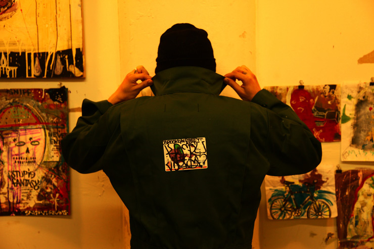
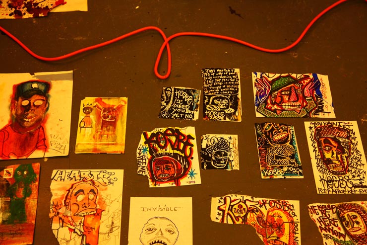
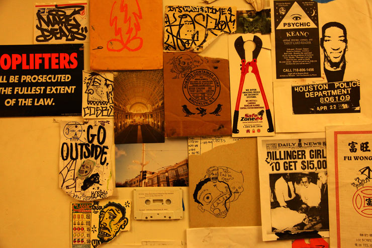
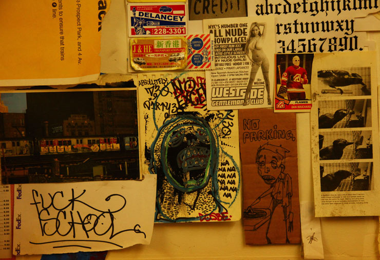
Sometimes on the street you get an inkling of the future. It could be an overheard excerpt from a cell-phone conversation about a club show the night before, or the color and texture of woman’s blouse as it flutters around her while she reads on a park bench, or the sight of the 3rd food truck this week selling spicy meatballs. Something tells you that you just got a glimpse of the future. And while it doesn’t completely reveal itself in it’s fullness, you can see a nascent potential, a storyline developing that may go far beyond it’s current self. Sometimes when you see a Kosbe sticker on a paper box, it feels that way too. In fact, each time you see one of his pieces on the street, it grabs you from above the fray. Yet it seems like he’s been under the radar. He may not stay there much longer.

Kosbe (photo © Jaime Rojo)

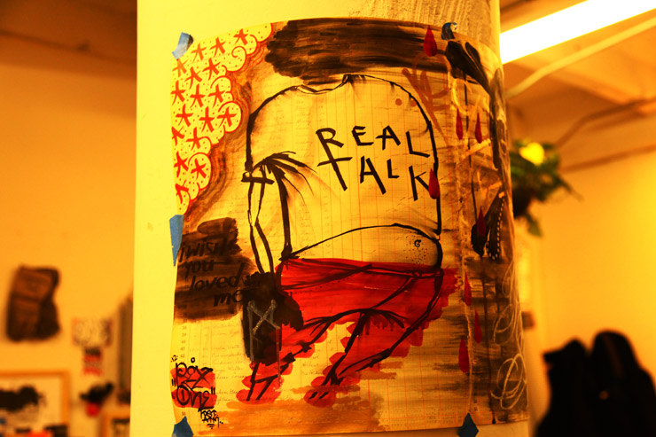
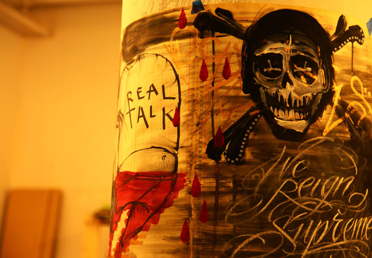
In the ebb and the flow of the Street Art conversation in New York, you keep seeing Kosbe’s wacky characters popping up in doorways and paper boxes. They aren’t tossed off little marker drawings done while watching TV – they’re intense petite character studies. Packed into one slapped on sticker is a lot of cacophonic kineticism; near crazed city characters with primitive wild eyes staring or blinkered, with tight jaws and teeth squarely gritted. The folk faces and forms are framed by an ardent prose, non-sequitors of angst and inside jokes. “What’s the guy saying?” you could ask. And why is he yelling? “Is he okay, is he mocking me? It’s the bundled rage and cryptic cleverness of the court jester.  Layers of reapplied color and repeated lines trap multiple actions on one non-static figure. This is not simple tagging, it’s a stationary tornado.

Kosbe (photo © Jaime Rojo)

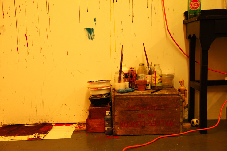
Street Artist Kosbe has put in two good decades of practice, and has learned some lessons the hard way. He’s been hitting up New York for a half decade but he comes from a long graffiti history as a kid in his native Chicago. Now a practicing artist readying a solo gallery show for fall, he grew up in a very young single-parent home where his mom created a small studio for the boy in the back of their apartment. “My mom was really supportive of me as an artist. When I was a kid she gave me this little back room that she allowed me to use like a painting studio. So I was always grabbing stuff off the street and bringing it in there, painting it. I was very secretive with my stuff. A lot of people would come over and see my stuff and they were like, ‘Dude, I didn’t know that you painted’. I was very protective of it.”

That hasn’t changed. He still likes to use found materials as canvasses, as he shows us around his small studio hidden in a warehouse in New York. “I’m always using things that I find in the streets. Like this is an old grading book from 1919,” he says as he pulls out a tattered tome with pages ripped out.  “It has all these people’s signatures. I found this outside a high school in Brooklyn. It’s really cool. So that’s what I’ve been using for my drawings.”

Kosbe (photo © Jaime Rojo)

Kosbe (photo © Jaime Rojo)

Tough times at home got him in trouble at school and with the police as a youth. Describing himself as hard headed, he talks about running away as a young teen to San Francisco for a while in the early 90s, where he spent a lot of time on the street admiring a new kind of character-based and tattoo influenced graffiti on the street by people like Twist (Barry McGee), Mike Giant, and Reminisce. “I went out and there were these Reminisce horses everywhere and they were great because you were going down the street and you would see this horse like galloping down the street. This stuff really blew me away. So I think the same time this stuff was going on there, over here in NY you had like Cost and Revs posting bills and doing rollers. And back then there wasn’t the internet.”

Kosbe (photo © Jaime Rojo)

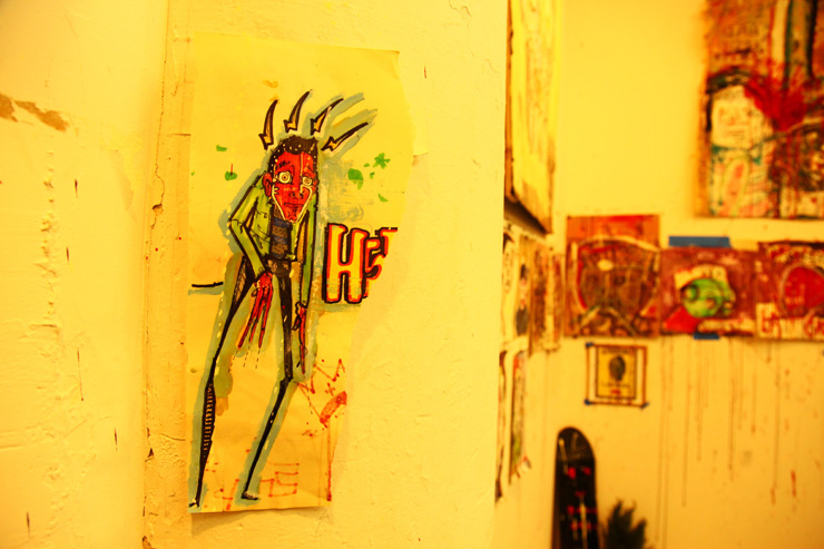
Years later here in this fluorescent lit studio filled with his drawings, paintings, books, ‘zines, assorted ephemera, a desk, and a loveseat, his excited retelling of stories reveals how much those childhood escapades running Chicago streets and exploring San Francisco formed his view of Street Art and prepared him for moving to New York eventually in the 2000s. A self-schooled student of graffiti, fine art, and street art, Kosbe can recount names of writers and crews, timelines, styles; drawing etymologies and stylistic connections and talking about migrations. With much fanfare he’ll also tell you the  stories about the famed Chicago “buff” – a citywide anti graffiti campaign in the mid-late 1990s that he says whitewashed the city’s history.

Kosbe (photo © Jaime Rojo)

But now he’s an artist on his own, and his practice is daily. “Now I’ve learned more that the only way, as an artist, that you can kind of grow and come up with new ideas is you gotta keep giving them away. So that’s why street art is kind of funny. I have friends who are painters that have become painters because of me. They are like ‘Dude, I was totally influenced by your drawings’ and stuff like that.” But the practice of Street Artists putting fully formed works out on the street still confuses some of his peers, “They say ‘Dude you give all your art away’ – you know, they don’t understand the concept.”

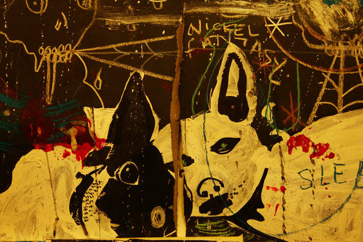
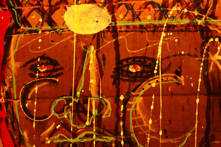
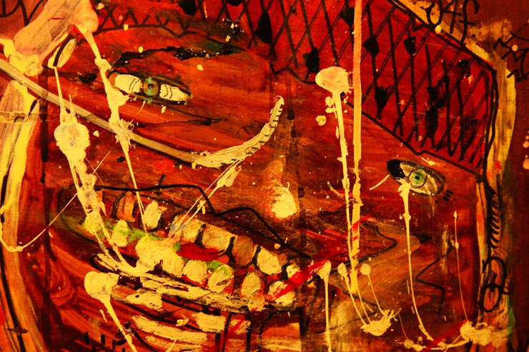
His new work on the street and in this studio now bends toward abstract expressionism and his years of comic book reading enlivens that rawness with a furtively bombastic character-driven personality. Almost every piece he does has some sort of commentary- a sort of helpful therapeutic narrative to explain what the character is thinking or feeling at the moment. “I like being bad for the sake of being bad”, “Tupac!”, “deathy”, “not good”, “astro zombie”,”power to the people”,“Kosbe don’t cry”.

Kosbe (photo © Jaime Rojo)

Kosbe also credits the street as his formative and evolutionary art instructor. “When I took an oil painting class, my teacher was like, ‘Dude you already know how to paint. How did you learn this?’ and I was like, ‘graffiti.’ ” Even though graffiti still attracts him and captures his imagination, Street Art and fine art have occupied his efforts lately and the combined synthesis of a lifetime studying art on the street and plenty of experimentation is coming together very strongly aesthetically. Combine that individual vision with the maturity that hits a person in their 30s and you may think that you are seeing a sudden glimpse of the future.

Brooklyn Street Art: I want to talk about you and your art and your influences. What are these characters? Where did they come from?
Kosbe: I don’t know. I’ve been drawing since I was real young.  It’s always something that comes naturally. I don’t do any sketches, I don’t plan anything out. I just – for me it’s more a guttural, more natural thing. It’s good and bad.

Brooklyn Street Art: What’s the bad part?
Kosbe: The bad part is that I don’t focus on it, you know? I just have been doing it so long and I really enjoy it.

Kosbe (photo © Jaime Rojo)

Brooklyn Street Art: Is your experience kind of like a faucet that you turn on and it all comes flowing out and then you decide, “Okay I better turn it off”?
Kosbe: Exactly, right. So the thing with me is, I try to also look for other outlets. So I’m really into other things. Like I like music, photography, writing, all that stuff. But that stuff doesn’t come as naturally to me like this does. But it’s a great outlet for me and I feel really kind of lucky to have something like that – to be able to express myself in that form and manner. It’s helped me out tremendously to kind of learn how to communicate with people. Every year I realize new things – like this is how I communicate with people. Is it bad? Is it bad that I think that this is the only way I think that I can talk to people? Maybe I’ve gotta learn how to become better with talking with people verbally or something.

Brooklyn Street Art: You don’t seem to have great difficulty communicating verbally. But I’m interested in understanding a little more about how you think of this work and this practice as communication.
Kosbe: There is definitely a lot of emotional stuff in my work, you know,

Brooklyn Street Art: There is! Despair, anger …– you use a lot of descriptive words, verbal narratives throughout – whether it’s a sticker or a wheat paste.
Kosbe: Yeah it’s whatever is always popping into my head and so there are a lot of things that are on my mind and hopefully this is a good way to have an outlet for it. I’m trying to not be so negative anymore. And some people are like “Man, it’s so dark”. You know I use a lot of bright colors now, which has been phenomenal. That has really changed my work. Here you can see some of my earlier stuff and it’s really brown, dark. Actually this is beginning where I started experimenting with more color. And then as I got to New York, more and more color started getting into my stuff.

When you do graffiti you learn the fundamentals of color theory, you know. You learn what works.

Kosbe (photo © Jaime Rojo)

Brooklyn Street Art: You know WK Interact talks about New York being a violent city
Kosbe: I love that guy! You know when I first moved to New York he had that little shop on the Lower East Side and you’d walk in and it was like a locker, a desk, and some Japanese kids standing around. And it would be like, “What is this? Is this a store? Is this a studio?”

Brooklyn Street Art: What made me think of him was I was interested in how you describe the city because WK has said that when he makes work on the street, if it is violent in nature and people walk by it, they sometimes give him the thumbs up! And it runs longer. But if he were to paint a pink bunny it would get crossed out because New Yorkers don’t really respond to positive cheerful stuff.
Kosbe: Oh yeah, and New York has definitely had a profound impression on me in that sense because my work before I got here still had that weird dark edge but it was a little cutesy-er. But like as time has progressed I just think I have kind of matured a bit more, becoming more of an adult and my stuff is getting more serious. But with me everything’s gotta be fun. I think it’s supposed to be fun.

Kosbe (photo © Jaime Rojo)

Kosbe (photo © Jaime Rojo)

Kosbe (photo © Jaime Rojo)

Kosbe (photo © Jaime Rojo)

Kosbe (photo © Jaime Rojo)

Kosbe (photo © Jaime Rojo)

Read more

Anti-Putin Street Art in Moscow

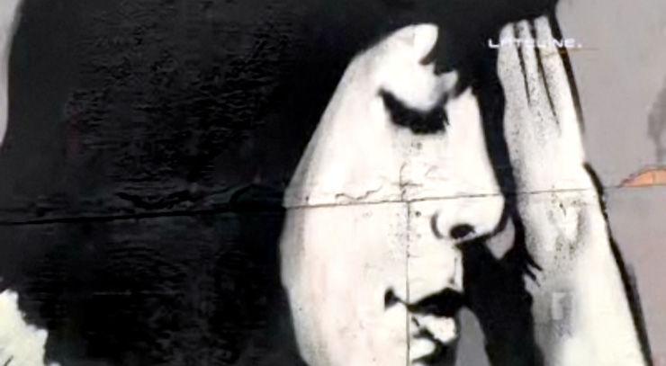
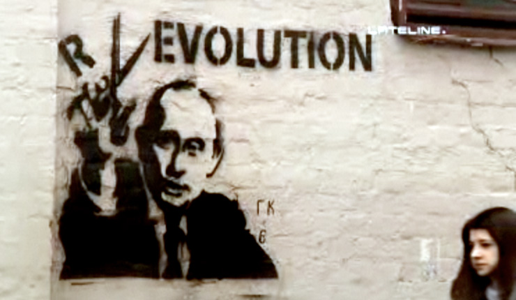
Norman Hermant, reporter for Australian news program Lateline did a story airing a couple of days ago profiling a new interest in Street Art in Moscow. According to the story the uptick in interest is spurred by the dissatisfaction many have with Russia’s political leadership and a general increased interest worldwide in Street Art. “Fans of the medium say the reason for its popularity is simple – street art can speak directly to the people,” reports Hermant.

Also fun to note: Despite decades of global graffiti culture, skater culture, hip hop culture, punk and anarchist subculture, political postering, and people’s movements to change predominant political paradigms through art, the newsreader here introducing the story attributes the Russian youth’s interest in Street Art to Banksy.

Still from video of news report on “Lateline” copyright Australian Broadcasting Corporation.

A detail from a piece by Russian Street Artist Pavel 183 in this still from video of news report on “Lateline” copyright Australian Broadcasting Corporation. Very possibly his name is inspired by Taki 183.

Still from video of news report on “Lateline” copyright Australian Broadcasting Corporation.

See the full report “Russian Protesters Turn to Street Art” HERE

Read more

Judith Supine Hits the Runway in Paris

Street Art goes high-fashion for ’13 with Street Artist Judith Supine

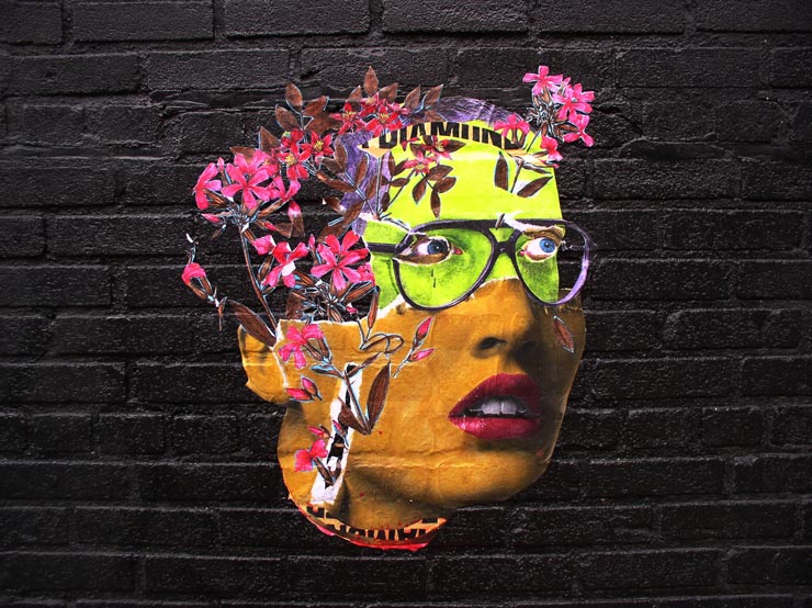
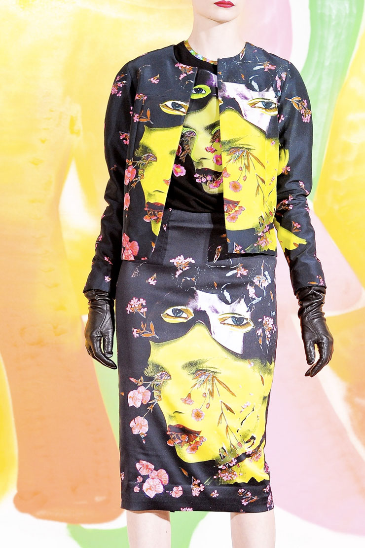
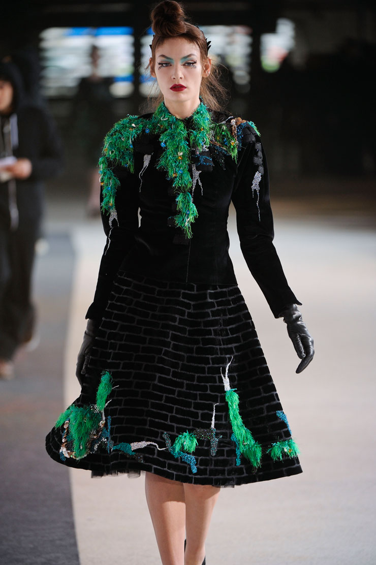
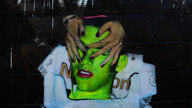
One image of a mysterious acid-green faced woman with pink flowers in her hair on a black brick wall reappears across a Ready-To-Wear line during Fashion Week by India based designer Manish Arora.

Autumn/Winter 2012-13 by Manish Arora at Paris Fashion Week (photo © courtesy Manish Arora)

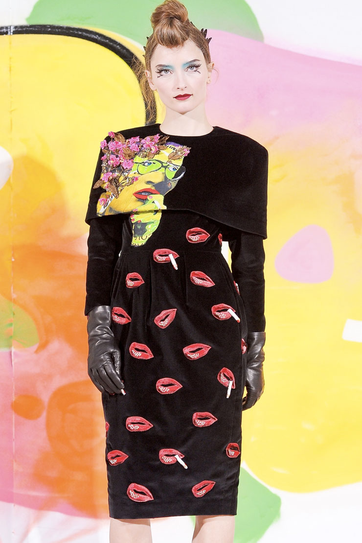
Street Artist Judith Supine shook slim hips on the runway last week with new stuff for Autumn/Winter 2012-13 as Arora collaborated with Supine for this new line of poke-out-your-eye moda. Manish must have seen the cover of the 2010 compendium “Street Art New York” for some inspiration, as the same image that graces the book appears here on blouses, and many of Supines’ signature acid green skinned ladies, smokers, and Brooklyn doyennes are splattered along with blossoms and moss across bolero jackets, pencil skirts, and 50s inspired ensembles.

The photo of a piece on the street by Judith Supine – and the cover of “Street Art New York” by Steven P. Harrington and Jaime Rojo.  (photo © Jaime Rojo)

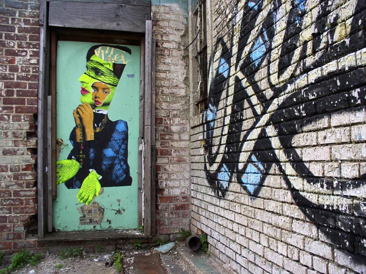
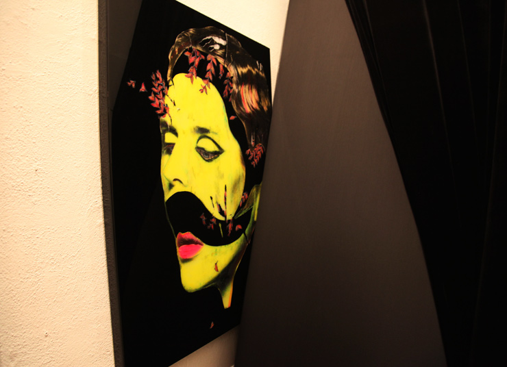
Supine’s high wire antics on the streets (and bridges) of Brooklyn are well known in New York, and his collage-based surrealist figures have stopped people dead in their tracks since the current scene exploded here in the last decade. Indicative of the fine art and figurative influences that plowed new paths for all manner of expression on the street, Supines’ work has eventually moved to badass galleries and adventurous private collections.

Autumn/Winter 2012-13 by Manish Arora at Paris Fashion Week (photo © courtesy Manish Arora)

Supine’s manager Naheed Simjee was in Paris for the fashion show and spoke to Manish Arora afterwards, who told her that in the process of designing this collection, the design team all became big fans of Judith Supine’s artwork. Arora pulled what spoke to him from the body of artwork and hoped he did the artwork justice.

Judith Supine (photo © Jaime Rojo)

“I was really amazed,” says Simjee. “Using detailed embroidering and taking elements like cigarettes in lips (which were hand embroidered on some of the pieces), exactly matching the color palette and the use of bright fuchsia flowers to decorate dresses and tops – all signature imagery in Judith Supine paintings, made the artwork really came alive on the models.”

Autumn/Winter 2012-13 by Manish Arora at Paris Fashion Week (photo © courtesy Manish Arora)

For the fashion line, Supine, who regularly pours through magazines for his inspiration, tells us he didn’t try to get too involved. He said he just liked the idea of the collaboration and allowed designer Arora to interpret his work in whatever way he liked. The official press release says that Agora (is) “very attracted to street art, it deserves a lot more attention than it gets.”  For Supine’s part, he’s pretty happy with the outcome too, and is looking forward to wearing one of the dresses.

Judith Supine (photo © Jaime Rojo)

Autumn/Winter 2012-13 by Manish Arora at Paris Fashion Week (photo © courtesy Manish Arora)

Judith Supine (photo © Jaime Rojo)

Autumn/Winter 2012-13 by Manish Arora at Paris Fashion Week (photo © courtesy Manish Arora)

Judith Supine (photo © Jaime Rojo)

Autumn/Winter 2012-13 by Manish Arora at Paris Fashion Week (photo © courtesy Manish Arora)

Judith Supine (photo © Jaime Rojo)

Autumn/Winter 2012-13 by Manish Arora at Paris Fashion Week (photo © courtesy Manish Arora)

Judith Supine at his “Ladyboy” show in Los Angeles last year at New Image Art (photo © Jaime Rojo)

Autumn/Winter 2012-13 by Manish Arora at Paris Fashion Week (photo © courtesy Manish Arora)

Judith Supine at his “Ladyboy” show in Los Angeles last year at New Image Art (photo © Jaime Rojo)

<<<<BSA>>>>><<<<BSA<<<<BSA>>>>><<<<BSA<<<<BSA>>>>><<<<BSA

See British Vogue for images from the full show here.

See SIMJEETEXTOR for more information about Judith Supine here.

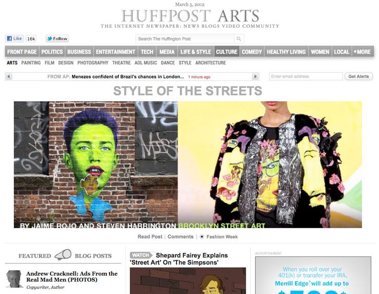
This posting is also published on The Huffington Post


Read more

Ron English Goes to Detroit With the Family (and wheat paste)

Street Artist Ron English has played many a visual trick on unsuspecting passersby, reflecting normalized consumer culture back through a funhouse mirror to illuminate the darker, more hypocritical aspects of unconscious living. Like the skits on Saturday Night Live, English’s brand of “POPaganda” has to stretch into the outlandish to lampoon the new normal, all for some social commentary that goes down with a spoonful of artistic sugar.

And now, for your voyeuristic edutainment, the reality show format is employed to take you on the revered “road trip” across the U.S. with the new American family: Ron, his wife, and kids (and assistants). Combining stunningly well-appointed suburban normality and bombed out urban abandonment, the gas-guzzling white flight this time is reverse back to the hood for a bit of wheat pasting, cameras in tow.  The final part of this brand new trilogy ties it all together, but you’ll notice the juxtapositions almost immediately along with the mundane and satirical. It’s just hard to know which one is which.

Part1:

Ron English in Detroit Part 2:

Ron English in Detroit Part 3:

Read more

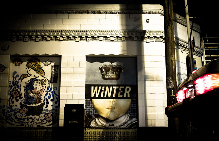
CYRCLE in LA ; A Winter Interlude

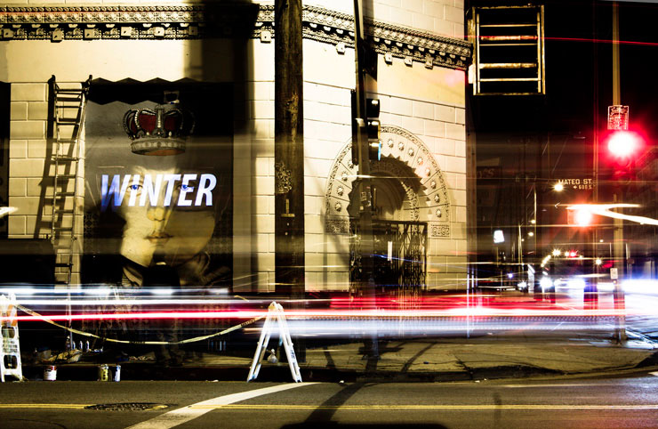
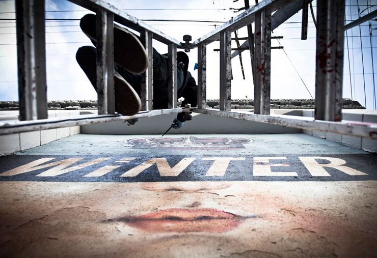
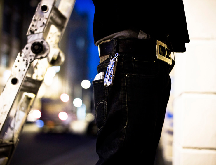
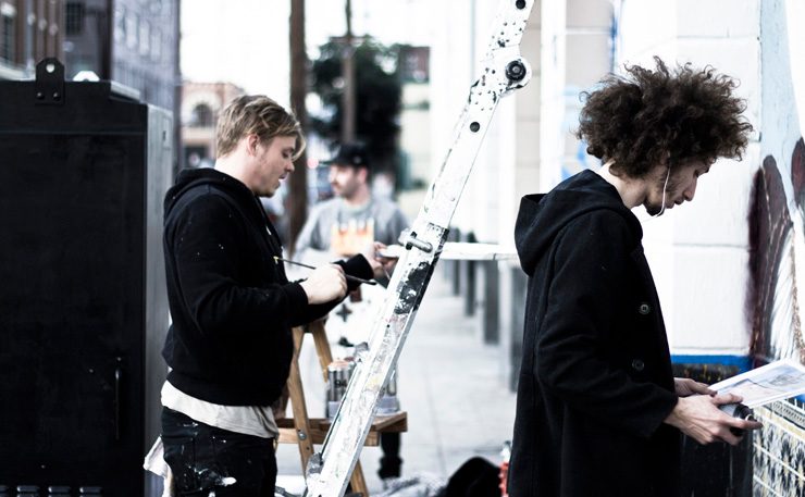
This section of Los Angeles is like so many – teaming anonymous streams of cars and trucks rumbling by, oblivious, almost menacing to you on the sidewalk with their rapacious roar as you ascend the ladder, can in hand, a glint of mischief in your eye. Headphones buffer the cacophony, the conversations with mates giving warmth in this garish flashing peopled no-mans’ land.

Cyrcle  (© Carlos Gonzalez)

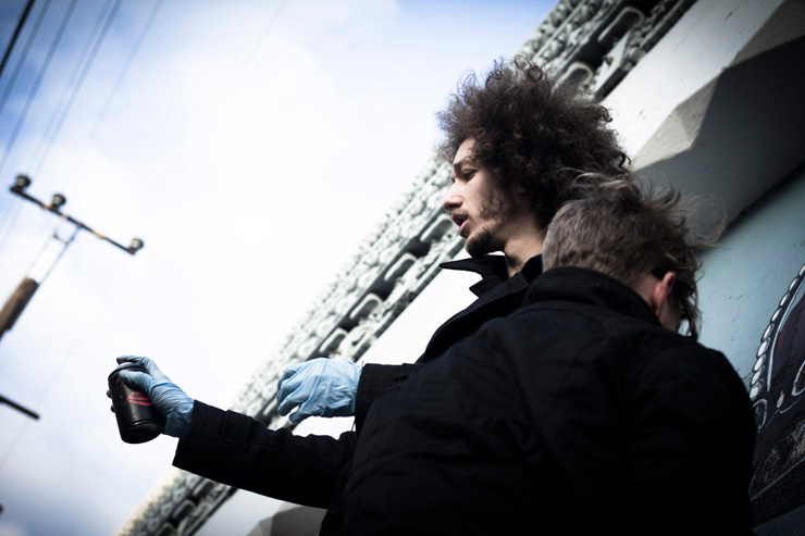
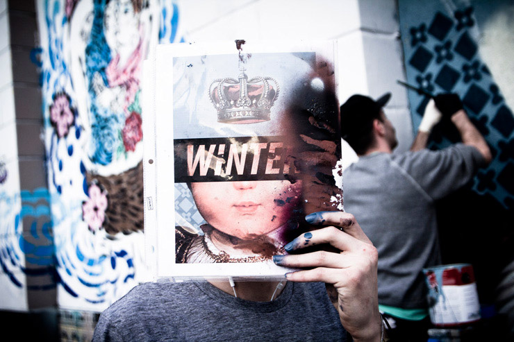
With a sense of satisfaction the Street Artist collaborative Cyrcle complete their first installment of a year-long series for  the LA Freewalls project on Mateo Street next to Aiko, Saber, and Kofie. Exclusively for you, photographer Carlos Gonzalez captures these artists in the Spring of life as they create in the bluish hues of Winter.


Cyrcle by Carlos Gonzalez (© Carlos Gonzalez)

Aiko next to Cyrcle’s new piece “Winter” (© Carlos Gonzalez)

Cyrcle  (© Carlos Gonzalez)

Cyrcle  (© Carlos Gonzalez)

Cyrcle  (© Carlos Gonzalez)

Cyrcle  (© Carlos Gonzalez)

Cyrcle  (© Carlos Gonzalez)

Cyrcle  (© Carlos Gonzalez)

Cyrcle  (© Carlos Gonzalez)

Cyrcle  (© Carlos Gonzalez)


Read more

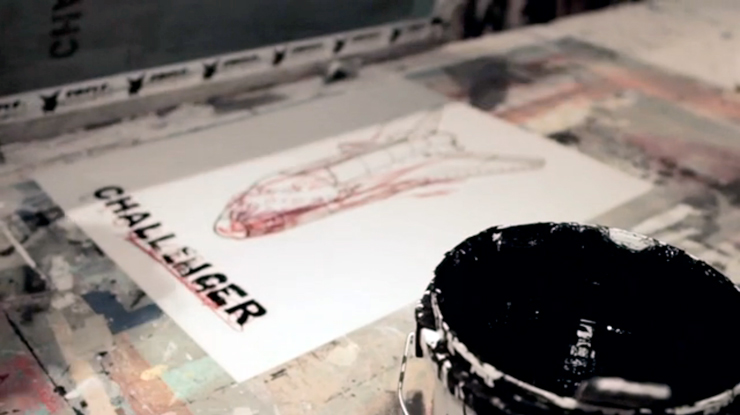
Brand New Faile Video – The 1986 Challenger Crash and It’s Impact

“Street Art: It’s a Living Breathing Thing on the Street,” says Patrick Miller

A few months ago, the independent doc filmmakers from Ride5 Films interviewed FAILE and did a beautiful, striking job of it.

The five-minute short film explores the motivation and the message behind their art – why they make it, how they make it and how they hope people will interact with it.

Of particular interest is the ruminating that both Patricks did about an historic event that affected them strongly as kids, and they explain in some detail the relevance of at least one of the recurring images in the Faile library – as well as the date 1986 (or number 86) that is often spotted in their work.

“…that night we were talking about the 1986 space shuttle Challenger disaster and we had very specific memories about where we were and what was going on that that time,” explains Patrick O’Neil.

With Special thanks to Ryan, Chris and Liz from Ride5 FIlms for sharing this with Brooklyn Street Art.


Read more

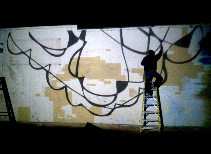
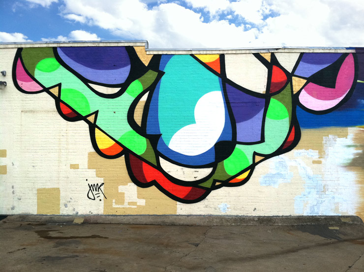
JMR Stars Again This Week In Dallas (not JR, he got shot, remember?)

YEEE HAAAAWWWW!  Brooklyn Street Artist JMR has been exploring the dusty detritus of Dallas for a spell and has found that some of the BIG D’s outlying areas remind him of the wildness of abandoned spots in Brooklyn that provided succor and inspiration to artists and performers and poets and wise guys at the turn of the century. But he has no illusions about the future for a lively hipster art scene here. For one thing, there are no redheads from Portland with 36 stringed home-made musical instruments connected to a projector here yet. Naturally while exploring, JMR brought some paint with him. Here’s what he’s been seeing…

JMR (photo © Jim Rizzi)

“The wall was offered to me in collaboration with a Dallas graff legend named Ozone. The building is a live-work space for two local guys starting a longboard company/music studio. They also repair motorcycles while watching documentaries in their make-shift living room; it’s a very early 90s Williamsburg ‘Frontier Land’ vibe, sans the imminent real estate surge. That’s never coming here and it’s refreshing. In the midst of this industrial lower class neighborhood at night you can light a fire and sit around it and talk about politics or whatever, while drinking beer and smoking.

There’s a bunch of hardcore graff writers out here as well, who I met through this painting.  Although the city is oddly devoid of any tags, throw-ups, or fill-ins, there is a major freight yard where trains lay up for days and people are getting busy. The trains are bombed well and it’s inspiring to watch them pass, and frustrating to try and snag flix with my iPhone, fumbling to keep up with the motion.”

JMR (photo © Jim Rizzi)

Read more

Gaia and Nanook New Baltimore PasteUps with Martha Cooper

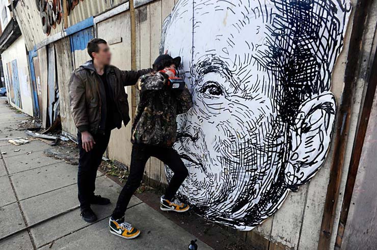
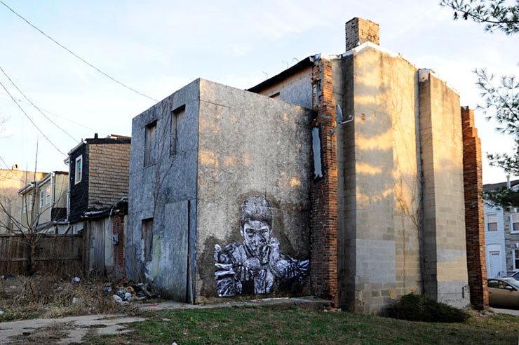
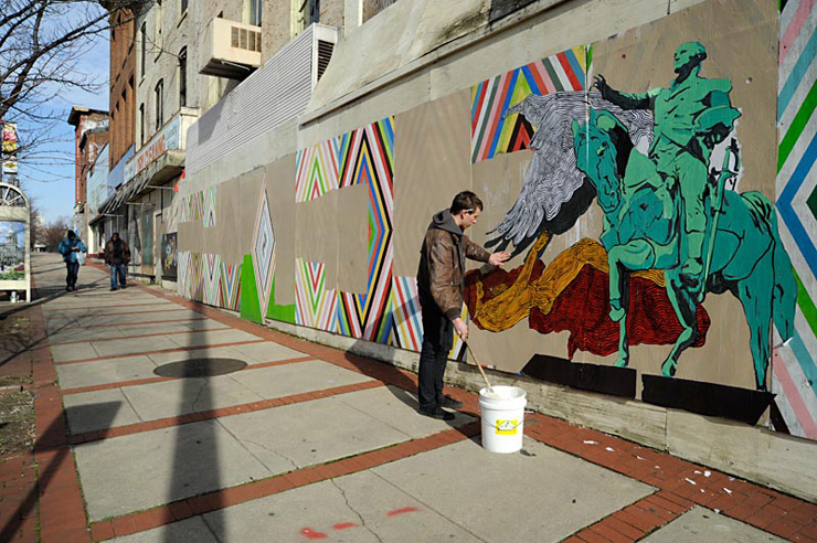
Last weekend Street Artists Gaia and Nanook had some fun touring around with photographer Martha Cooper in her neighborhood of South West Baltimore. Gaia’s ongoing “Legacy” series of big ol’ heads of white men – we should say portraits – who have contributed to the history of urban environments and conditions continues here too.

Photo © Martha Cooper

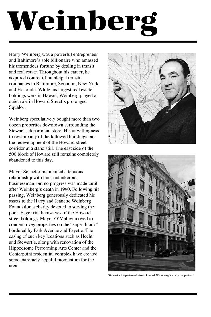
We’ve been seeing Gaia continue this theme recently in cities like New York, Albany, Atlanta, Miami and even his studio piece in our “Street Art Saved My Life” show last summer in LA – and it’s strangely rewarding and even entertaining…site specific postings of people like NYC’s master builder and corporate beneficiary Robert Moses from mid-20th century may look strange posted in the wilds of decayed New York, yet his big mug is probably more related to the state of our local economy than most people who are running things today. Where Moses’ critics accused him of destroying much of New York’s culture and life through building, Baltimore’s ill-famed developer is accused of killing parts of the city through active neglect. Gaia’s new big head is that of Baltimore billionaire Harry Weinberg, who bought clusters of buildings and abandoned them, effectively bringing blight to part of the city for decades, including today, according to Gaia’s position paper on the topic.

Gaia frequently assists passersby with helpful background information to help explain and contextualize his work like this one-pager above. (copyright Gaia)

“ First we installed a site generated piece of Weinberg’s portrait across the street from his formerly decrepit, now demolished, real estate holdings,” explains Gaia about his travels with the well-known street life photographer. Afterward they all  toured with Martha through her hood, hearing her perspective and insights on urban decay and sociological aspects of the neighborhood now better known as the site for the TV show “The Wire” – a tour which is a genuine treat BSA has also enjoyed.

Photo © Martha Cooper

Eventually it was time to put up a Gaia piece created from a Martha photograph of HE3 from the 1970s. Says, Gaia, “The piece is situated in an alley where a lot of the neighbors congregate and is right now the street from the active stables and pigeon coops.”

Nanook at work (photo © Martha Cooper)

 <<<>>><>BSA<<<>>><>BSA<<<>>><>BSA<<<>>><>BSA<<<>>><>BSA<<<>>><>BSA

See more images by Martha Cooper and read her posting on the events of the day with the guys on 12 oz. Prophet here.

Here is a link to the finished pieces on Gaia’s Flickr
http://www.flickr.com/photos/gaiastreetart/6662613139/in/photostream

Here is Nanook’s Flickr http://www.flickr.com/people/nanookart/

Read more

Texting at the Bus Stop, On the Bus Stop

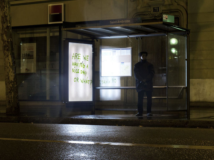
(Image © Ludo)

An interesting departure for Street Artist LUDO, the Parisian who’s usually messing with nature:  a new series of images show what appears to be bus shelters scrawled with clever phrases and plays on words. Can’t help but be reminded of Brooklyn’s Elbow Toe, another studio artist who places text-based snatches of poetry and reverie on dumpsters and doorways around New York. Without stylistic flourish or flair, this form of street texting has antecedents of course; Basquiats’ SAMO scripting, for example, and REVS underground diaries, among others. It raises questions about how one might define it? Street Art? Graffiti? It is just interesting to follow this thread that continues into this new year.

Elbowtoe (photo © Jaime Rojo)


Read more

How and Nosm Brand New Video – How They Started

Artists, muralists, and graffiti artists How and Nosm – “That’s what we do, that’s who we are.” In this new video they talk about their beginnings in the world of graffiti, before becoming world renowned fine artist and epic muralists.

Produced and directed by The Little Squares.

Read more

BSA in Print : Pantheon, The Book

Public, Urban, Street, Unauthorized, Permissioned, Private, Graffiti, Vandalism, Fine Art, Installation, Throwie, Portraiture, Poetry, Sticker, Sculpture, Aerosol, Line Drawing, Wheat paste, Yes. All of it applies and all of it is part of a large conversation that has been happening in New York for about 50 years, probably before that. The intersection of art and the street is by nature open to the interaction of every person. At its core is an expression that is human, and the reactions to it are likewise. ” – Steven P. Harrington and Jaime Rojo in PANTHEON: A history of art from the streets of NYC

An installation for “Pantheon”. Sadue, Gen2, Oze108, Droid, Goya, UFO, 907 Crew (Photo © Jaime Rojo)

When the erudite artist and alchemist Daniel Feral first talked enthusiastically in the summer of ’10 about his plans to mount a tribute to NYC graffiti and Street Art across the street from the Museum of Modern Art (MoMA) in ’11, we surveyed the large display windows of the former Donnell Library with their grand sweep on 53rd Street in Manhattan, and thought, “Why the Hell not?” As months rolled by and we continued to communicate with Feral and co-curator Joyce Manalo, the once medium sized exhibition grew larger in depth and scope – each time.

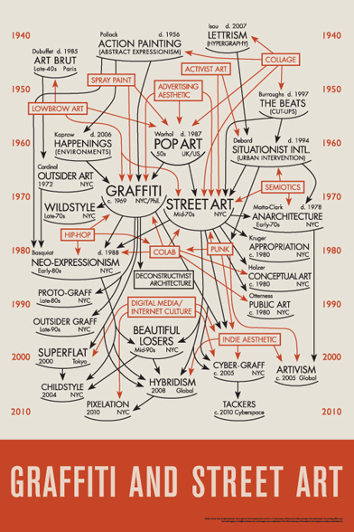
Truly a grassroots effort that was free of institutional or corporate restrictions, the PANTHEON show was funded by a modest Kickstarter campaign and administered under a non-profit. Each role and skillset was donated, as was all the labor – freely given by people involved in the scene. When the windows were unveiled in April of 2011 to the thousands of daily passersby, their Pantheon dream had grown into a full fledged installation of historic and current NYC graffiti and Street Artists, a 426 page tome of academic quality and behind the scenes insights, and the new iconic “Feral Diagram” that was quickly snapped up for display and sale at the historic “Art in the Streets” show in Los Angeles.

PANTHEON, the book, was one of three published works that BSA was honored to write for and provide images for in 2011. In the process of building PANTHEON, the exhibit, many new ideas and relationships were born, and like it’s muse – graffiti and all it’s cousins, it continues to organically grow in influence in New York and around the world. As 2012 begins, Daniel and Joyce are beginning a publishing and curatorial company, Pantheon Projects. Together in 2011 the artists, writers, historians, academics, curators, and photographers in PANTHEON told a story about an organic movement over time, helping us to understand this moment.

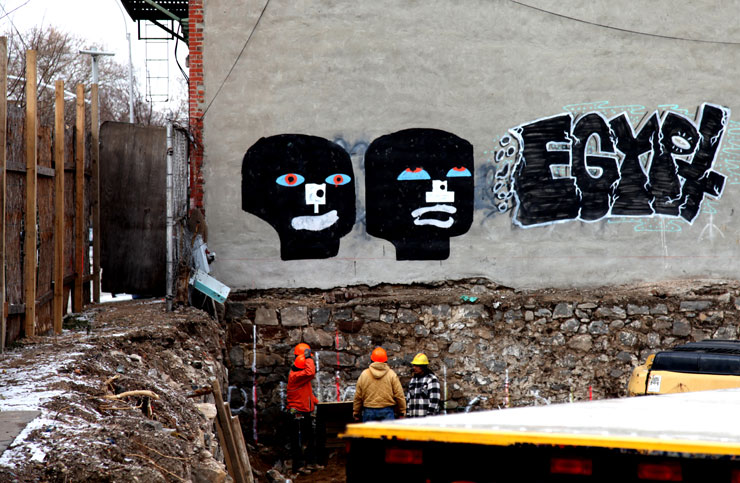
Cassius Fowler. Egypt (Photo © Jaime Rojo)

For our part, BSA furnished a chapter in the book about the first explosive decade of Street Art in the 2000s in neighborhoods where it was most impressive and untamed, especially Brooklyn. “PANTHEON: A history of art from the streets of NYC” allowed us to put in context the importance of the public sphere and how people create in it, whether commissioned, approved, or otherwise.

“Brooklyn Street Art (BSA) has been watching, recording, curating, interviewing, and interacting with this scene and its many players and passing on what we’ve learned to readers on our blog, which now number into the thousands daily. As experts in a field of many experts and opinion makers and fans, we like to assess and synthesize the messages and movements among the madness that is the “Street Art Scene”.  As artists and creative professionals in New York for 25 years, the primary draw for us is the creative spirit that is alive and well on the streets and its fascinating ability to continuously recreate itself without the dictate of any one overriding legislative body. This organic growth of art on the street is like seeing Spring eternally. It didn’t ask anyone for permission, and it defines itself. Un-bought and un-bossed, this is a truly free movement born of the people. Not that we are overly romantic about it, mind you.”

Overunder. No Touching Ground (Photo © Jaime Rojo)

Sadue, Gen2, Oze108, Droid, Goya, UFO, 907 Crew (Photo © Jaime Rojo)

PANTHEON was the group exhibition on Graffiti and Street Art that took place on April 2 – May 1, 2011 at the former Donnell Library across The Museum of Modern Art. Daniel Feral and Joyce Manalo Co-Curated this show with 33 participating which included Abe Lincoln Jr., John Ahearn and Rigoberto Torres, Adam VOID, Cake, Cassius Fouler, Darkclouds, Droid, El Celso, Faro, John Fekner and Don Leicht, Freedom, Ellis Gallagher, Gen2, Goya, Groser, Richard Hambleton, infinity, KET, LSD-Om, Matt Siren, NohJColey, OverUnder, Oze 108, QuelBeast, Royce Bannon, Sadue, Jordan Seiler, Stikman, Toofly, UFO and Vudu. 

The 426-page catalog is a hybrid of scholarly journal, popular magazine, and graff zine. 33 artists from the 1970s through today tell their own histories, in their own words and pictures, while local writers and photographers give an overview of the cultural milieu. The catalog includes a dedication to Rammellzee by Charlie Ahearn, essay on the Feral Diagram by Daniel Feral, Street Art in the 2000s by Steven P. Harrington with photographs by Jaime Rojo, in addition to 20 essays, 20 interviews and over 400 images from the efforts of over 30 individuals.


Read more

Street Artist XAM : Architecture for the City Bird

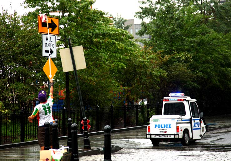
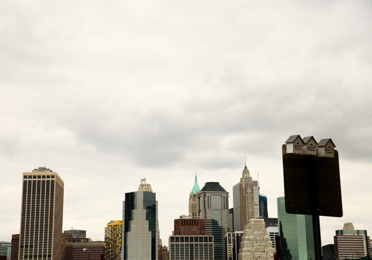
Architect to the urban aviary set, Street Artist XAM is one rare bird. Averaging one per week over the last year, the California born former graffiti writer has designed, constructed and installed homes and feeders for New York City birds on street signs above your head.

While studying architecture and object design at the School of the Art Institute of Chicago, he followed an open interdisciplinary structure that allowed him to develop his vision, and made him prove the soundness of his work. “I had very intense conceptual-based architectural studio courses in school that didn’t allow time to slack off, to say the least.”

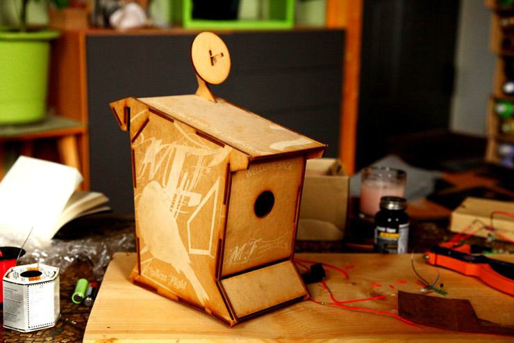
He points to his years as a student as pivotal in his development as a thinker and artist today. That’s probably why his design, materials, and technical discipline can stand up to academic rigor, but it won’t completely explain why these bird “dwelling units” have a satellite dish for television reception, a solar panel on the roof powering a night light, nor the certain minimalist elegance overlaying it all. Clearly XAM is a Street Artist for more than just the bird watchers and one worth keeping your eye on.

XAM (photo © Jaime Rojo)

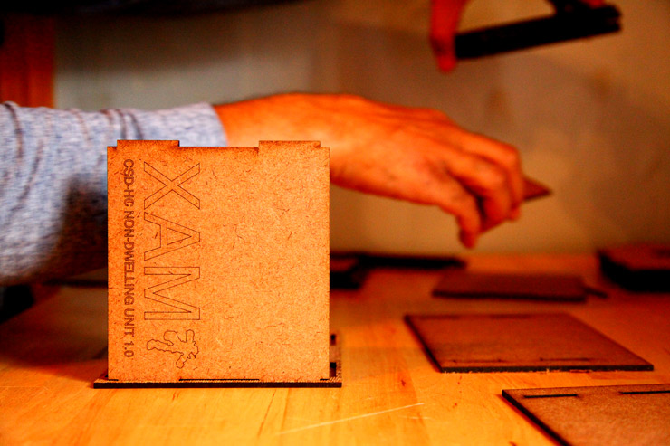
With military influenced abbreviation and terminology and a three decimal point precise measurement for components, XAM creates his installations with specific intentions for their use. That said, despite a rigid “rule set” the work has a lot of humor, and even social commentary. There are the Dwelling Units; intended for all the comforts of a modern fine-feathered home, the Feeding Units; a sort of fast food option in your busy bird day, and the brand new Non-Dwelling units; a conceptual project that disallows entry into a “Foreclosed” unit – inspired by our bank-induced housing crises.

For ease of conversation, there is a real need to categorize stuff that happens in the public sphere – and we default to the term “Street Art” or “Art in the Streets” most of the time. But sometimes we find a new category and we lack a sufficient way to describe it. XAM is part architect, engineer, designer, environmentalist, social activist, urban ornithologist, Street Artist, graff writer, and humorist. His output is all within the self-induced confines of a rational process that is defined and re-defined based on results, and whim. The installations actually feed birds and provide shelter to them. They are not commissioned, not permissioned, and not vandalism. They are labor intensive thoughtful one-offs ⎯ a handmade functional sculpture that takes XAM eight to ten hours to complete, and yet you can easily lift it off a sign and take it home.

A very green dwelling unit by Street Artist XAM (photo © Jaime Rojo)

As frequently occurs on the graffiti and Street Art scene, the artist has adopted his nom de guerre, an alternate persona that he inhabits and views the world through when working. It could be an idealized version of himself, or a refracted image of his id. As you might surmise, often the fictional is autobiographical. In this case, XAM says his character is a purple robot.

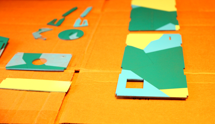
From his tiny shared Brooklyn apartment, XAM showed us his complete process in detail – converting surfaces and home-made ventilation structures into an economical production facility before our eyes. In the following extensive interview with BSA, XAM’s very first, the artist explains his process, intention, inspiration, and what educational television programming he envisions for the city birds who stop by.

XAM (photo © Jaime Rojo)

Brooklyn Street Art: Can you describe the steps or phases that are necessary to build one dwelling unit?
XAM:
With my original dwelling units (CSD series) I did a ton of research on common birds that make use of birdhouses. I read through books, blogs and articles to make sure I fulfilled all requirements in making a proper birdhouse. I then added what I obtained from my contemporary design education to make the units as efficient and self sustainable as possible.

The more I built, the more I took notice of birds in the urban environment and how they were much more adaptable than the research I had been provided by “backyard” birders. I could not find information regarding building birdhouses for use in a city so I learned by observation. From there I started my Sculptural series, which allowed me to create a form that uses less material, identifies the units as more of a contemporary object and removes itself further from the archetype of a bird house.

My steps include;

  1. Coming up with a design by drawing in Illustrator or on scraps of paper,
  2. Designing my cutsheets in Illustrator,
  3. Sending my file off to get cut by my laser cutter,
  4. Painting my designs and masking for each color,
  5. Clear coating,
  6. Soldering the wiring,
  7. Assembly,
  8. Clear coating again,
  9. Hanging my work on a sign near you.

XAM rests on a sign by Street Artist Dan Witz (photo © Jaime Rojo)

Brooklyn Street Art: How does a dwelling unit vary from a feeding unit?
XAM:
My dwelling units, unlike my feeding units incorporate passive ventilation, solar panels, LED porch lights (to attract insects), green roofs (for insulation), a food storage area that I fill before hanging and a dwelling space. My feeding units are gravity fed and the feeding trough is refilled from a large food storage cavity.

Brooklyn Street Art: You’ve been a graff writer, street artist, and architect. Somehow this project ties it all together.
XAM:
For sure. The form of my original unit was inspired by the letter “I”. The façade is similar to the results you would get from framing sections of a graffiti piece. The exterior also brings me back to when I used to create stencils and the overall form plays with volumes and functions the same way architecture does.

XAM (photo © Jaime Rojo)

Brooklyn Street Art: How do you think your training as an architect impacted your process?
XAM:
It has made me a very harsh critic of my own work. I continue to reexamine everything I produce to make sure every detail has intention and serves a purpose. I also find myself trying to make my process more efficient by sourcing cheaper and locally found materials, improving storage (I just designed my own modular storage units), cutting costs, and attempting to lower my carbon footprint.

Brooklyn Street Art: You talk about doing your work and your projects with a sense of “intention”. Can you describe that?
XAM:
My units are intended to share my education, interests and to create curiosity. In my eyes, progress comes from education and being curious… I am also aware of street art being ephemeral and so I create my work so that it can easily be removed if seen as a blight to the surrounding community.

XAM (photo © Jaime Rojo)

Brooklyn Street Art: With an almost regimented methodical approach to planning, constructing, and installing, do you ever find that the rule set under which you operate needs to evolve?
XAM:
I do see my process as always evolving. By reexamining my creations, I understand more about my results, but interestingly, I have never done the same thing twice. I am always pushing forward and working on the understanding of all my interests regarding my project.

Brooklyn Street Art: From a stylistic perspective, one can see influences of Modernism and Bauhaus in your work. Where and who do you draw your inspiration from?
XAM:
Modernism and Bauhaus are two major design/art movements that I do deeply admire. I like the idea of using new materials and technologies to expand the definition of art and design. In a way my units are similar to the Case Study Houses of the late 40’s, 50’s and 60’s.Through research, I try to make the most efficient birdhouses and feeders possible that can be reproduced on a large scale, but retain individuality. I am inspired by artist/designers that push boundaries like Louis Sullivan, Frank Lloyd Wright, Le Corbusier, Victor Horta, Gustav Klimt, Santiago Calatrava, Charles & Ray Eammes, Daniel Libeskind, Eero Saarinen, William McDonough, Mies van der Rohe and so on. At the same time I am also very interested and inspired by biomimicry, movement through space, and removing oneself from the “mundane”.

XAM (photo © Jaime Rojo)

Brooklyn Street Art: Are you encouraging birds to become slovenly dropouts from society by installing Dish network on the dwelling units? Might this contribute to a larger percentage of overweight birds who cannot touch their claws?
XAM:
In all honestly I hope the Dish network only encourages the birds to tune into educational programs like Design e², Art 21 and Teenage Mutant Ninja Turtles. The TV package accounts for a large portion of my per unit cost, and I do hope that it is used in productive manner.

Brooklyn Street Art: The patterning on the sides of the units is evocative of camouflage. Were you intending to help the units blend into the environment?
XAM:
The interesting thing is, I did not mean for this to happen, but when I look at my intention and manner of execution I realize that the result is camouflage. I simply wanted to play with the juxtaposition between variants of value and size of shapes to create the illusion of foreground and background.  I later realized that I was recreating Razzel Dazzel – a camouflage effect used on British naval ships during WWI and also a short lived art movement.

XAM (photo © Jaime Rojo)

Brooklyn Street Art: When you talk about XAM, he is a third person – a robot with a specific personality and set of behaviors or attitudinal characteristics.
XAM:
I found it interesting that in graffiti, street art and logo design, an identity is associated to your name. The companies, street art and graffiti that I found myself remembering and interested in have a strong identity that remains consistent… I spell XAM in all sans serif caps because I like the strong architectural structures that the letters create. XAM is a larger than life rogue-bot with a destructive interest in contemporary architecture. He destroys the architecture that he loves so much to investigate its functions, but he can’t help it due to the way he was programmed. Remorse is deeply felt by him, so to give back he creates contemporary birdhouses for communities around the world. As a kid I use to love to destroy electronics to understand their functions. In a way XAM is The Hulk and I’m Dr. Bruce Banner.

Brooklyn Street Art: Do you have any other personalities, or is it pretty much you and XAM?
XAM:
XAM is my only personality, but as I progress in creating work around XAM, I realize he has more interests needing to be expressed, therefore expect to see a lot of new work as time progresses.

XAM (photo © Jaime Rojo)

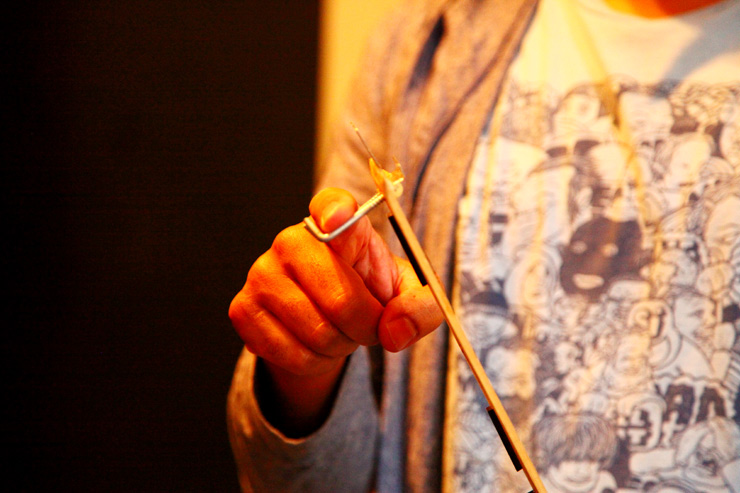
Brooklyn Street Art: Your method of installation; using a custom designed utilitarian “Swiss Amy knife” all-in-one tool, leaves the unit resting upon a sign. Why not make the installation more permanent?
XAM:
I like the community to decide the longevity of my work. I guess I like playing with ‘Grey Areas’. Are we supposed to accept and/or appreciate the units because they are in a way trying to reverse our destructive effects on nature? Or should we remove them because they are illegally placed? I like to provoke thought and challenge our belief system as well as expand definitions.

XAM (photo © Jaime Rojo)

Brooklyn Street Art: You include a small QR code on the bottom of each unit. Where does that take someone if they scan it?
XAM:
The QR code is located on the unexposed back of each unit and is intended to be discovered by the person who decides to remove my units. When scanned you are taken to a list of facts that explains how we benefit from birds in the urban environment. You’re asked a question of morality, then you are given my email address to bring up any comments or concerns.

Brooklyn Street Art: Sometimes the placement on a sign blocks the letters of the sign. Does that endanger anyone?
XAM:
Many signs are printed on both sides. What appears to be the cover up of an important message is just a waste of paint due to the direction of traffic never facing the back of the signs. A piece that I put up last March in NY is still hanging on a one way sign and I believe it is for this reason. I am making use of a common useless space.
XAM (photo © Jaime Rojo)

Brooklyn Street Art: How long does a typical unit remain on the street where you place it? Have you ever seen one being taken?
XAM:
It all depends on where it has been placed. When hanging in Willamsburg, Brooklyn the units last about as long as a scoop of ice cream in the Sahara Desert. When mounted in industrial parts of LA, I see units remaining up from multiple visits prior. It all depends on location. I tend to avoid Willamsburg these days due to the lack of longevity.

XAM (photo © Jaime Rojo)

Brooklyn Street Art: Can you talk about how sustainability enters into the planning of each unit?
XAM:
I make sure that my units have no unnecessary functional attributes.  I use a structural material that is the byproduct of another process.  I take advantage of resources that are renewable (the sun, gravity, plant life, and weather). Environmental ethics are deeply seeded into all my work.

Brooklyn Street Art: Have you considered creating your custom materials?
XAM:
I am very interested in getting involved in as many aspects of the project as possible. I would love to eventually make my own paint, structural materials, solar panels, energy storage units and bounding agents. As time progresses, I know I will only get deeper into my process and have my hand involved in more aspects.

XAM (photo © Jaime Rojo)

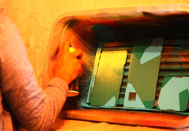
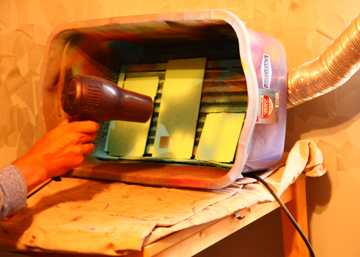
Brooklyn Street Art: The spraying process alone is so impressive with the pragmatic selection of materials and venting, and economical use of space…
XAM:
Originally I had a studio near my apartment. (After that) I was painting my units on the streets in cardboard boxes. I tried to find a place to rent a spray booth by the hour, but eventually I drew up plans and made my own. I now paint in my house using a retrofitted storage bin that has a bathroom fan for ventilation, a heater filter to catch paint and other partials – plus a dryer tube to guide the exhaust out my window.

XAM (photo © Jaime Rojo)

XAM (photo © Jaime Rojo)

Brooklyn Street Art: Initially the color palette was purple, lavender? Why? Why did it change?
XAM:
The exterior of all the units is actually composed of fragments of XAM. I scale and crop sections of XAM’s body to create compositions on the façade, then I paint them in multiple values. Originally I used a monochromatic color scheme of purples because XAM is purple and his body is what wraps the surface. Slowly I phased out that rule by using at least one purple. Now it no longer matters to me because I have always been interested in the use of color.

Brooklyn Street Art: If Dish TV approached you to do a collaborative project, would you dress as a purple robot for the commercial?
XAM:
I wouldn’t want to sellout by being XAM in a Dish TV commercial. I would rather be an extra in the background dressed up as Sweetums, the big scary, hairy monster from the Muppets who is nothing more than a gentle giant. Wait, that sounds kind of like XAM…

The original prototype for the Dwelling Unit. XAM (photo © Jaime Rojo)

XAM (photo © Jaime Rojo)

Brooklyn Street Art: Not only do you utilize nearly the entirety of a sheet of tempered hardwood, you use your relatively small living space as your workspace also.  Would you prefer a separate studio, or do you like to challenge yourself to maximize resources?
XAM:
I always make sure I minimize my waste and make all parts of my process as efficient as possible. I have been offered a free studio that is probably 10+ times the size of my entire apartment, but I don’t feel I need that much space. I like the intimacy and the efficiency I experience by having to work in a small space. My work is modular and packs flat so it is all about using space and material efficiently. I feel working in a small space reinforces my design philosophy.

XAM (photo © Jaime Rojo)

Brooklyn Street Art: Can you talk about your new collection of foreclosed units and the intersection with social or political advocacy?
XAM:
I feel my work has always had a social and political voice, but one that may not have been realized on a large scale, perhaps understood more by contemporary designers. With the introduction of my NON-DWELLING series I feel I have created a voice that hits home and that a larger audience can understand. By creating what I view as the same spectrum, I hope to open up an opportunity to understand my CSD work. In a way, I am giving a thought provoking solution or option (CSD series) to a problem we face (NON-DWELLING series).

Brooklyn Street Art: You have a vision of how the “Foreclosed” units will change over time, right? It kind of makes me think of squatters and homeless people taking over abandoned real estate.
XAM:
With my NON-DWELLING units I have glued the structure with waterproof wood glue and the mounted signage with water resistant wood glue. I look at America as a country that is constantly reinventing itself over time. With time we will discover a solution to our housing crisis and with time (and weather) the “Price Reduced”, “Foreclosure” and “Bank Owned” signs will fall from the units and allow birds to live in the once vacant houses… To be honest, I would love it if homeless birds were to expedite the process and remove the signs themselves.

XAM (photo © Jaime Rojo)

Brooklyn Street Art: Do you see your work going forward containing more message-driven content?
XAM:
I feel like my work has a message behind it, but I am beginning to realize that it may not be so obvious or people don’t care enough to realize it. I will continue to figure out ways to deliver the same message with different work.

Brooklyn Street Art: What motivates you to do this project?  In the last 12 months you must have spent 1,000 hours of your life doing this.
XAM:
In my eyes the design process only ends when you decide to step away from it or deadlines require you to do so. There is always room for more research, investigation and understanding. My project has no final deadline to meet and endless amount of opportunities to reinvestigate, therefore I continue to work at it. I am an artist/designer that is very interest in the process.  Once the work is done and examined, I move on to the next area of investigation. On top of that I love to explore. Crossing my design interests with street art fulfills all my needs.

XAM (photo © Jaime Rojo)

This article was also published on The Huffington Post,


Read more