All posts tagged: Straat Museum

Graffiti, Architecture, and the Art of the Letterform at STRAAT in “Graffitecture: Typographic Blueprints”

Graffiti, Architecture, and the Art of the Letterform at STRAAT in “Graffitecture: Typographic Blueprints”

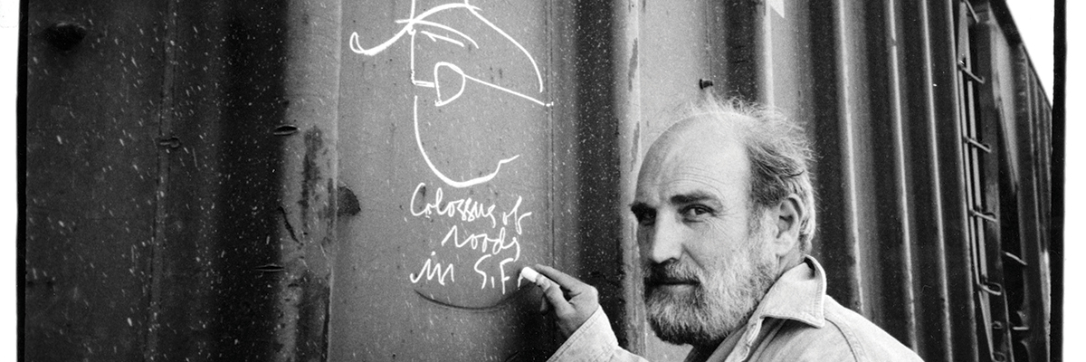
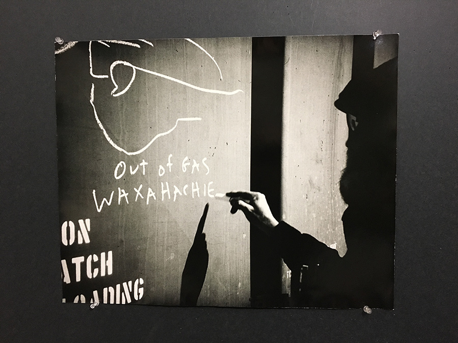
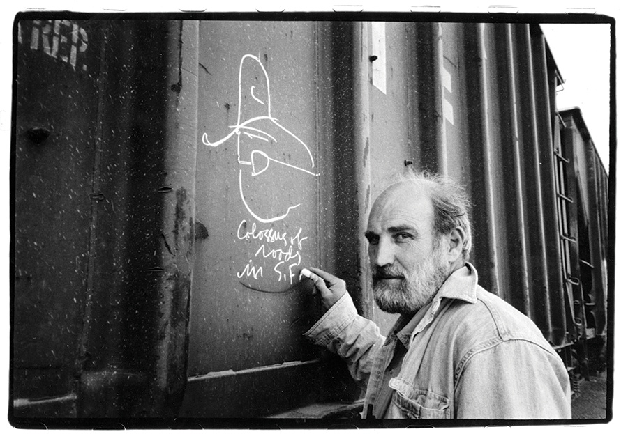
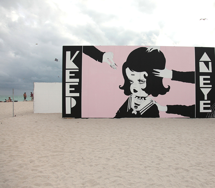
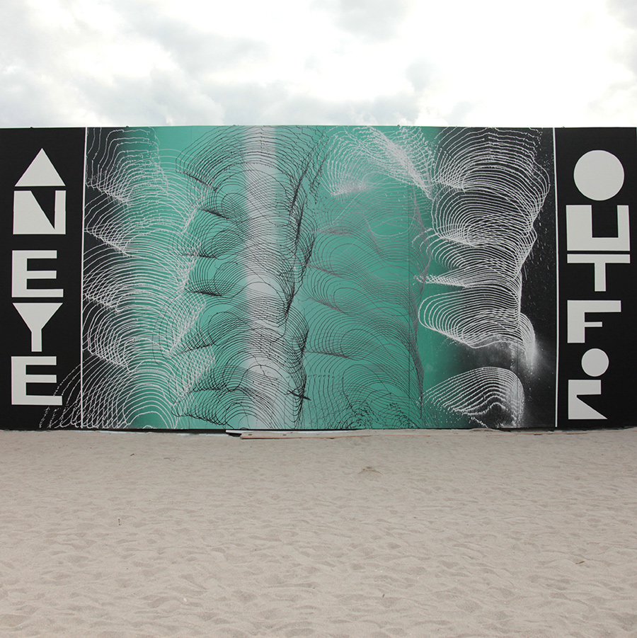
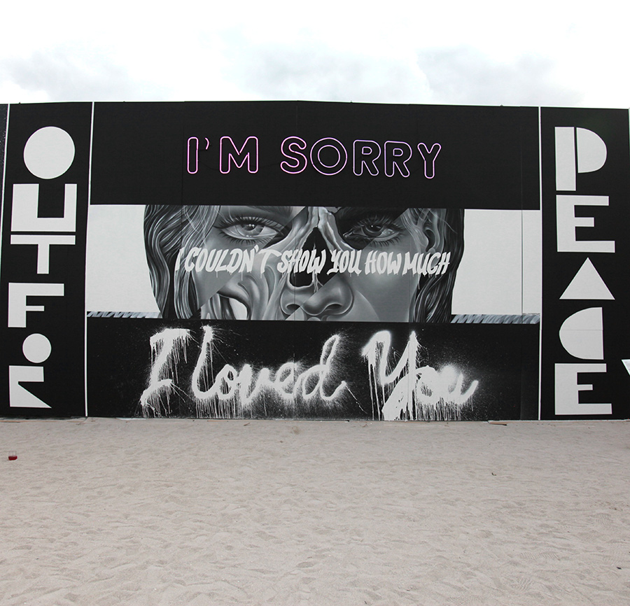
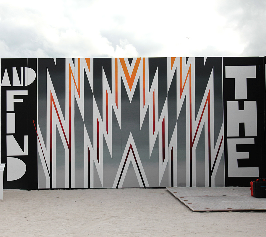
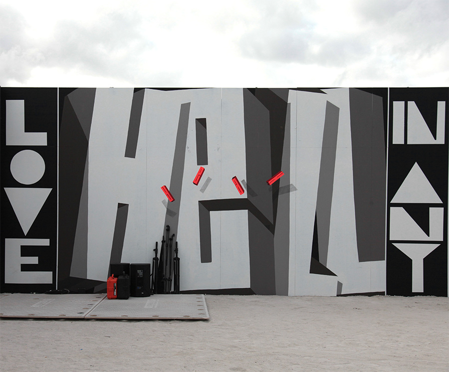
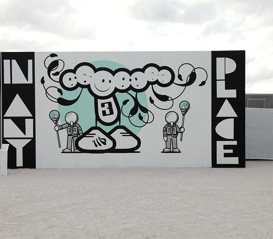
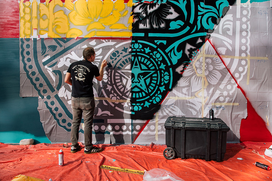
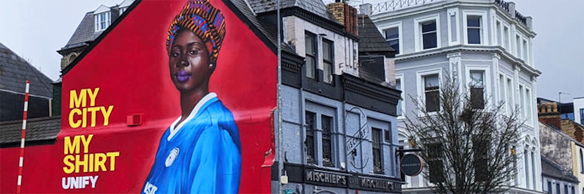
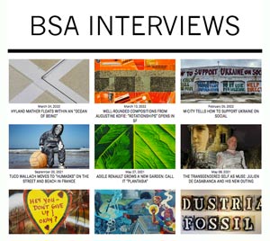
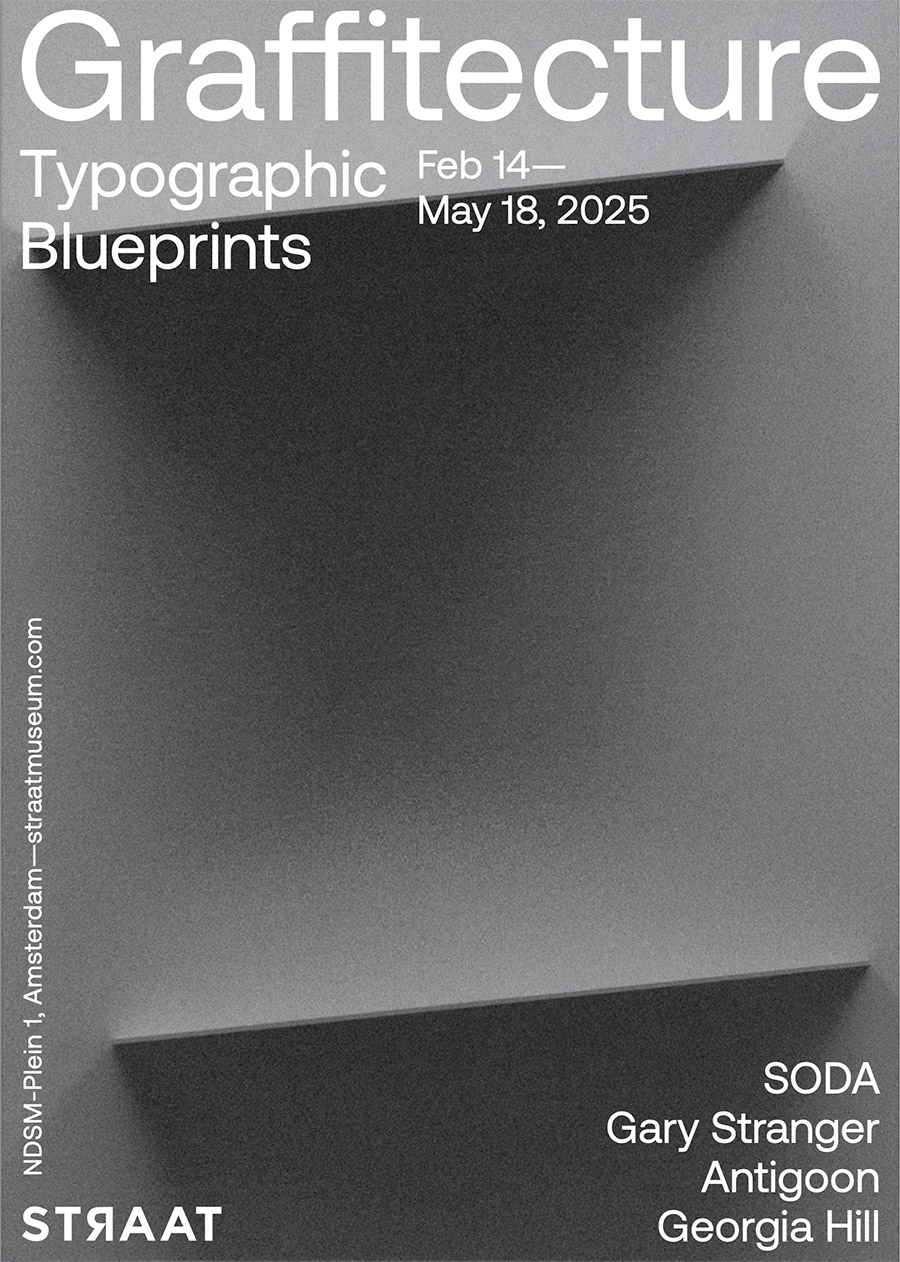
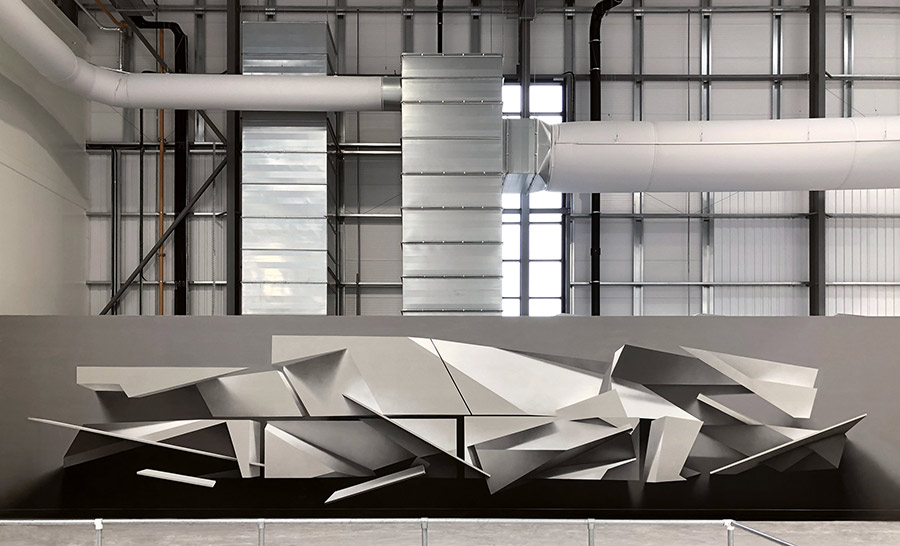
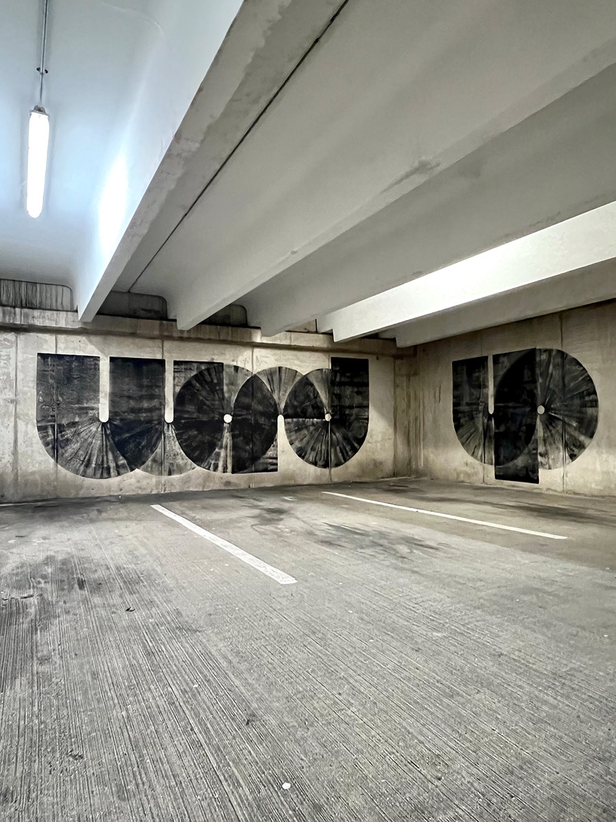
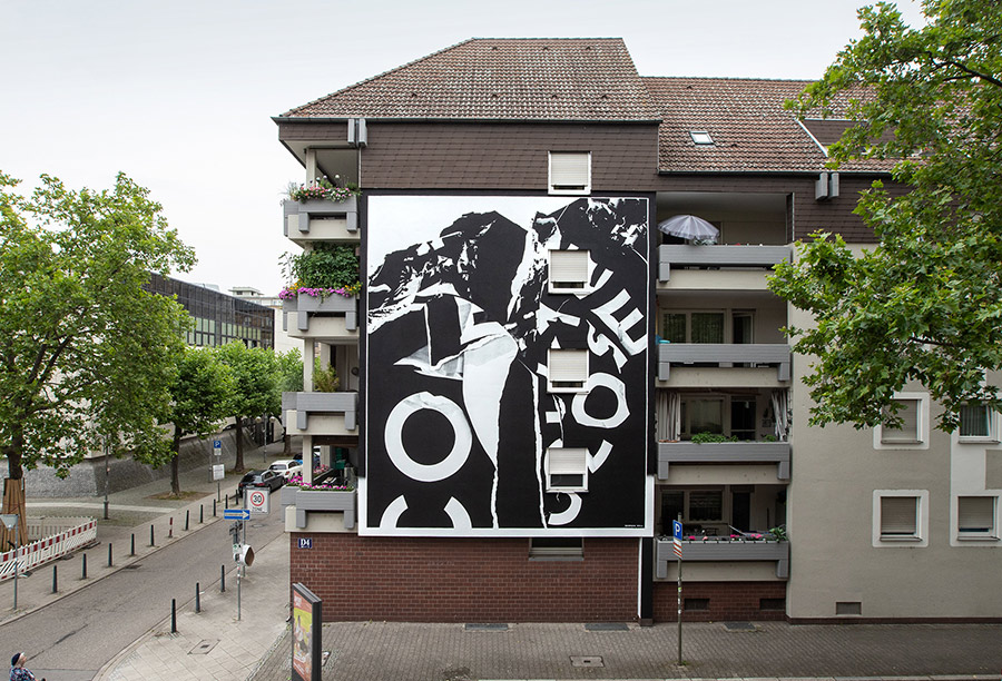
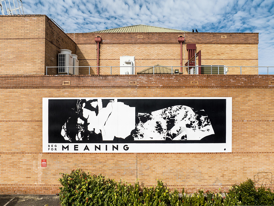
Graffitecture: Typographic Blueprints, on view at STRAAT Museum from February 14 to May 18, 2025, explores the evolving relationship between graffiti, typography, and the built environment. Curated by Hyland Mather, the exhibition brings together four artists—SODA, Gary Stranger, Antigoon, and Georgia Hill—who each push the boundaries of letterforms, blending street-born spontaneity with architectural precision. With around fifty works and several installations, the show underscores how graffiti’s evolution extends beyond its rebellious origins, shaping contemporary urban aesthetics through language and form.

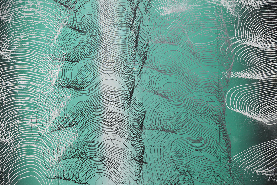
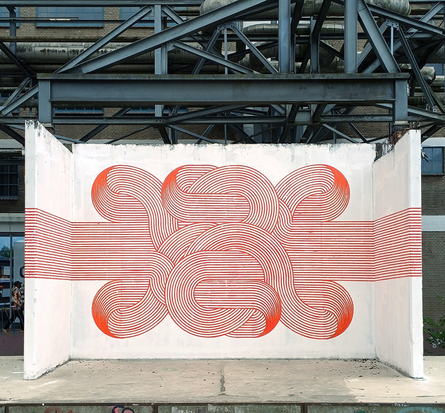
What unites these artists is their ability to challenge traditional notions of typography and its place in public space. SODA’s optical illusions introduce a trompe-l’œil effect, where depth and structure emerge from flat surfaces. Gary Stranger, with his graffiti roots in MSK, refines letterforms into architectural compositions that exude elegance and control. Antigoon’s machine-assisted process introduces an almost industrial approach, evoking the mechanics of urban construction. Meanwhile, Georgia Hill’s poetic monochromatic works harness language as both message and material, inviting reflection through carefully curated phrases. Together, they offer a dialogue between chaos and control, craftsmanship and spontaneity, underscoring how typography continues to redefine urban landscapes.

BSA spoke with Curator Hyland Mather and the four artists about their practice and the show.

BSA: As an artist known for assemblages of ‘lost objects’ and a curator deeply involved in street culture, how do you perceive the intersection of graffiti and architecture influencing contemporary urban aesthetics?

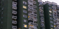
Hyland Mather: Well, to start, graffiti and architecture have always been in conversation…more than that, married.  I mean graffiti happens on buildings.  That part is as clear as it gets. But, graffiti isn’t just something on the built environment…it’s reacting to it, engaging with it, sometimes even fighting against it, protesting. And also, the rebellious or mischievous practice of graffiti is an ethos and attitude, and that’s a huge part of the allure and charm for the culture for both the viewer and the artists. So, not only does graffiti take place ON the architecture but also IN the cityscape, IN the architecture of the city in ways other artistic movements simply don’t. 

In terms of contemporary urban aesthetics…which, we all know, is a moving target…I see the intersection of graffiti and architecture continuing to evolve in ways that go beyond just paint on structures. A lot of artists are playing with depth and layering, in ways that feel ‘in conversation’ with architecture. You’ve got geometric abstraction, precision lettering that mimics architectural lines, and even a kind of ‘graffiti expressionism’ (think NUG, or Revok, or even 108) where the movement and energy of tagging culture gets translated into something that engages with architecture more fluidly, without being so tied to strict letterforms.


More from our interview with the curator after the artists.
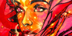

SODA

SODA. (photo courtesy of STRAAT)

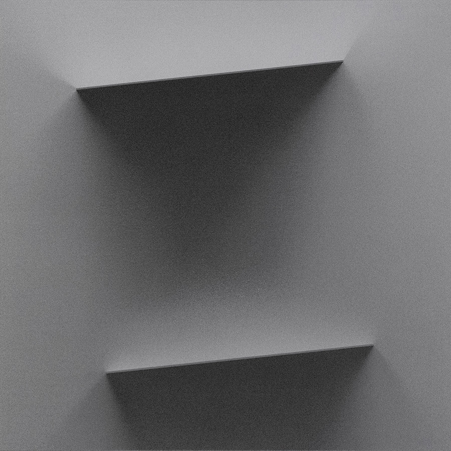
Brooklyn Street Art: Your work plays with three-dimensional illusions on flat surfaces, blending hyper-realistic and abstract forms. How do you approach the balance between abstraction and realism, and what challenges arise when scaling these concepts to larger works?”

SODA: That’s a great question. I tend to think abstractly when creating both my artworks and music. One of my main goals is to achieve a certain look and feel—something that appears hyperrealistic in detail, despite the limitations of the medium on canvas, certainly not on wall.

SODA. Arrival. Banbury, UK, 2019. (photo courtesy of STRAAT)

I aim to depict something that appears tangible, but within an abstract space—unreal, yet rendered with a sense of realism. However, when working with oil paints, I completely avoid hyperrealism. Instead, I focus on abstraction, using expressive brushstrokes and fluid compositions to create depth and movement. Light and shadow play a crucial role in shaping the geometry, while the mind instinctively fills in the details to form the bigger picture.

To me, abstraction and hyperrealism hold broad meanings. Their significance depends on how we perceive and approach them.

SODA (photo courtesy of STRAAT)

When creating, I use my own sound design as either a starting point for inspiration or as a parallel process. My approach remains abstract, even in music—where notes and rhythms follow a non-conventional, almost random structure. This randomness often leads to unexpected results, which can be more compelling than the initial idea. The same applies to my visual work, whether on canvas or walls—there’s always an intended direction, but the “unintended” elements often become a focal point.

On a larger scale, my work offers different spatial and design possibilities. Every piece presents its own set of challenges, from the initial sketch to the final execution. But to me, that challenge is an essential part of the process—an evolving interplay between control and spontaneity.

GARY STRANGER:

Gary Stranger (photo courtesy of STRAAT)

Brooklyn Street Art: Having started in graffiti in the 1990s, you’ve developed a distinctive freehand typographic style. How has that background influenced your work, and what drives your commitment to precision?

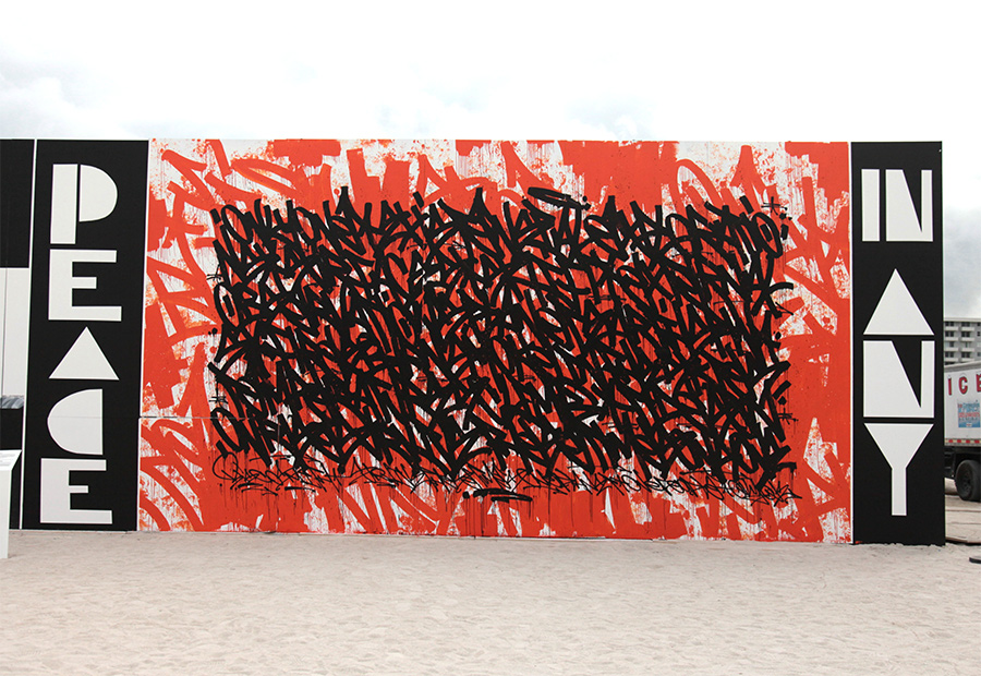
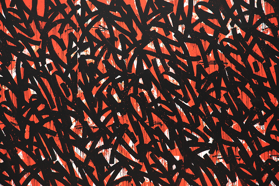
Gary Stranger: The graffiti I painted was heavily influenced by type. The characteristics and some of those letter forms have persisted through to the work I make today. The structure, rigidity, and legibility of my graffiti were important to me. I think a foundational understanding of letter form is vital if you’re going to paint good graffiti. I hope that understanding now informs my studio work in the same way. 

Gary Stranger (photo courtesy of STRAAT)

I’m not sure I have a commitment to precision. I like order and I reflect that in my work. I am however trying to embrace the element of jeopardy in my current work. The nuances of the brush stroke and the imperfections of how the paint is picked up by the canvas are part of the joy now. Previously, I would have worked hard to eliminate these details. 

I spent 25 years learning how to make spray paint do what I wanted it to, only to realise it was never the correct medium for the art I wanted to make.
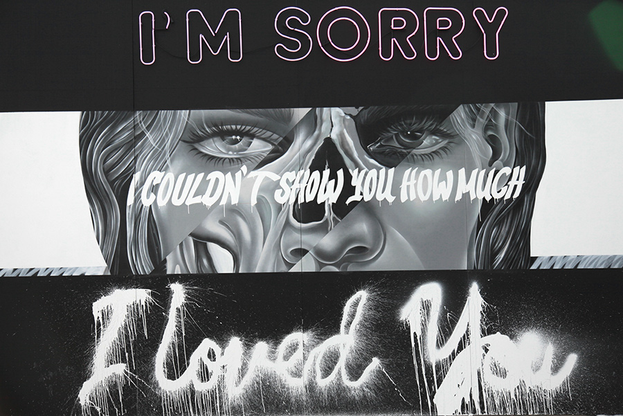
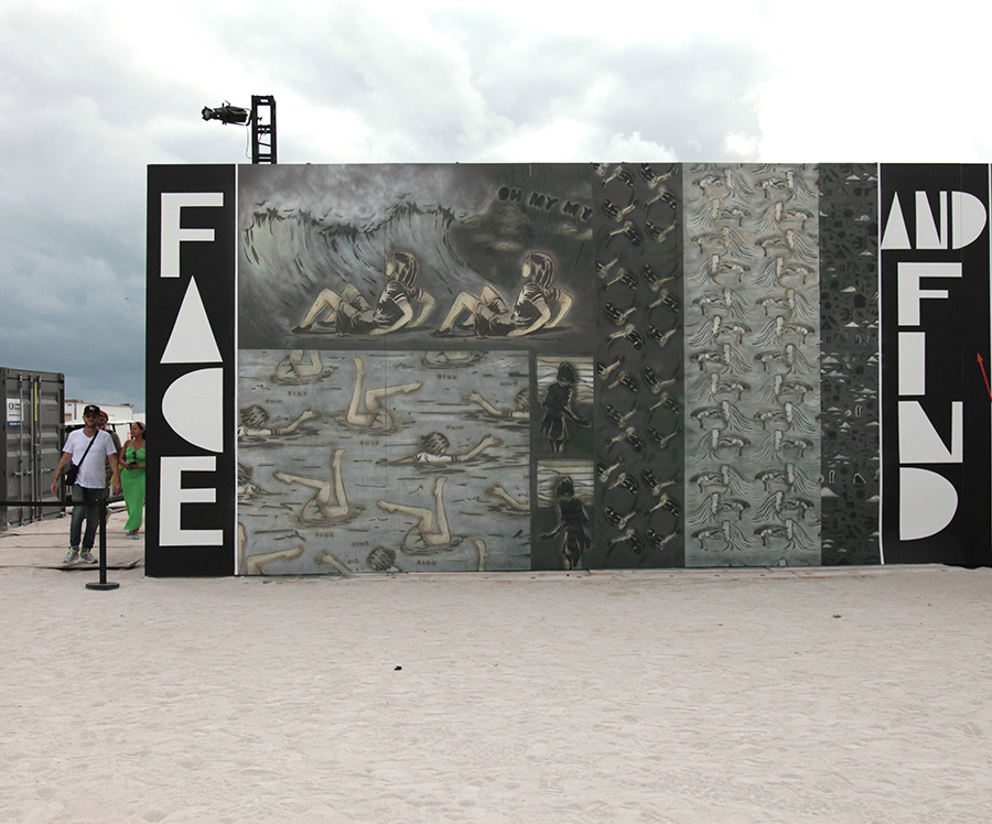
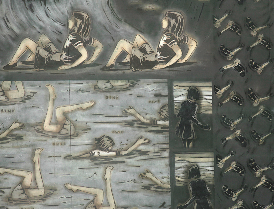
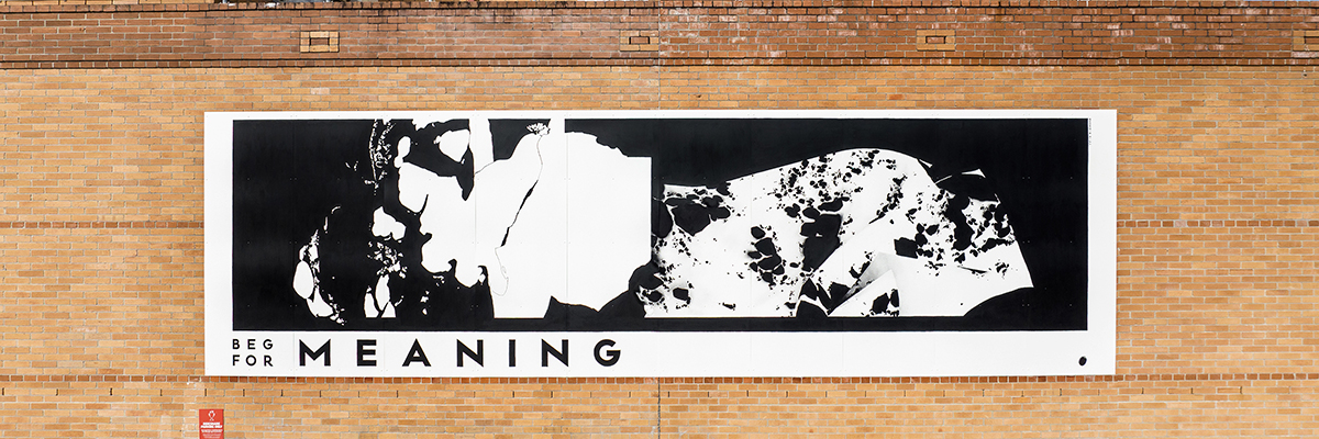
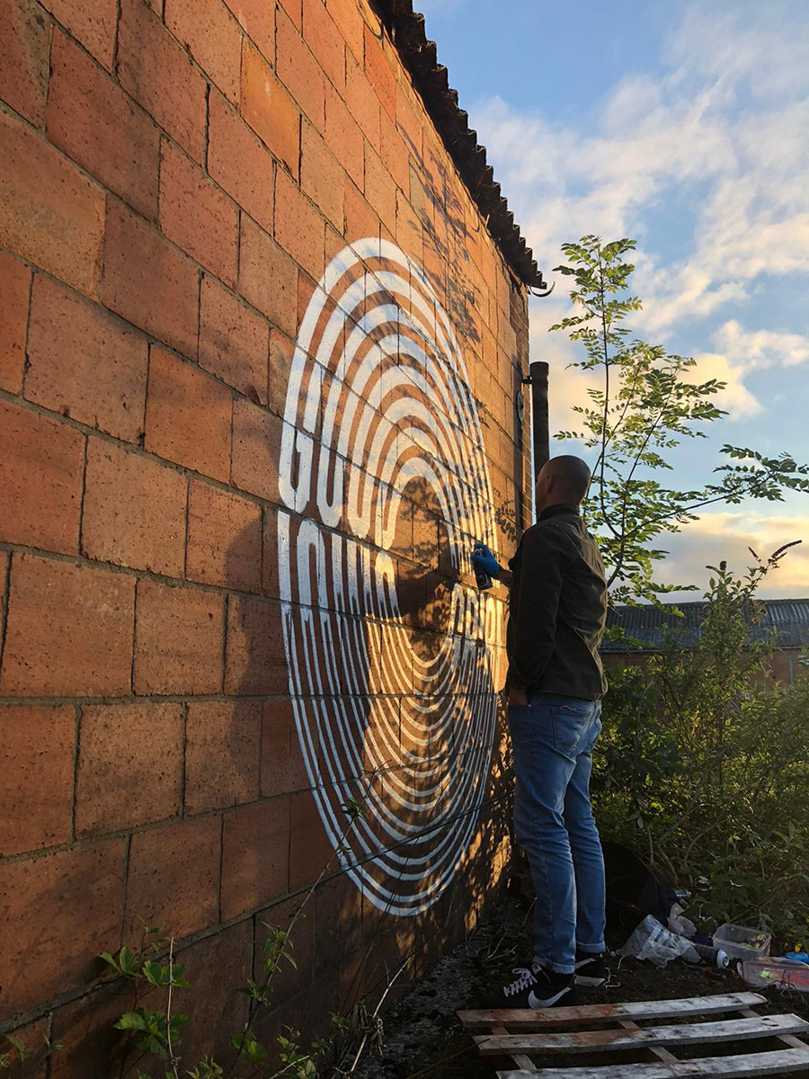
Gary Stranger. Word Up. (photo courtesy of STRAAT)

GEORGIA HILL

Georgia Hill (photo courtesy of STRAAT)

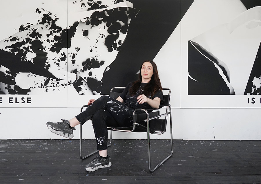
Brooklyn Street Art: Specializing in type-based, monochromatic artworks, your pieces may reflect personal and poetic themes. How do you select the phrases you incorporate, and in what ways do you aim for your work to engage viewers on both individual and communal levels?

Georgia Hill: The phrases I feature in my works are collected over time, in a number of ways. Sometimes, I play with collaging words together, noting down misheard lyrics, or simply noting thoughts or phrases that play on my mind. I keep a long list of these and am always waiting for the right place to put them – whether that’s as a painting title, featured in an artwork, or ‘fit’ the facade I’m working with. 

Georgia Hill. Come Close To Me. Mannheim, Germany, 2024. (photo courtesy of STRAAT)

I hold onto these phrases because they reflect or stir something in me, but often have an ambiguous nature. I really like that they’re open-ended and a record of a fleeting moment for myself, but that people use their own experiences and contexts to build their own connections to the work, whether that’s on an individual level or reflects a sense of connection and community.
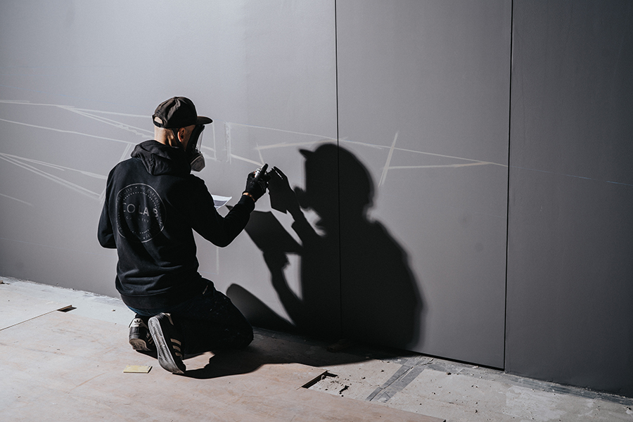
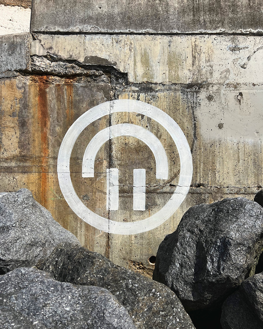
Georgia Hill. Beg For Meaning. Newcastle, Australia, 2022. (photo courtesy of STRAAT)

ANTIGOON

ANTIGOON (photo © Pascal Duin)

Brooklyn Street Art: Your work pushes the boundaries of material and process using custom-designed tools. What inspired you to incorporate these unconventional tools, and how do they influence the final aesthetic of your typographic forms?

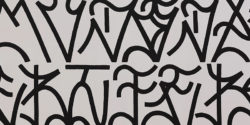
ANTIGOON: I guess it all comes down to the computer-controlled machines I started building out of boredom after years of being a web designer. These were little pen plotters that drew my designs with pen and paper. They’re very neat and precise, which was really nice in the beginning because, apparently, I did a great job building them.

After playing around with this pen plotter for a while, the neatness became quite boring. I started to enjoy the little mistakes it made, like the little blobs of ink here and there, the less-pronounced lines, and the visible vibrations of the motors.

ANTIGOON. Eindhoven, Netherlands. (photo courtesy of STRAAT)

One time, out of curiosity, I started using charcoal instead of the usual pen on paper. For the first time, it became more of a collaboration between me and the machine. I had to change my design because the lines were a lot thicker than before, tape some metal brackets to the Z-axis to add the needed pressure, and babysit the plotter because the charcoal kept running out.

In hindsight, this sparked a new playground: Let’s feed this machine weird things. This collaboration is at times a battle – this is what really triggers me. The boundaries that come with using a certain material and a machine that’s actually not made for this are fascinating.

In the end, it’s all about the question: How can we make this work? Sometimes, I have to alter my drawings; other times, I have to add extensions to the machine, change the material a bit, or completely build a new machine. These challenges are what keep it interesting for me and, hopefully, for the audience as well.


BSA’s interview with curator Hyland Mather continues here:

BSA: In curating Graffitecture: Typographic Blueprints, what criteria guided your selection of artists, and how do their diverse practices contribute to the exhibition’s exploration of typographic transformation in public spaces?

HM: I obviously couldn’t include everyone—that’s always the first limitation, haha. But these four artists I think represent a good glimpse into something much broader that’s been happening globally.  With these four artists I can help introduce this story to the visitors of STRAAT.

I wanted artists who manipulate letterform in unexpected ways, basically. Two of them, Gary Stranger (MSK) and SODA, came straight out of graffiti-writing traditions, while someone like Georgia Hill works more conceptually with language…like Barbara Kruger or Jenny Holzer but on the street.  

Anyways, it just seemed to me that all four of these artists share a deep understanding of how typography and letterform interact with space.  

BSA: Given your experience with found-object art, how do you see the concept of ‘reuse’ manifesting in the practices of the artists featured in this exhibition, particularly in their approach to typography and spatial design?

HM: Thank you for asking this.  With these four, ‘reuse’ isn’t happening in quite the same way that I engage with lost physical objects in my own work. But there’s definitely a shared sensibility. I see parallels in how they repurpose visual language, reclaim surfaces, and reinterpret structures.

Graffiti has always been partly about taking what’s available and transforming it…buildings, bridges, train cars, power boxes…, and on and on. These artists are working from that tradition but doing what good artists should do and pushing the traditions. We see great examples from each of these artists in terms of rethinking letterform, reusing language, and reshaping typography. 

There’s also a shared discipline in terms of approach. Like in my own work, I see a commitment to geometric abstraction, to working within a precise and often limited palette, and to an almost meditative focus on form. So while the materials are different, the mindset of taking what exists and flipping it into something fresh, I guess I would be speaking for them, but I definitely think we all share that. 

BSA: How do you see the dialogue between traditional graffiti practices and contemporary design evolving, and what role do exhibitions like Graffitecture play in this progression?

HM: See, this is a good but tricky question…I mean how many young turks started off as graffiti writers and now work in cushy design industry jobs?…a nearly uncountable number, I think.  Of course lines continue to blur … advertising for example, annexes more and more from graffiti and street art culture all the time.  But, let’s not forget, traditional in your face name writing graffiti is still super strong and needed…repetition, name recognition, getting up, the whole ruckus…to me this part of the culture is in ‘non-dialogue’ with contemporary design.  It can have an influence on the visual language of design, but the ruckus part of the culture will never truly be embraced by contemporary design, and thank fucking god, actually. 

But anyway, to go back to how I started to answer this question … a lot of artists are applying design sensibilities and innovations to their street work.  So instead of ‘Design always borrowing from Graffiti’, I like to think of it as ‘Graffiti sometimes stealing from Design’

The artists in Graffitecture, I see these artists as thinking about typography and letterform not just as a personal tag but as a system of communication, like a designer or an architect thinks of their work. Something that can be constructed or deconstructed, built or rebuilt.  Of course this is not new, artists like DELTA have been exploring themes like this for a very long time, there are just now more examples of artists working like this in our global culture. An Exhibition like Graffitecture helps amplify the ongoing conversations between graffiti, design and architecture for our STRAAT visitors. We are so very proud to provide the venue and forum for such a cool and nuanced topic.

For more information about this exhibition click STRAAT

Read more
buZ Blurr, One Telling of the “Origin Story” at Straat Museum Amsterdam

buZ Blurr, One Telling of the “Origin Story” at Straat Museum Amsterdam

In the shifting culturescapes of urban contemporary art, STRAAT Museum’s latest exhibition, “Moniker: An Origin Story,” emerges as a poignant narrative that bridges the transient heritage of hobo monikers with the vibrant pulse of today’s street art scene. This show not only marks an exploration into the roots of a movement but stands as a tribute to Russell Butler, known as buZ Blurr, a pivotal figure who recently passed away, and whose legacy in the realm of freight train artistry has left an indelible mark on the canvas of American folk art.

Hand. Colossus of Roads. Moniker, An Origin Story. Straat Museum Amsterdam. (photo © Scot Phillips)

The practice of hobo writing on trains, a tradition from the early 20th century, encapsulates a form of rebellion against the confines of societal norms, embracing a nomadic lifestyle that flourished alongside the tracks of freight trains. In their quest for freedom and community, Hobos developed a unique language of symbols, or “monikers,” that became a vital means of communication within this itinerant community. These monikers, often rendered in solid paint sticks or industrial crayons, are the precursors to the graffiti and punk DIY styles that would later permeate urban landscapes, among other things, embodying a spirit of protest against modern society’s failings and creating platforms for random acts of poetry.

Colossus of Roads. Moniker, An Origin Story. Straat Museum Amsterdam. (photo © Bill Daniel)

buZ Blurr, an artist who commenced his journey within the rail yards of Gurdon, Arkansas, crafted a visual lexicon over five decades, becoming synonymous with the Colossus of Roads moniker. His “boxcar icon dispatches” served not only as personal narratives but as a collective memory for the transient souls that found solace in the freedom of the rails. Through his friendship and collaboration with Bill Daniel, a documentarian whose work “Who is Bozo Texino?” delves into the subculture of rail graffiti, Blurr’s legacy and the broader narrative of hobo moniker art have been meticulously archived and celebrated.

Colossus of Roads in S.F. Moniker, An Origin Story. Straat Museum Amsterdam. (photo courtesy of Straat Museum)

The exhibition at STRAAT invites audiences to traverse the evolution of this underground art form, from its hobo origins to its present-day incarnation within the global urban art scene. The exhibition showcases a selection of works that encapsulate the essence of the moniker movement, highlighting the original artworks and boxcar iconography that buZ Blurr authored and brandished. Visitors will encounter a diverse array of expressions, from the iconic Colossus of Roads to other seminal figures within the moniker tradition, each piece narrating a story of freedom, identity, and resistance.

In an era where some in the contemporary urban art scene gravitate towards commodification, this genesis story rekindles the foundational values of community, communication, and the unadulterated desire for expression that characterized the organic origins of this movement. STRAAT Museum reaffirms its commitment to celebrating the authentic and genuine voices that have shaped graffiti, street art, and urban art through this exhibition. This show is not just a historical recount but a vibrant testament to the enduring spirit of artists who have navigated the margins to inscribe their narratives on the city’s canvas – and across the country.

Colossus of Roads. Moniker, An Origin Story. Straat Museum Amsterdam. (photo courtesy of Straat Museum)

The exhibition opens its doors with a reception on Saturday, March 9, 2024, from 6-9 PM, inviting the public into a dialogue with the past and present. The exhibition will continue through Sunday, April 28, 2024, at STRAAT Museum. In its essence, one hopes it celebrates the indomitable human spirit’s quest for freedom, identity, and expression.

Herby. Hand photo. Moniker, An Origin Story. Straat Museum Amsterdam. (photo © Bill Daniel)
Bozo Texino. Moniker, An Origin Story. Straat Museum Amsterdam. (Film still Who Is Bozo Texino © Bill Daniel)
Bozo Texino. Moniker, An Origin Story. Straat Museum Amsterdam. (photo © Bill Daniel)
J.H. McKinley. Moniker, An Origin Story. Straat Museum Amsterdam. (photo © Bill Daniel)
buZ blurr. Beyond The Streets New York. June 2019. (photo © Jaime Rojo)

buZ blurr during a conversation with Brooklyn Street Art in 2019.

“These are a self-portrait as predicated on the first Bozo Texino person, and I kind of changed the image around,” says Mr. Blurr, a legendary figure in denim overalls, as he patiently describes his classic tag image of a railway cowboy.

“It is a writer motif – the pipe smoke is going up, and then it is trailing back to signify movement as the train goes down the track,” he says. “I worked in the train yards, and my job was as a brakeman. I had a little free time, so I started making drawings. I made my first one on November 11, 1971,” he says as he recalls a state of mind that he was in at the time as he began to tag freights with the image and text that came to him clearly – yet it may have perplexed other travelers.

“They came from a confused state. I was questioning everything. I was putting a kind of cryptic messages under my drawings. It was anybody’s guess as to its literal interpretation. I addressed some of them up to specific people, but whether they saw them or responded to them, I wouldn’t have any idea.”


The full list of contributing artists includes:

2359, Alquimia Ferrocarrilera, Bill Daniel, Coaltrain, Colossus of Roads, Ed Haskel, Fat Owl, Flangesqueal, I’m Ugly, Khaze, The Kodak Kid, Lamps, Leroy Drown, Milktooth, Mr. Bass, NY Tomato, North Bank Fred, NOVA, POOH. The Rambler, Shrug, Smokin’ Joe, The Solo Artist, Stonewall Jim, Swampy, Take 5, Tex Goth, Wooden Axle, Bozo Texino, Conrail Twitty, Herby, Iowa Blackie, J.B. King Esq, Matokie Slaughter, Mud Up, Taurus, El Truncón, Water Bed Lou.

Moniker: An Origin Story is open to the public from Sunday, March 10th until Sunday, April 28th, 2024

STRAAT Museum 

NDSM-Plein 1, 1033 WC Amsterdam

Read more
It’s “Not So Black And White” Outside Scope with STRAAT

It’s “Not So Black And White” Outside Scope with STRAAT

NOT SO BLACK AND WHITE

SCOPE WALLS 2023


A decade ago, spotting a fire extinguisher tag at a high-profile art fair was as rare as stumbling upon a unicorn. These tags, a raw expression borrowed from the rebellious part of street culture, remain one of the few graffiti forms embodying untamed, voluminous fury. Their wild, nearly uncontrollable nature often sends extinguisher tags sprawling chaotically across walls, typically in a burst of illegal exhilaration and complete disregard. Yet, at Scope, something has changed. Here, under the discerning eye of the STRAAT Museum from Amsterdam, New York’s Elle adds it to her graphic vocabulary, confined in a grid. The extinguisher phrase is sweetly an affair of the heart, neatly encapsulated within the structured lines of a painted grid on an outdoor display wall.

Valfre. The Lost Object (text). Not So Black & White Wall Mural Project in collaboration with STRAAT Museum Amsterdam and Scope. Miami Art Week December 2023. (photo © Jaime Rojo)

In this world (the West, East, North, and South), increasingly sliced by polarized political fault lines, the once rigid boundaries between art and vandalism blur into intriguing shades of gray. Consider hand styles like those of Bisco Smith at this venue – once underground, now they fold into the stylized lexicon of ‘calligraffiti,’ accessible to all. It’s a testament to the evolving nature of art, shattering the dichotomy of rules once as clear-cut as the commandments brought down by Moses.

HOXXOH. The Lost Object (text). Not So Black & White Wall Mural Project in collaboration with STRAAT Museum Amsterdam and Scope. Miami Art Week December 2023. (photo © Jaime Rojo)

Take Anthony Garcia Sr., for instance. His story is a narrative of contrasts. Born in Denver, that bastion of Boomer wealth now gasping in the throes of late-stage capitalism, Garcia’s roots are in Globeville, a less privileged neighborhood. He gets street cred for starting as a graffiti writer, then joins a DIY art collective – a move perhaps uncharacteristic for traditional graffiti artists. Garcia’s journey exemplifies the fading of stark black-and-white distinctions.

This year’s walls outside the Scope Fair in Miami vividly showcase this eclectic con/fusion. We see graffiti writers rubbing shoulders with art school graduates, graphic designers, and street artists. It’s a diverse panorama condensed into a concise exhibit. Curated by Hyland Mather and David Roos, STRAAT’s exhibition “Not So Black & White” celebrates this new, complex artistic landscape – where the lines between defiance and conformity, street and gallery, blend into a new, undefined horizon.

Artists include The London Police Hoxxoh, Pref ID, Bisco Smith, Mando Marie, Elle, Valfre, and Anthony Garcia Sr. .

HOXXOH. Detail. (photo © Jaime Rojo)
ELLE. The Lost Object (text). Not So Black & White Wall Mural Project in collaboration with STRAAT Museum Amsterdam and Scope. Miami Art Week December 2023. (photo © Jaime Rojo)
ELLE. Detail. (photo © Jaime Rojo)
Bisco Smith. The Lost Object (text). Not So Black & White Wall Mural Project in collaboration with STRAAT Museum Amsterdam and Scope. Miami Art Week December 2023. (photo © Jaime Rojo)
Bisco Smith. Detail. (photo © Jaime Rojo)
Mando Marie. The Lost Object (text). Not So Black & White Wall Mural Project in collaboration with STRAAT Museum Amsterdam and Scope. Miami Art Week December 2023. (photo © Jaime Rojo)
Mando Marie. Detail. (photo © Jaime Rojo)
Anthony Garcia Sr. The Lost Object (text). Not So Black & White Wall Mural Project in collaboration with STRAAT Museum Amsterdam and Scope. Miami Art Week December 2023. (photo © Jaime Rojo)
Pref ID. The Lost Object (text). Not So Black & White Wall Mural Project in collaboration with STRAAT Museum Amsterdam and Scope. Miami Art Week December 2023. (photo © Jaime Rojo)
The London Police. The Lost Object (text). Not So Black & White Wall Mural Project in collaboration with STRAAT Museum Amsterdam and Scope. Miami Art Week December 2023. (photo © Jaime Rojo)
The London Police. Detail. (photo © Jaime Rojo)
Not So Black & White Wall Mural Project. Detail. In collaboration with STRAAT Museum Amsterdam and Scope. Miami Art Week December 2023. (photo © Jaime Rojo)

“KEEP AN EYE OUT FOR PEACE IN ANY FACE, AND FIND THE LOVE IN ANY PLACE” Hyland Mather AKA The Lost Object.

Read more
Shepard Fairey Raises the Level Again, This Time at STRAAT – Amsterdam

Shepard Fairey Raises the Level Again, This Time at STRAAT – Amsterdam

New Mural with Shoe and Yalt in Amsterdam

Shepard Fairey. Printed Matters: Raise The Level. Straat Museum Amsterdam.

“Raise the Level” is what street artist/fine artist Shepard Fairey has always done regarding the level of political, social, and environmental discourse in any given room. At the STRAAT Museum in Amsterdam, where the shipping trade resides in the annals of history, you may also find yourself contemplating the ebb and flow of ocean levels. The question of how high future waters will lap at the doors of this establishment, nestled within a former maritime warehouse, has surely crossed the minds of those who tread its epic halls.

Shepard Fairey. Printed Matters: Raise The Level. Straat Museum Amsterdam. (photo © Straat Museum)

In town for his first serious exhibition here, which opens this weekend and runs through the first of October, the sharply satirical stalwart of activism and stunning graphic design on the street is surrounded by a cadre of fans and photographers gathering on the sidewalk as he floats with his crew on the lift above.

With deft choreography, he and his adept crew maneuver a lift to forge a new mural, seamlessly fusing his signature elements: symbols, incisive political commentary, and an embodiment of feminine resilience – somehow all of it converging in her unwavering gaze.

As ever, Fairey hopes to shake you from your apathy, if possible. The Californian voyager of street/punk/graphic aesthetics says the themes he follows in the new exhibition are “aimed at improving the ‘health’ of our planet but also addresses other urgent matters, such as nationalism, xenophobia, war, fake news, and threats to democracy.” There will be no doubt that he will do so convincingly.

Across the bottom of this new wall, which we’re proud to be able to share, are two collaborators styled rather wildly and in a complementary color palette. One is the OG USA crew captain and calligraffiti artist Niels “Shoe” Meulman. To his left is writing legend Yalt, who kills it. Integrated more directed into Shepard’s composition are the stylized letters of Shoe, perhaps reminding us that in matters of the planet and each other, it’s a good idea to “Handle With Care”.


“Printed Matters: Raise the Level” opens at Straat Museum Saturday, August 13th.

Shepard Fairey. Printed Matters: Raise The Level. Straat Museum Amsterdam. (photo © Straat Museum)

STRAAT: NDSM-Plein 1, 1033 WC Amsterdam Click HERE for more information about this exhibition.

Read more
BSA Film Friday: 02.11.22

BSA Film Friday: 02.11.22

This image has an empty alt attribute; its file name is BSA-Film-Friday-2021-900.gif

Our weekly focus on the moving image and art in the streets. And other oddities.

Now screening:
1. Global Street Art: “Cultural Vandals”?
2. DOES: Cement Graffiti piece at Amsterdam’s STRAAT Museum
3. New Border. Imagine a different kind of Southern Border between the USA and Mexico.

This image has an empty alt attribute; its file name is BSA-Special-Feature-Static-900.jpg

BSA Special Feature: Global Street Art: “Cultural Vandals”?

Calmer, more measured perhaps, and still pissed off at those who appropriate the culture and then mow it over, here’s Doug Gillen examining a community led mural program being dissed by a fast food corporation in Cardiff, Wales. More alarming perhaps are the middle people who smooth the path and take a cut, according to this new episode of Fifth Walls, called “Cultural Vandals”.

DOES: Cement Graffiti piece at Amsterdam’s STRAAT Museum

An unusual feat of art-making that brings his piece into another dimension, DOES builds up the foundation for his lettering with a carefully applied layer of cement. STRAAT Museum has the story and DOES brings the skillz.

New Border. Imagine a different kind of Southern Border between the USA and Mexico.

The project is called “New Border” and it proposes a constructive alternative bilateral, ecological and humanistic solution to the wall erected (in part) under the Trump administration on the decaying US-Mexican border.

Read more