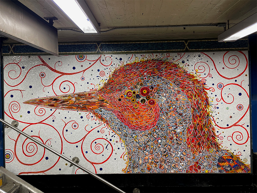
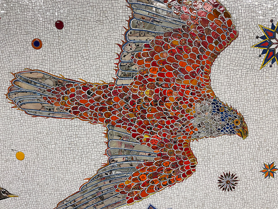
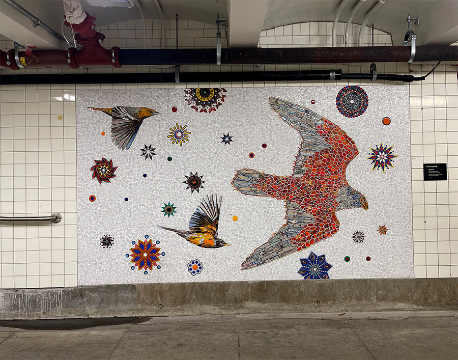
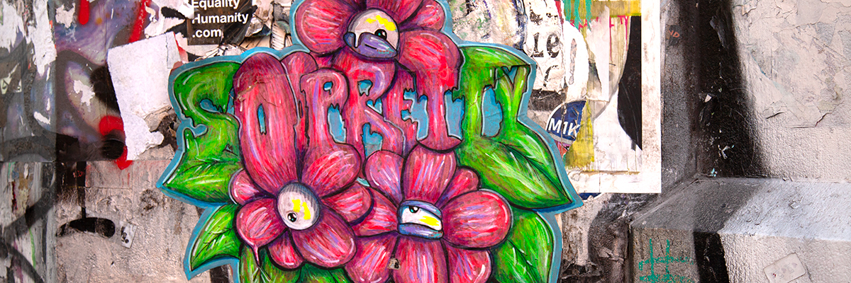
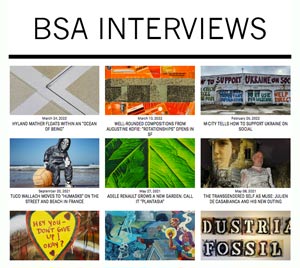
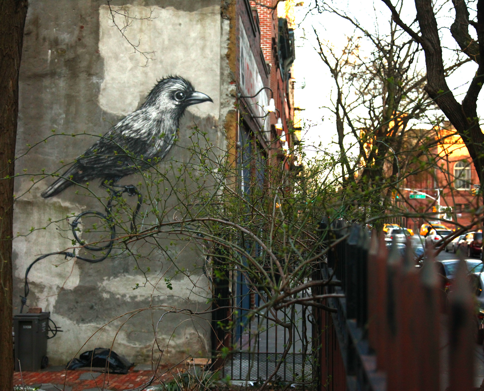
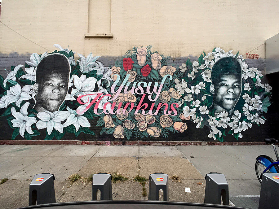
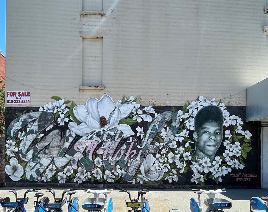
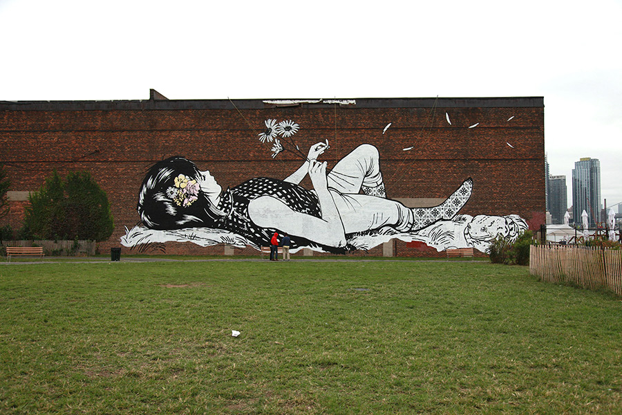
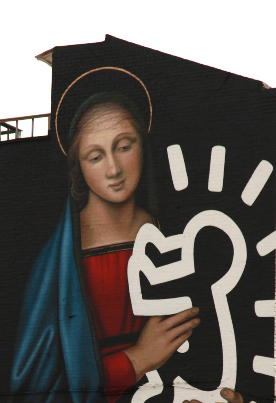
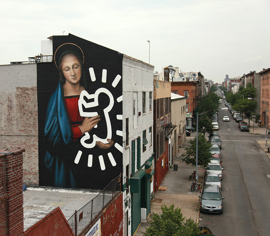
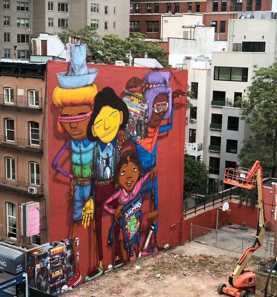
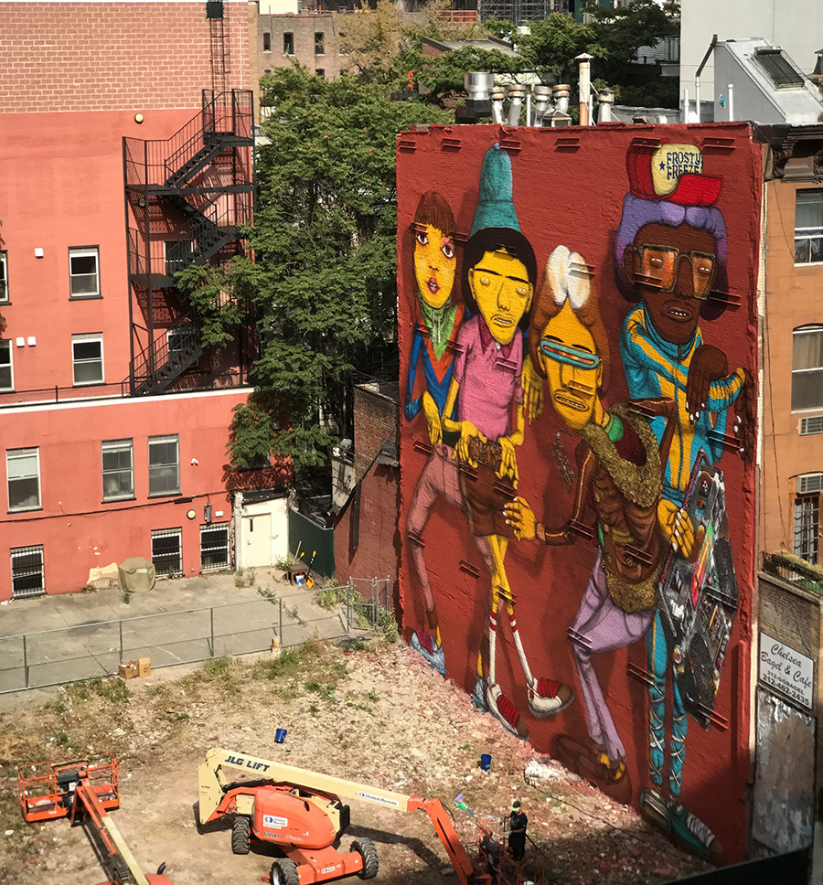
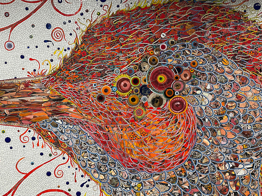
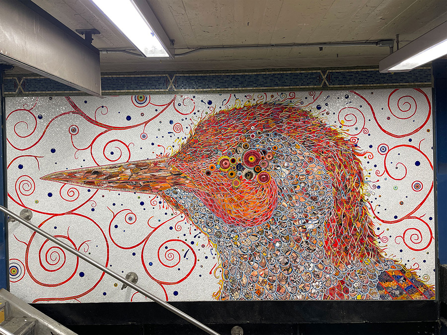
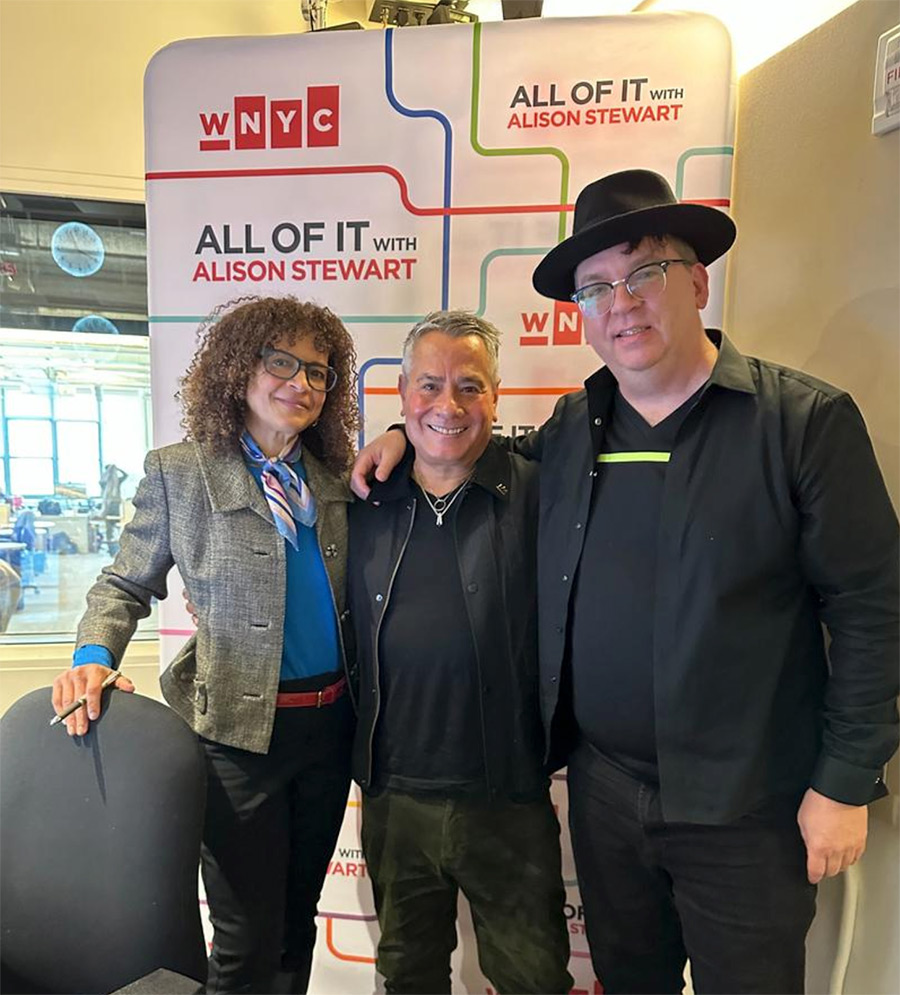
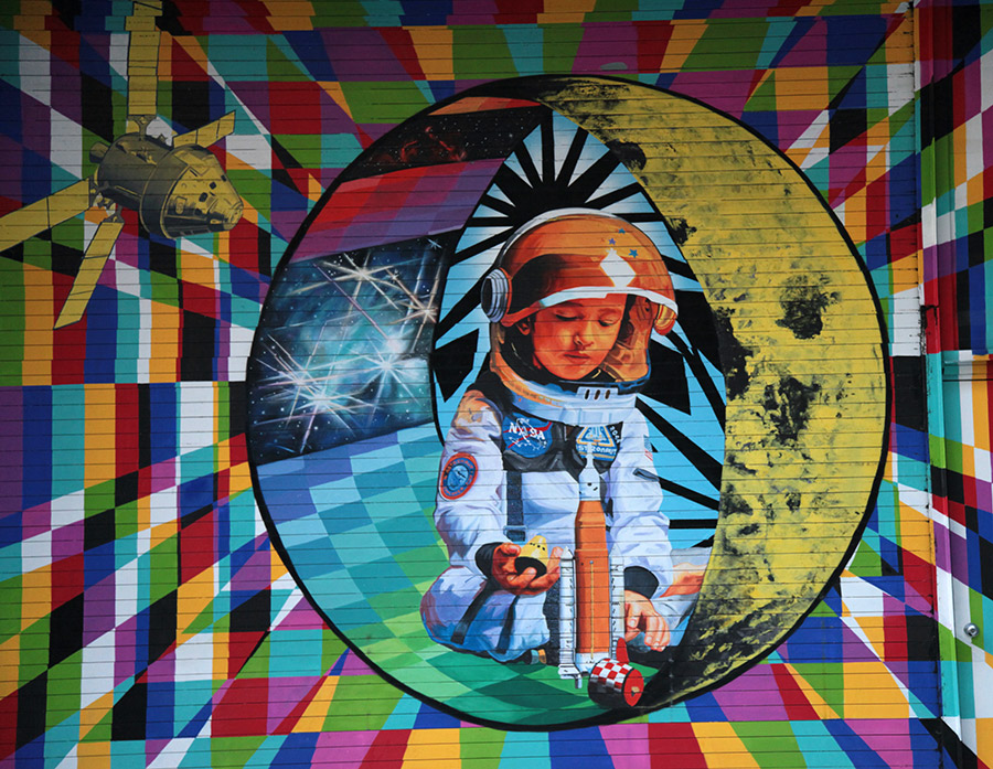
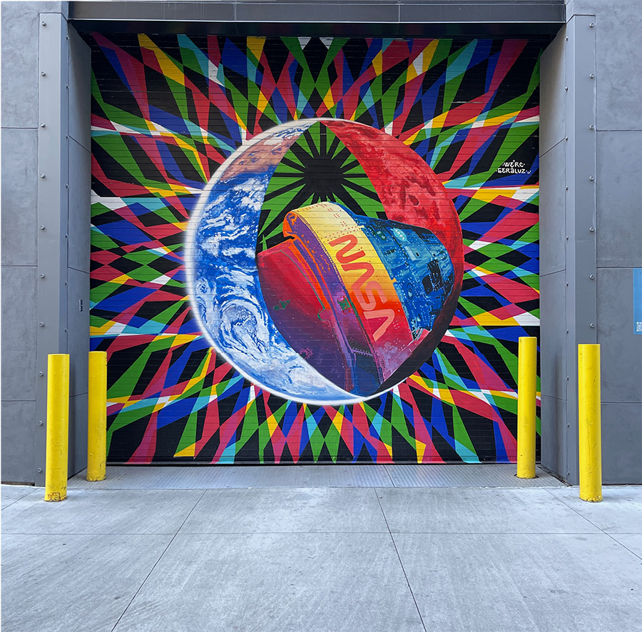
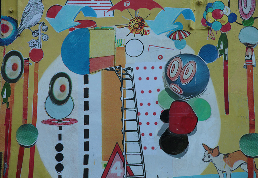
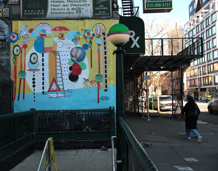
In honor of the radio station WNYC’s 100th birthday, Alison Stewart’s “All Of It” program is celebrating 100 pieces of art in New York City. Each month, Alison speaks with an expert in the art world about their 10 favorites. This month, Alison talked to Jaime Rojo and Steven P. Harrington, co-founders of Brooklyn Street Art, about 10 pieces of art in the streets that they think all New Yorkers would like to know about.
Since it was a radio show, it was impossible to show, only to tell. BSA fans have written to ask us for pictures of the pieces discussed, so here they are!
The list is unscientific and offers a wide selection of art styles and disciplines in New York’s public sphere. Please don’t take it as an indicator of importance or value; rather, take it as a casual survey of things you may see around town.
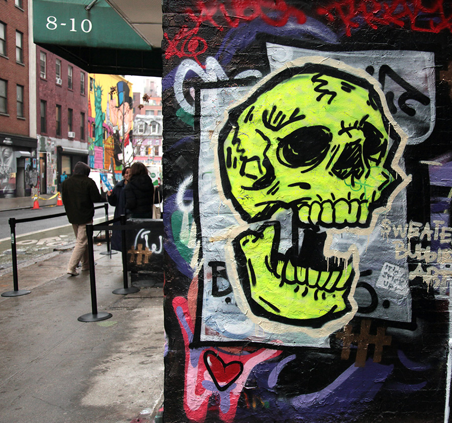
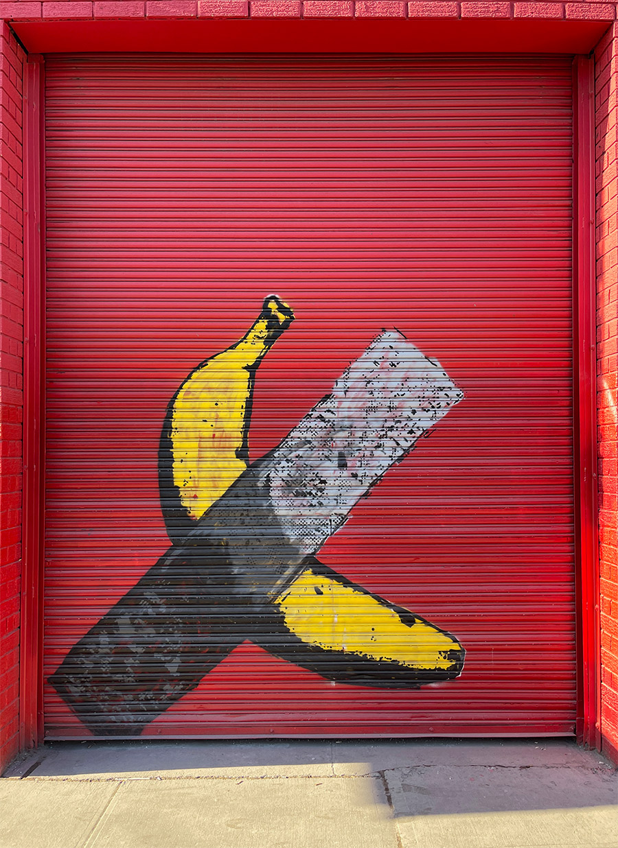
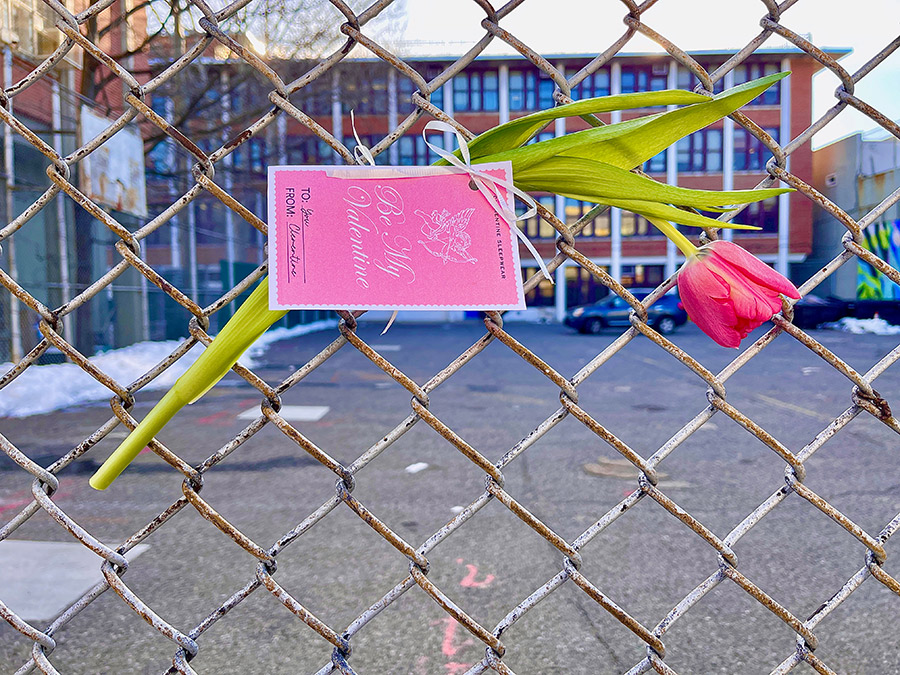
Welcome to BSA Images of the Week! Feeling that Valentine’s chocolate buzz? Gearing up for President’s Day? Thank goodness for holidays—little pauses in the relentless, whiplash-inducing news cycle we’re all riding.
First, some street art news:
San Francisco street artist Rabi Torres taps into ad culture subversion with his new “We Buy Souls” campaign, echoing the tactics of Cash For Your Warhol artist Hargo—right down to the cryptic answering machine message and documentation website. This kind of remixing of commercial signage also has historical roots in Ed Ruscha’s experiments with text, Barbara Kruger’s billboard-style commands, Jenny Holzer’s wheat pasted provocations, Corita Kent’s screen prints, and the bold aesthetics of the Colby Poster Printing Co. Certainly Rabi is getting people’s attention in a San Francisco cityscape that some may describe as hammered with advertising. Call the number on the signs, and you might get pulled into an existential rabbit hole—if you’re up for the game. SF Gate breaks it down here.
It looks like the card company using Banksy-style artwork for its designs may soon put the anonymous street artist in the public eye, as its trademark case with Full Color Black continues to progress in court. Depending on the twists and turns of this legal case, you may see Banksy making a public appearance.
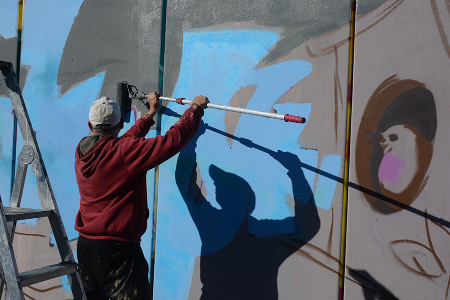
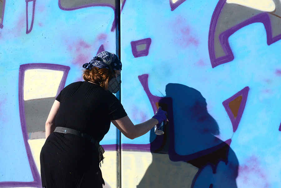
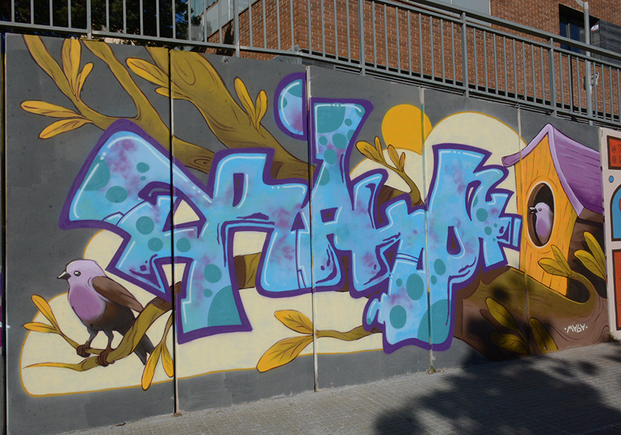
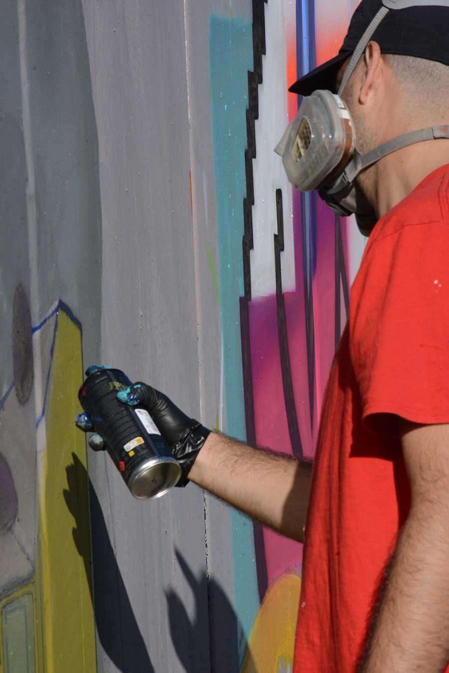
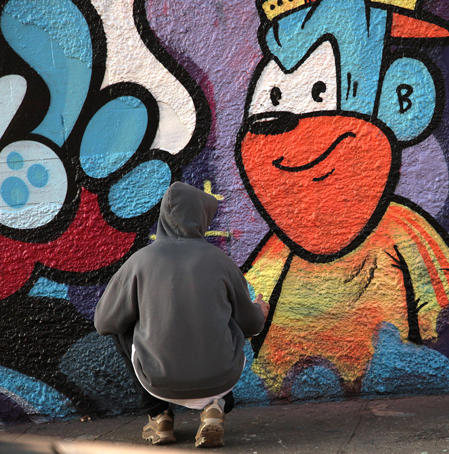
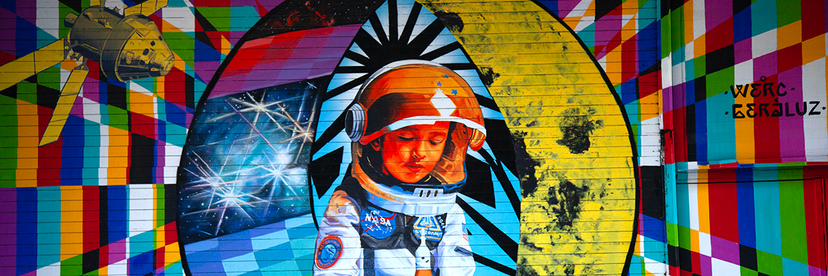
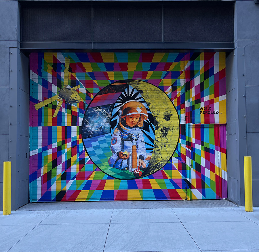
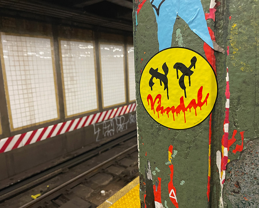
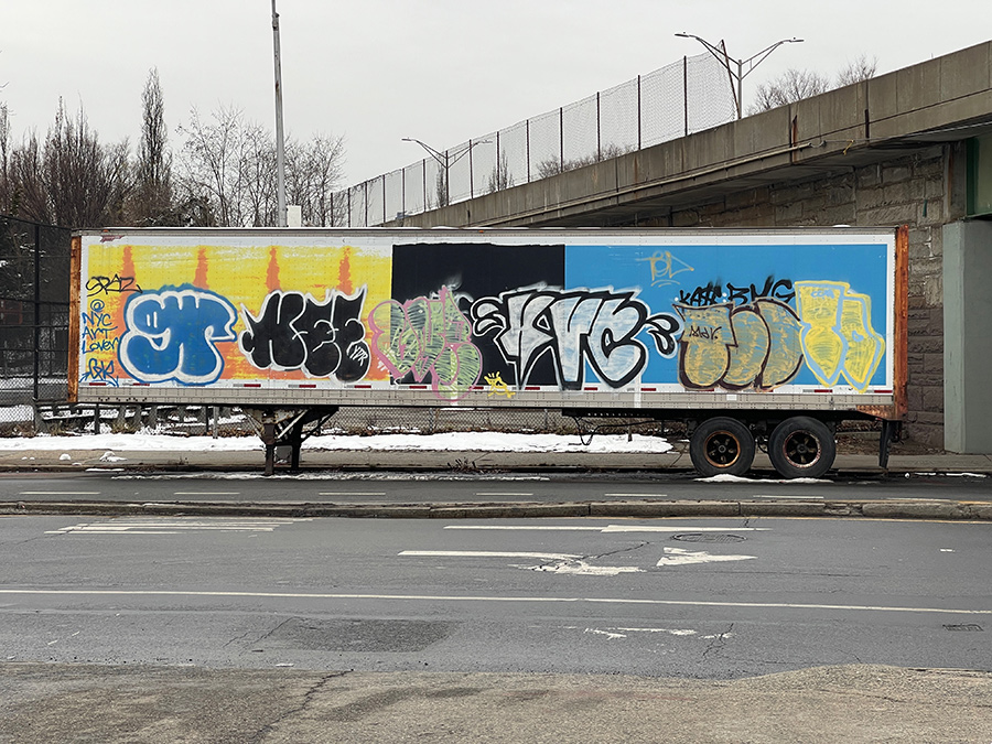
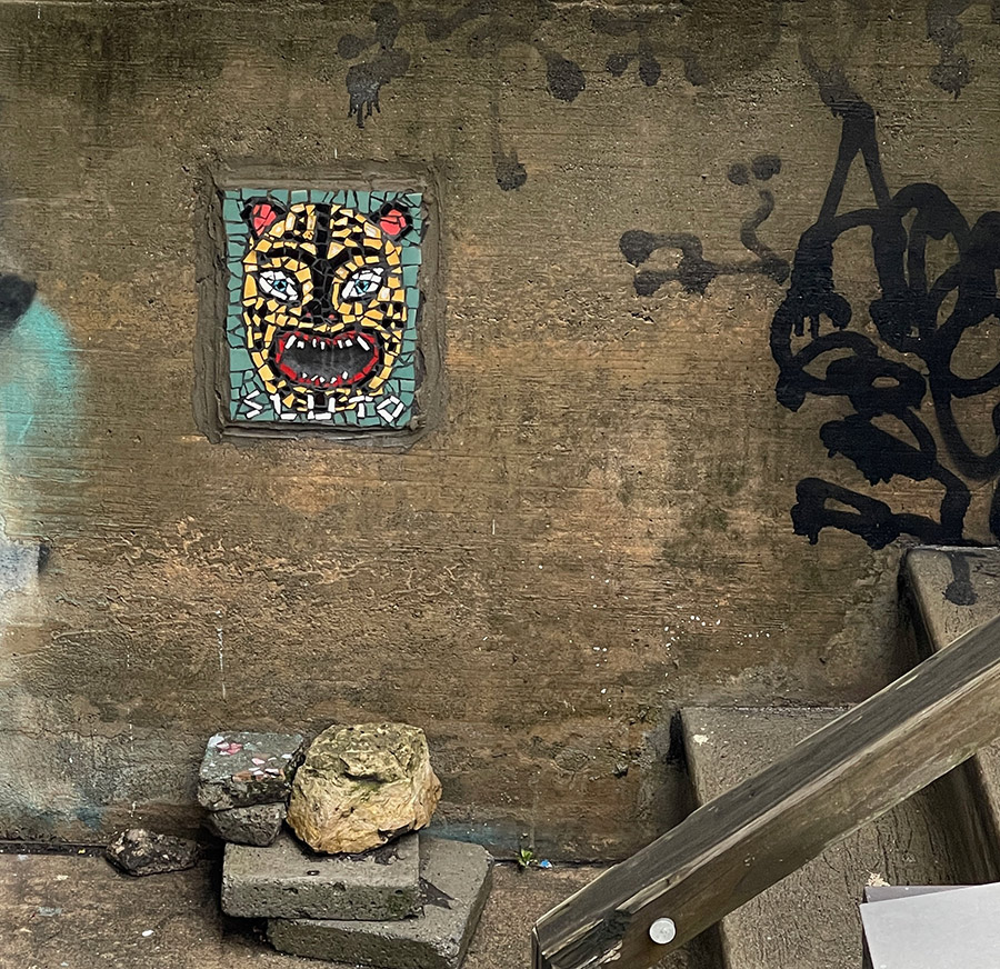
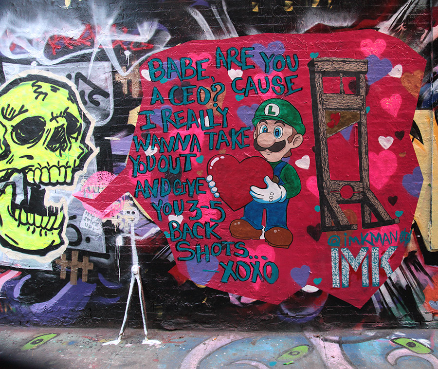
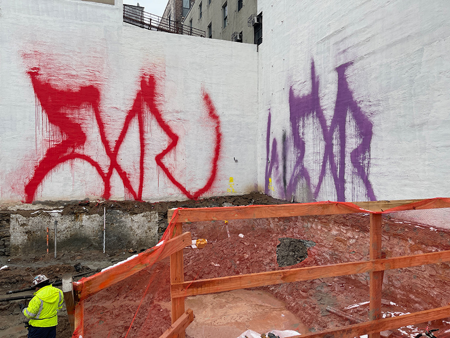
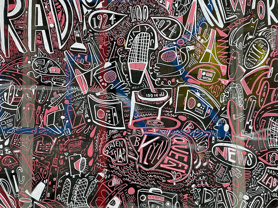
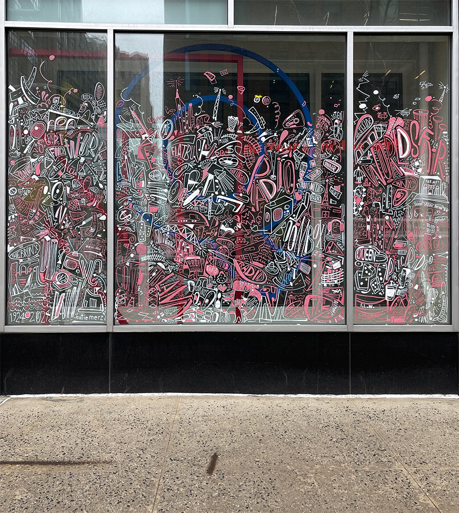
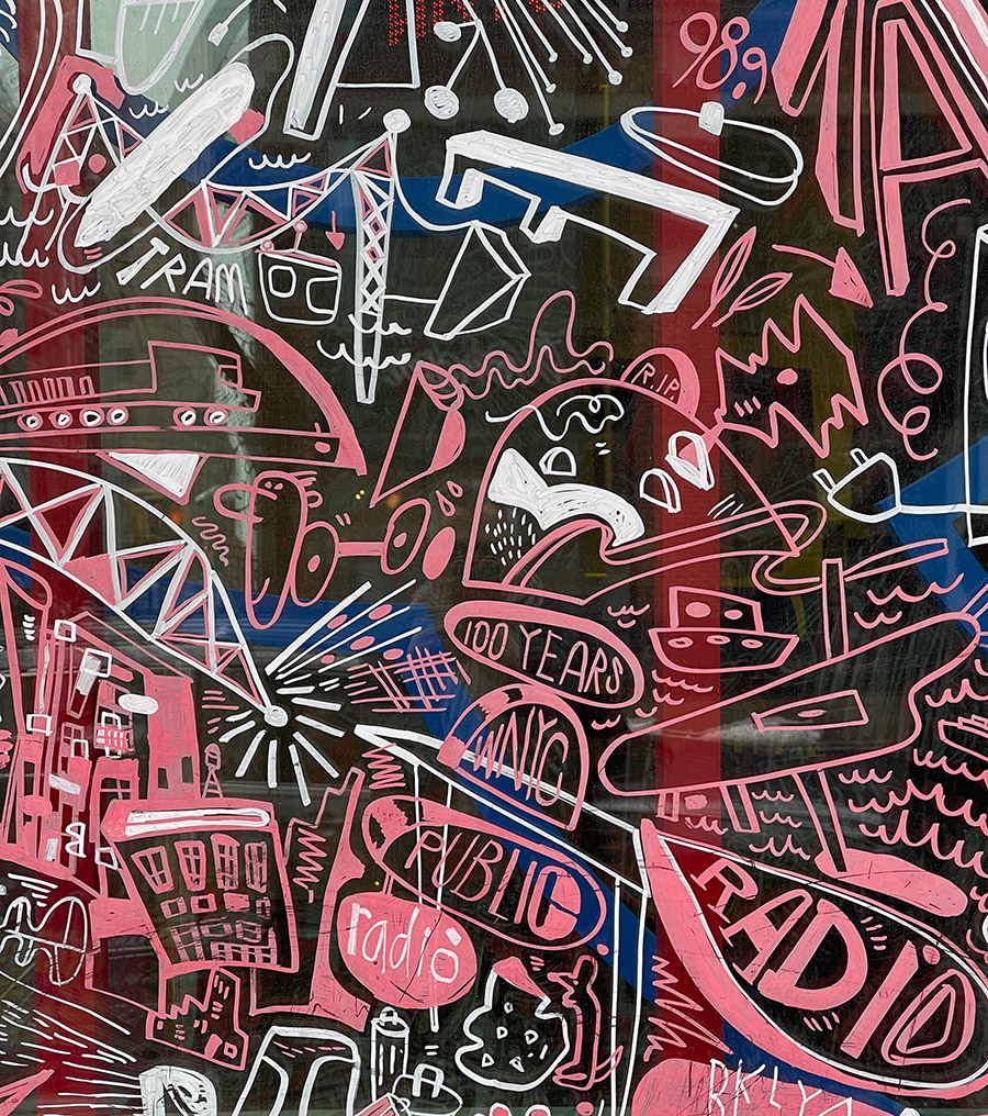
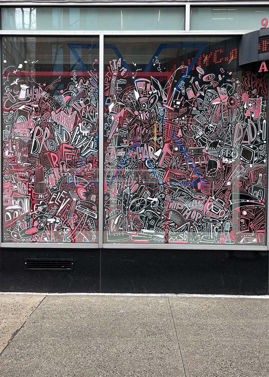
Meanwhile, here’s our interview with the streets this week, including Nick Walker, Clown Soldier, IMK, EXR, W3RC, Sluto, Short, Zaver, Katie Merz, Geraluz, Helch, HVC, TOD, Peter Daverington, Carve, and Kee:
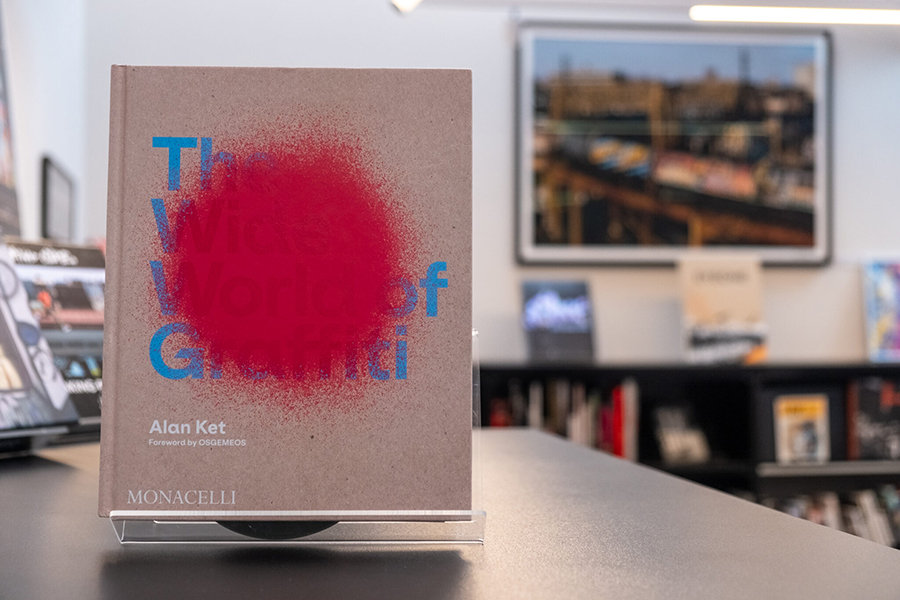
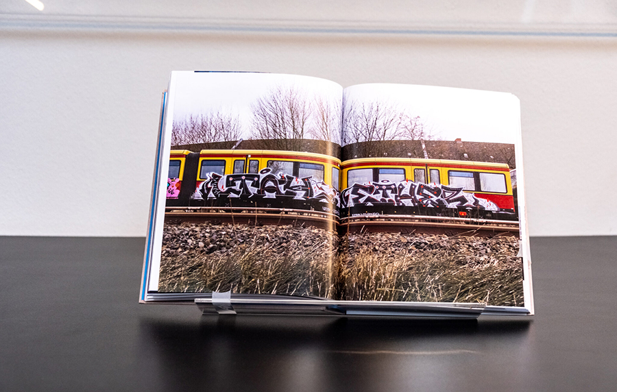
The Wide World of Graffiti by Alan Ket is a comprehensive exploration of graffiti art, tracing its evolution from a marginalized expression to a globally recognized art form. The book delves into the origins of graffiti in the late 1960s and 1970s, primarily in Philadelphia and New York City, where it began as a voice for youth who felt excluded from mainstream society. Ket, a graffiti writer and co-founder of the Museum of Graffiti in Miami, provides an informed perspective, blending personal experience with scholarly insight.
The narrative chronicles the development of graffiti, emphasizing its grassroots beginnings and connections with other subcultures such as skateboarding, hip-hop, and tattooing. This holistic approach provides a broad understanding of the cultural milieu that nurtured graffiti’s growth. Ket documents how graffiti evolved over decades from simple tags to complex murals, reflecting the changing social and political landscapes. The book offers a detailed account of various styles and techniques, highlighting how graffiti artists and street artists have pushed the boundaries of traditional art forms.
MARTHA COOPER LIBRARY: BOOK RECOMMENDATION
| Title: The Wide World of Graffiti | The Monacelly Press. December 2023. Hardcover. | Author: Alan Ket | Language: English
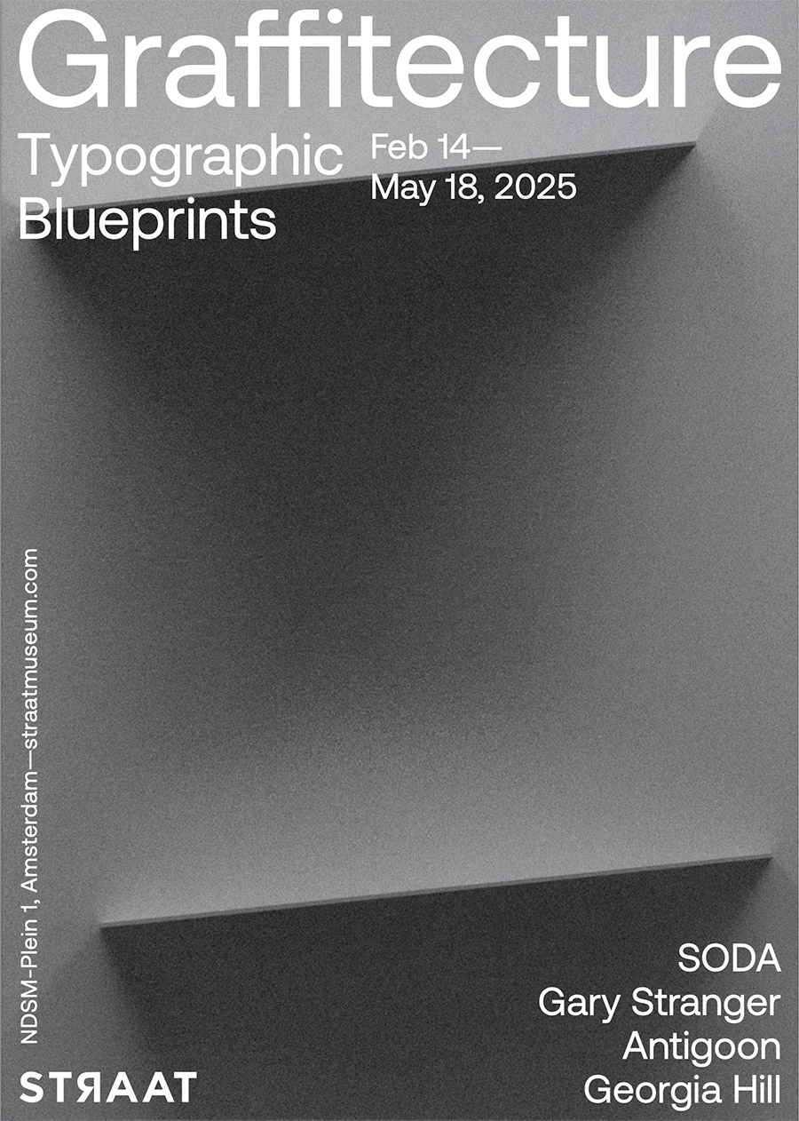
Graffitecture: Typographic Blueprints, on view at STRAAT Museum from February 14 to May 18, 2025, explores the evolving relationship between graffiti, typography, and the built environment. Curated by Hyland Mather, the exhibition brings together four artists—SODA, Gary Stranger, Antigoon, and Georgia Hill—who each push the boundaries of letterforms, blending street-born spontaneity with architectural precision. With around fifty works and several installations, the show underscores how graffiti’s evolution extends beyond its rebellious origins, shaping contemporary urban aesthetics through language and form.
What unites these artists is their ability to challenge traditional notions of typography and its place in public space. SODA’s optical illusions introduce a trompe-l’œil effect, where depth and structure emerge from flat surfaces. Gary Stranger, with his graffiti roots in MSK, refines letterforms into architectural compositions that exude elegance and control. Antigoon’s machine-assisted process introduces an almost industrial approach, evoking the mechanics of urban construction. Meanwhile, Georgia Hill’s poetic monochromatic works harness language as both message and material, inviting reflection through carefully curated phrases. Together, they offer a dialogue between chaos and control, craftsmanship and spontaneity, underscoring how typography continues to redefine urban landscapes.
BSA spoke with Curator Hyland Mather and the four artists about their practice and the show.
BSA:As an artist known for assemblages of ‘lost objects’ and a curator deeply involved in street culture, how do you perceive the intersection of graffiti and architecture influencing contemporary urban aesthetics?
Hyland Mather: Well, to start, graffiti and architecture have always been in conversation…more than that, married. I mean graffiti happens on buildings. That part is as clear as it gets. But, graffiti isn’t just something on the built environment…it’s reacting to it, engaging with it, sometimes even fighting against it, protesting. And also, the rebellious or mischievous practice of graffiti is an ethos and attitude, and that’s a huge part of the allure and charm for the culture for both the viewer and the artists. So, not only does graffiti take place ON the architecture but also IN the cityscape, IN the architecture of the city in ways other artistic movements simply don’t.
In terms of contemporary urban aesthetics…which, we all know, is a moving target…I see the intersection of graffiti and architecture continuing to evolve in ways that go beyond just paint on structures. A lot of artists are playing with depth and layering, in ways that feel ‘in conversation’ with architecture. You’ve got geometric abstraction, precision lettering that mimics architectural lines, and even a kind of ‘graffiti expressionism’ (think NUG, or Revok, or even 108) where the movement and energy of tagging culture gets translated into something that engages with architecture more fluidly, without being so tied to strict letterforms.
More from our interview with the curator after the artists.
SODA
SODA. (photo courtesy of STRAAT)
Brooklyn Street Art:Your work plays with three-dimensional illusions on flat surfaces, blending hyper-realistic and abstract forms. How do you approach the balance between abstraction and realism, and what challenges arise when scaling these concepts to larger works?”
SODA: That’s a great question. I tend to think abstractly when creating both my artworks and music. One of my main goals is to achieve a certain look and feel—something that appears hyperrealistic in detail, despite the limitations of the medium on canvas, certainly not on wall.
SODA. Arrival. Banbury, UK, 2019. (photo courtesy of STRAAT)
I aim to depict something that appears tangible, but within an abstract space—unreal, yet rendered with a sense of realism. However, when working with oil paints, I completely avoid hyperrealism. Instead, I focus on abstraction, using expressive brushstrokes and fluid compositions to create depth and movement. Light and shadow play a crucial role in shaping the geometry, while the mind instinctively fills in the details to form the bigger picture.
To me, abstraction and hyperrealism hold broad meanings. Their significance depends on how we perceive and approach them.
SODA (photo courtesy of STRAAT)
When creating, I use my own sound design as either a starting point for inspiration or as a parallel process. My approach remains abstract, even in music—where notes and rhythms follow a non-conventional, almost random structure. This randomness often leads to unexpected results, which can be more compelling than the initial idea. The same applies to my visual work, whether on canvas or walls—there’s always an intended direction, but the “unintended” elements often become a focal point.
On a larger scale, my work offers different spatial and design possibilities. Every piece presents its own set of challenges, from the initial sketch to the final execution. But to me, that challenge is an essential part of the process—an evolving interplay between control and spontaneity.
GARY STRANGER:
Gary Stranger (photo courtesy of STRAAT)
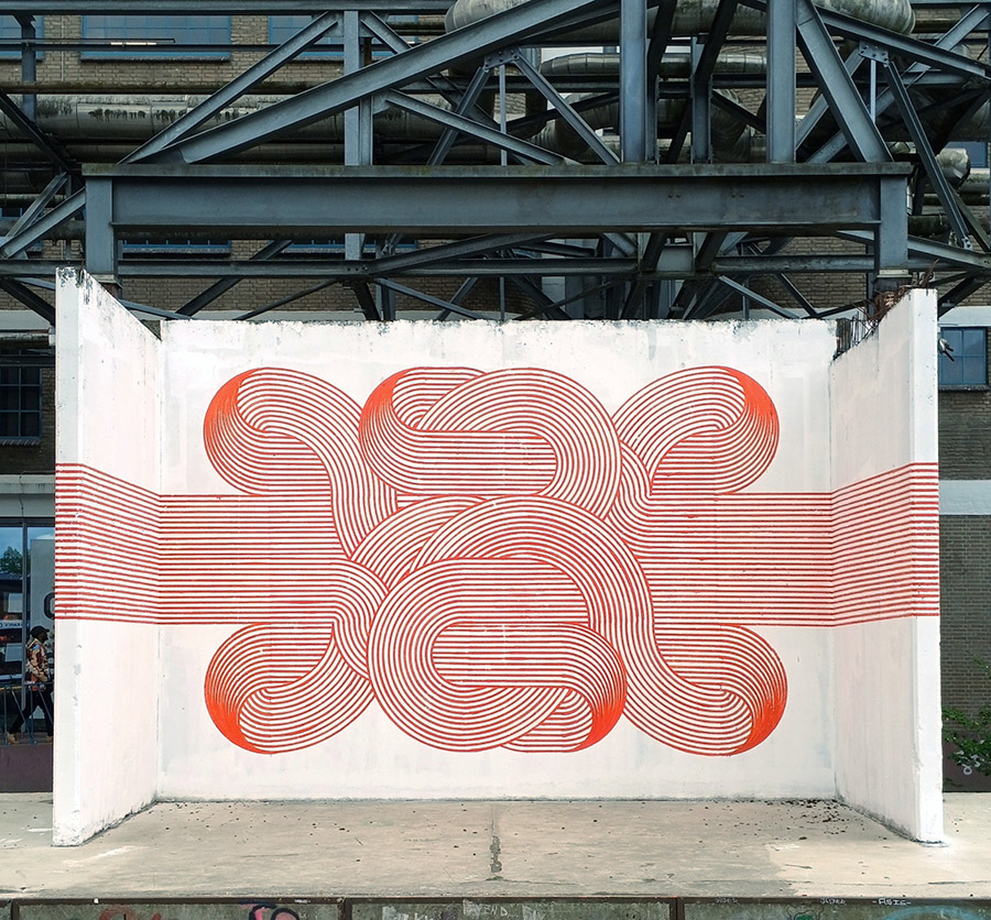
Brooklyn Street Art: Having started in graffiti in the 1990s, you’ve developed a distinctive freehand typographic style. How has that background influenced your work, and what drives your commitment to precision?
Gary Stranger: The graffiti I painted was heavily influenced by type. The characteristics and some of those letter forms have persisted through to the work I make today. The structure, rigidity, and legibility of my graffiti were important to me. I think a foundational understanding of letter form is vital if you’re going to paint good graffiti. I hope that understanding now informs my studio work in the same way.
Gary Stranger (photo courtesy of STRAAT)
I’m not sure I have a commitment to precision. I like order and I reflect that in my work. I am however trying to embrace the element of jeopardy in my current work. The nuances of the brush stroke and the imperfections of how the paint is picked up by the canvas are part of the joy now. Previously, I would have worked hard to eliminate these details.
I spent 25 years learning how to make spray paint do what I wanted it to, only to realise it was never the correct medium for the art I wanted to make.
Gary Stranger. Word Up. (photo courtesy of STRAAT)
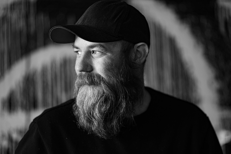
GEORGIA HILL
Georgia Hill (photo courtesy of STRAAT)
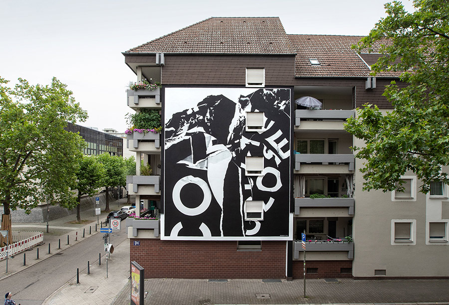
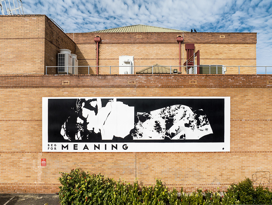
Brooklyn Street Art:Specializing in type-based, monochromatic artworks, your pieces may reflect personal and poetic themes. How do you select the phrases you incorporate, and in what ways do you aim for your work to engage viewers on both individual and communal levels?
Georgia Hill: The phrases I feature in my works are collected over time, in a number of ways. Sometimes, I play with collaging words together, noting down misheard lyrics, or simply noting thoughts or phrases that play on my mind. I keep a long list of these and am always waiting for the right place to put them – whether that’s as a painting title, featured in an artwork, or ‘fit’ the facade I’m working with.
Georgia Hill. Come Close To Me. Mannheim, Germany, 2024. (photo courtesy of STRAAT)
I hold onto these phrases because they reflect or stir something in me, but often have an ambiguous nature. I really like that they’re open-ended and a record of a fleeting moment for myself, but that people use their own experiences and contexts to build their own connections to the work, whether that’s on an individual level or reflects a sense of connection and community.
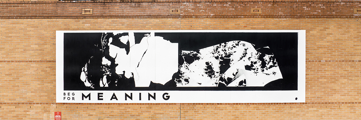
Georgia Hill. Beg For Meaning. Newcastle, Australia, 2022. (photo courtesy of STRAAT)
Brooklyn Street Art: Your work pushes the boundaries of material and process using custom-designed tools. What inspired you to incorporate these unconventional tools, and how do they influence the final aesthetic of your typographic forms?
ANTIGOON: I guess it all comes down to the computer-controlled machines I started building out of boredom after years of being a web designer. These were little pen plotters that drew my designs with pen and paper. They’re very neat and precise, which was really nice in the beginning because, apparently, I did a great job building them.
After playing around with this pen plotter for a while, the neatness became quite boring. I started to enjoy the little mistakes it made, like the little blobs of ink here and there, the less-pronounced lines, and the visible vibrations of the motors.
ANTIGOON. Eindhoven, Netherlands. (photo courtesy of STRAAT)
One time, out of curiosity, I started using charcoal instead of the usual pen on paper. For the first time, it became more of a collaboration between me and the machine. I had to change my design because the lines were a lot thicker than before, tape some metal brackets to the Z-axis to add the needed pressure, and babysit the plotter because the charcoal kept running out.
In hindsight, this sparked a new playground: Let’s feed this machine weird things. This collaboration is at times a battle – this is what really triggers me. The boundaries that come with using a certain material and a machine that’s actually not made for this are fascinating.
In the end, it’s all about the question: How can we make this work? Sometimes, I have to alter my drawings; other times, I have to add extensions to the machine, change the material a bit, or completely build a new machine. These challenges are what keep it interesting for me and, hopefully, for the audience as well.
BSA’s interview with curator Hyland Mather continues here:
BSA: In curating Graffitecture: Typographic Blueprints, what criteria guided your selection of artists, and how do their diverse practices contribute to the exhibition’s exploration of typographic transformation in public spaces?
HM: I obviously couldn’t include everyone—that’s always the first limitation, haha. But these four artists I think represent a good glimpse into something much broader that’s been happening globally. With these four artists I can help introduce this story to the visitors of STRAAT.
I wanted artists who manipulate letterform in unexpected ways, basically. Two of them, Gary Stranger (MSK) and SODA, came straight out of graffiti-writing traditions, while someone like Georgia Hill works more conceptually with language…like Barbara Kruger or Jenny Holzer but on the street.
Anyways, it just seemed to me that all four of these artists share a deep understanding of how typography and letterform interact with space.
BSA:Given your experience with found-object art, how do you see the concept of ‘reuse’ manifesting in the practices of the artists featured in this exhibition, particularly in their approach to typography and spatial design?
HM: Thank you for asking this. With these four, ‘reuse’ isn’t happening in quite the same way that I engage with lost physical objects in my own work. But there’s definitely a shared sensibility. I see parallels in how they repurpose visual language, reclaim surfaces, and reinterpret structures.
Graffiti has always been partly about taking what’s available and transforming it…buildings, bridges, train cars, power boxes…, and on and on. These artists are working from that tradition but doing what good artists should do and pushing the traditions. We see great examples from each of these artists in terms of rethinking letterform, reusing language, and reshaping typography.
There’s also a shared discipline in terms of approach. Like in my own work, I see a commitment to geometric abstraction, to working within a precise and often limited palette, and to an almost meditative focus on form. So while the materials are different, the mindset of taking what exists and flipping it into something fresh, I guess I would be speaking for them, but I definitely think we all share that.
BSA:How do you see the dialogue between traditional graffiti practices and contemporary design evolving, and what role do exhibitions like Graffitecture play in this progression?
HM: See, this is a good but tricky question…I mean how many young turks started off as graffiti writers and now work in cushy design industry jobs?…a nearly uncountable number, I think. Of course lines continue to blur … advertising for example, annexes more and more from graffiti and street art culture all the time. But, let’s not forget, traditional in your face name writing graffiti is still super strong and needed…repetition, name recognition, getting up, the whole ruckus…to me this part of the culture is in ‘non-dialogue’ with contemporary design. It can have an influence on the visual language of design, but the ruckus part of the culture will never truly be embraced by contemporary design, and thank fucking god, actually.
But anyway, to go back to how I started to answer this question … a lot of artists are applying design sensibilities and innovations to their street work. So instead of ‘Design always borrowing from Graffiti’, I like to think of it as ‘Graffiti sometimes stealing from Design’
The artists in Graffitecture, I see these artists as thinking about typography and letterform not just as a personal tag but as a system of communication, like a designer or an architect thinks of their work. Something that can be constructed or deconstructed, built or rebuilt. Of course this is not new, artists like DELTA have been exploring themes like this for a very long time, there are just now more examples of artists working like this in our global culture. An Exhibition like Graffitecture helps amplify the ongoing conversations between graffiti, design and architecture for our STRAAT visitors. We are so very proud to provide the venue and forum for such a cool and nuanced topic.
For more information about this exhibition click STRAAT
The White House is running a masterclass in rapid-fire policy moves, deploying a ‘shock and awe’ strategy that keeps everyone—reporters, analysts, and politicians alike—scrambling to keep up. This week alone, the administration launched a ‘Faith Office’, proposed a federal task force to tackle anti-Christian bias,slapped sanctions on ICC officials looking into U.S. and Israeli military actions, floated the idea of turning Gaza into the ‘Riviera of the Middle East’, and sent Congress a $7 billion arms sale notification for Israel.It’s a policy blitzkrieg that leaves no time to process one move before the next headline drops. Some of these proposals will gain traction, and others will fizzle, but the message is clear: the news cycle belongs to them. We haven’t heard a lot of policy changes that repair the holes in the social safety net and help the poor and struggling middle class yet, but we’re sure those are just around the corner.
Meanwhile, New York City Mayor Eric Adams is catching heat to clarify a contentious ICE memo. Critics say it gives federal immigration agents way too much leeway, potentially endangering city employees and immigrant communities alike. We’re not cracking any jokes here because it’s too serious, and too many people living in New York are impacted. The anti-immigrant fever that has infected parts of the US has thus far not surfaced here in any appreciable quantity, perhaps because New York has traditionally been proud to be a city of immigrants.
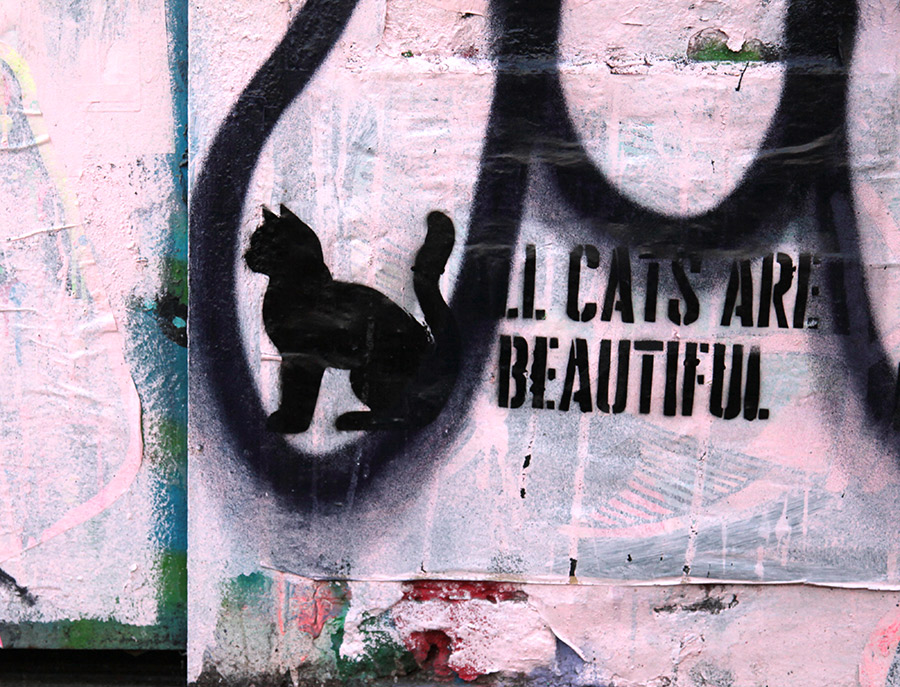
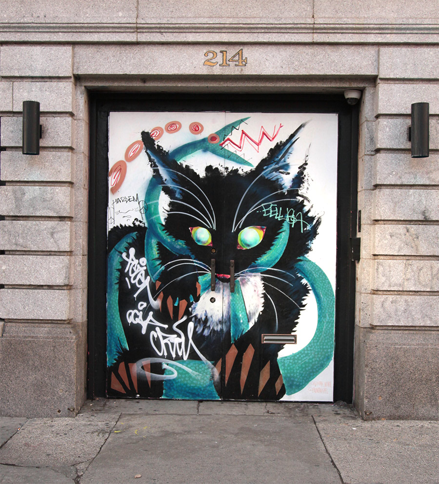
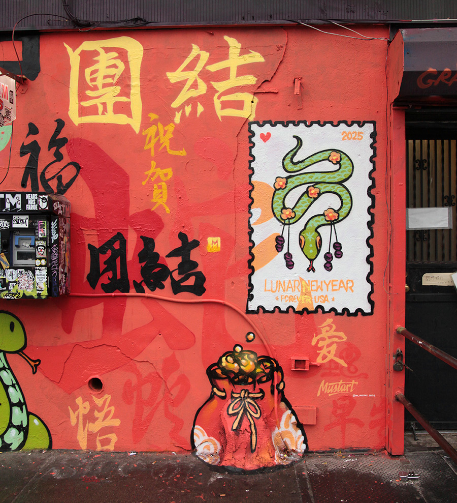
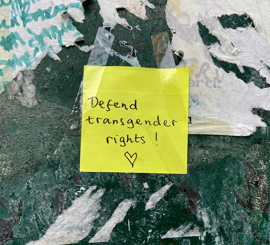
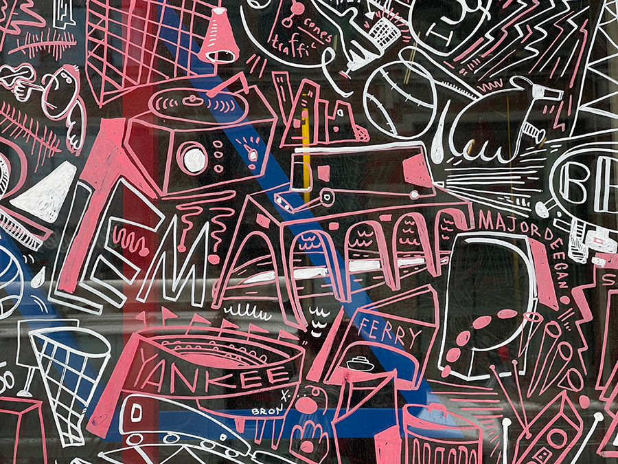
While you won’t find murals explicitly tackling these new and rekindled political firestorms (yet), the chaotic, overlapping narratives on NYC’s walls feel like a fitting reflection of the moment. Confusion, authority, resistance, chaos, cats—it’s all out there, spray-painted and wheat-pasted for anyone paying attention.
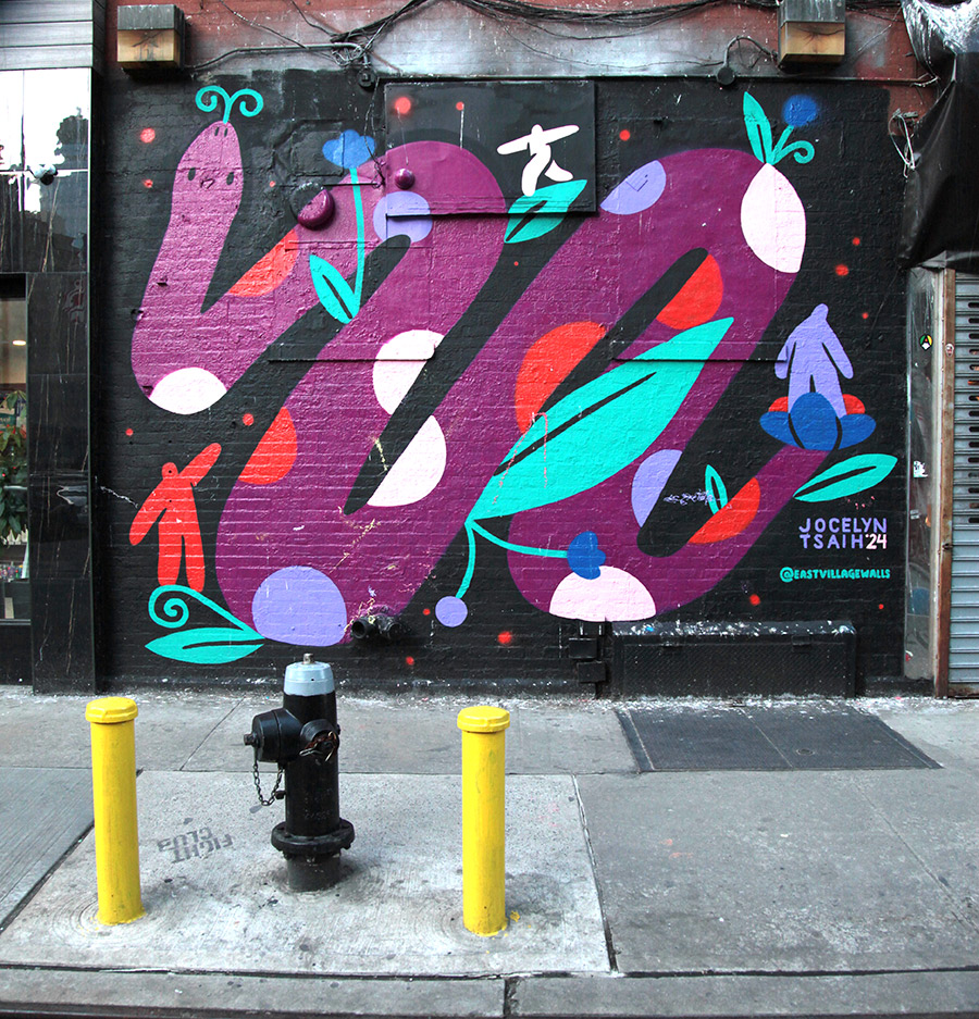
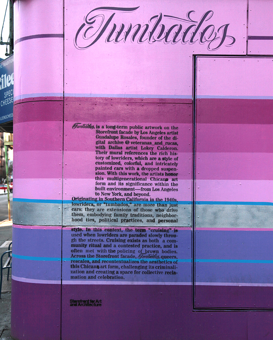
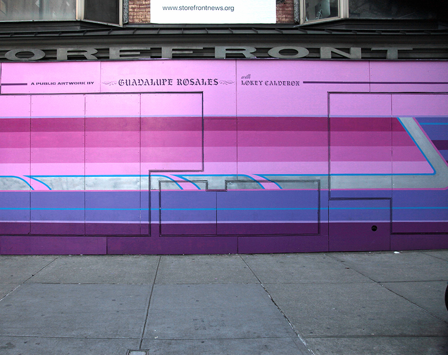
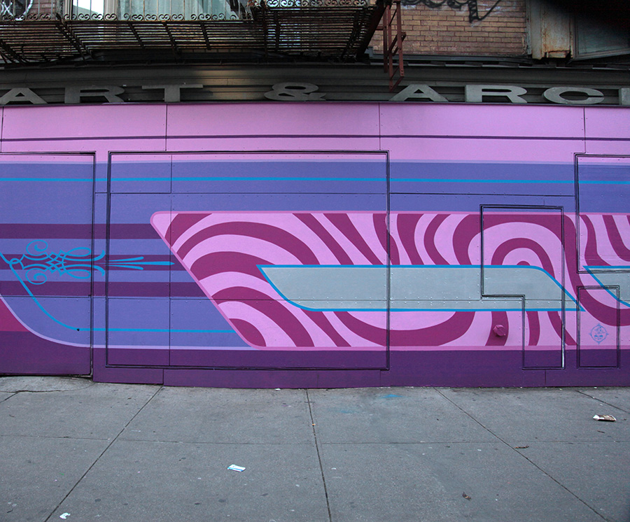
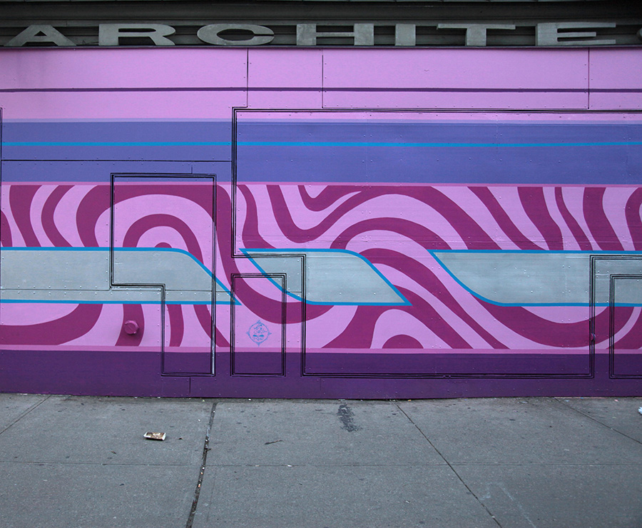
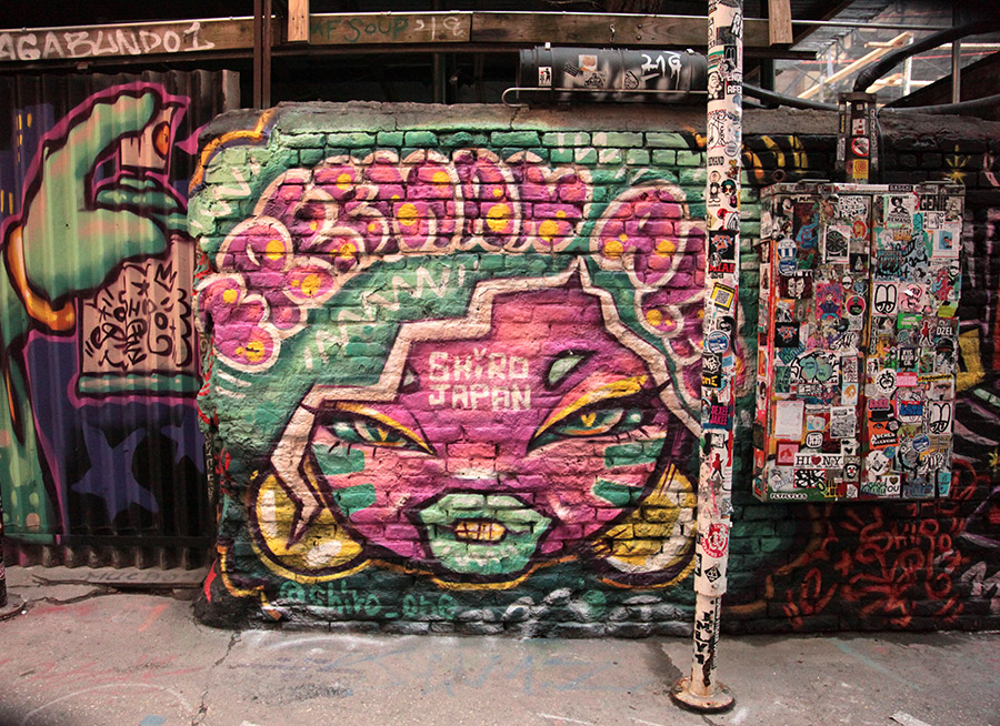
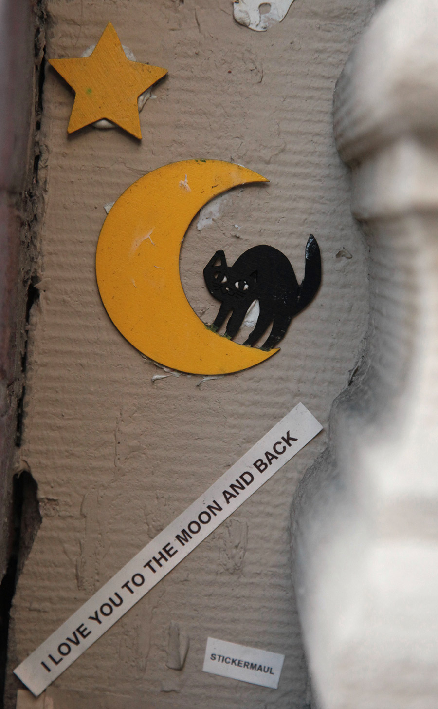
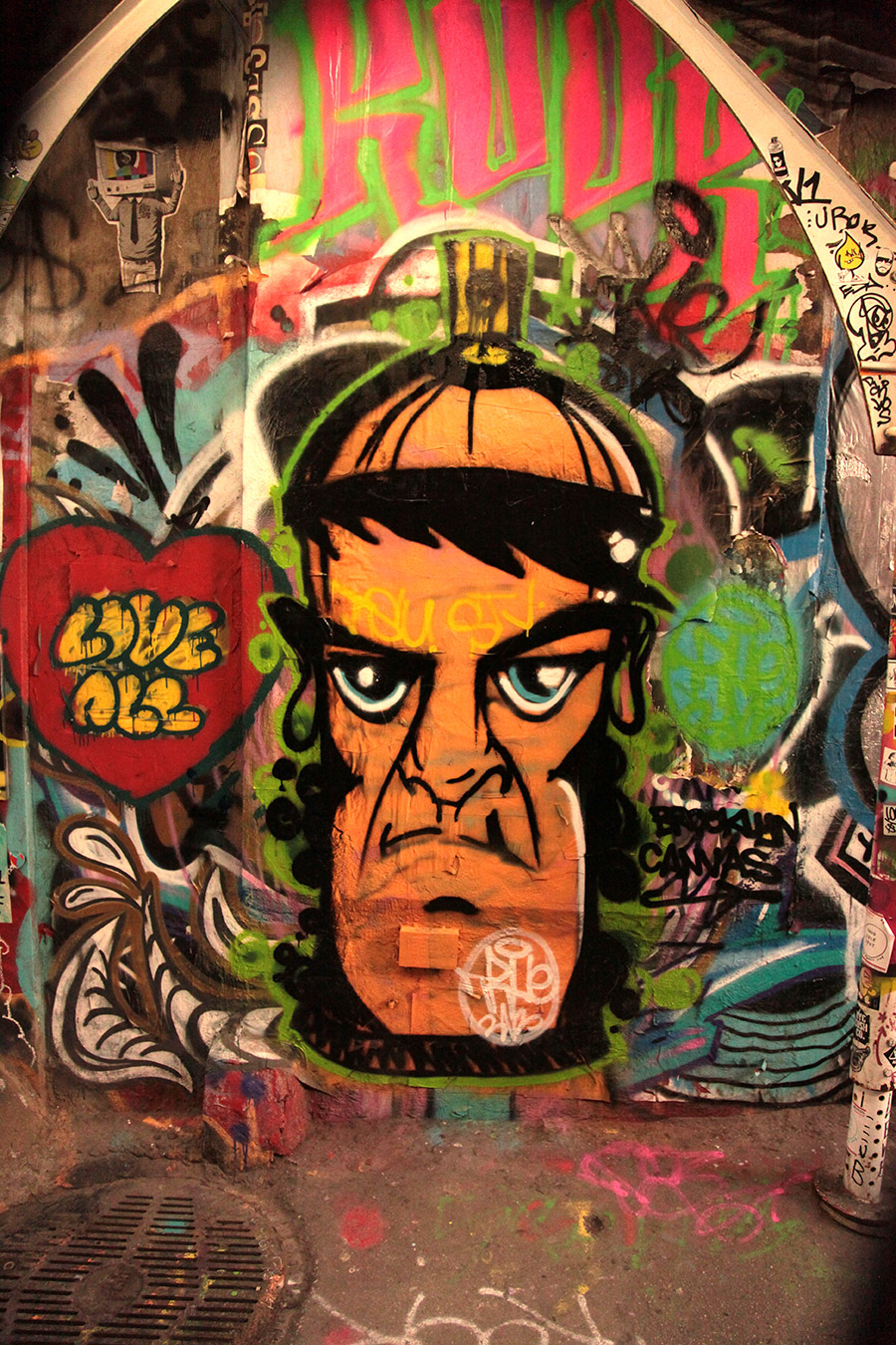
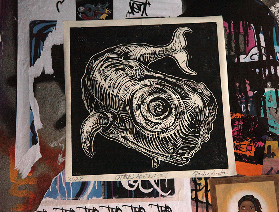
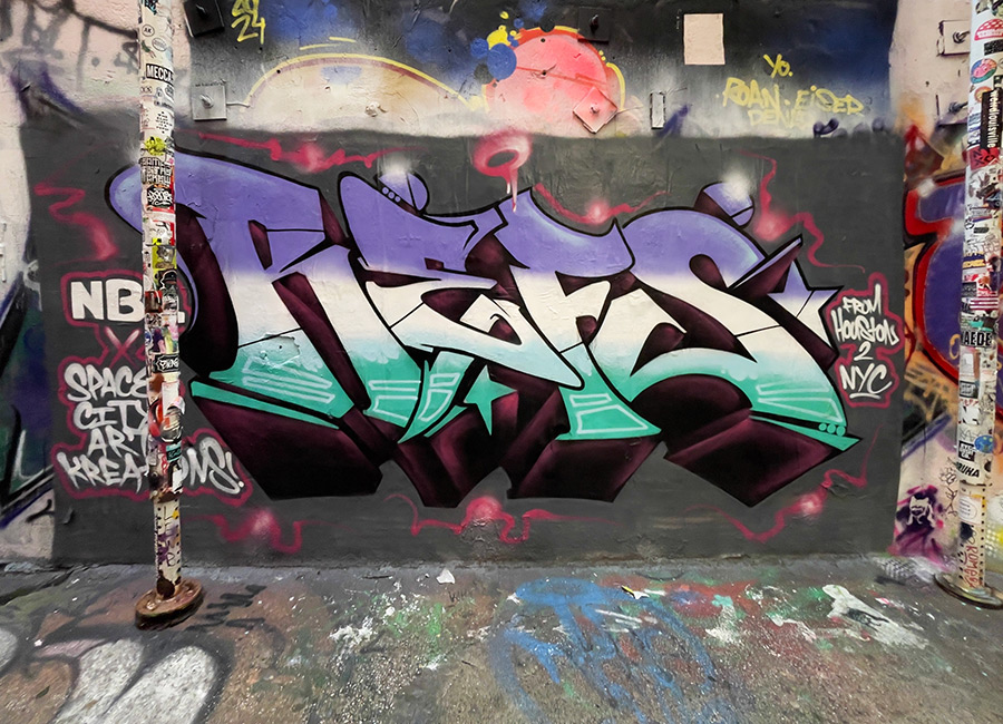
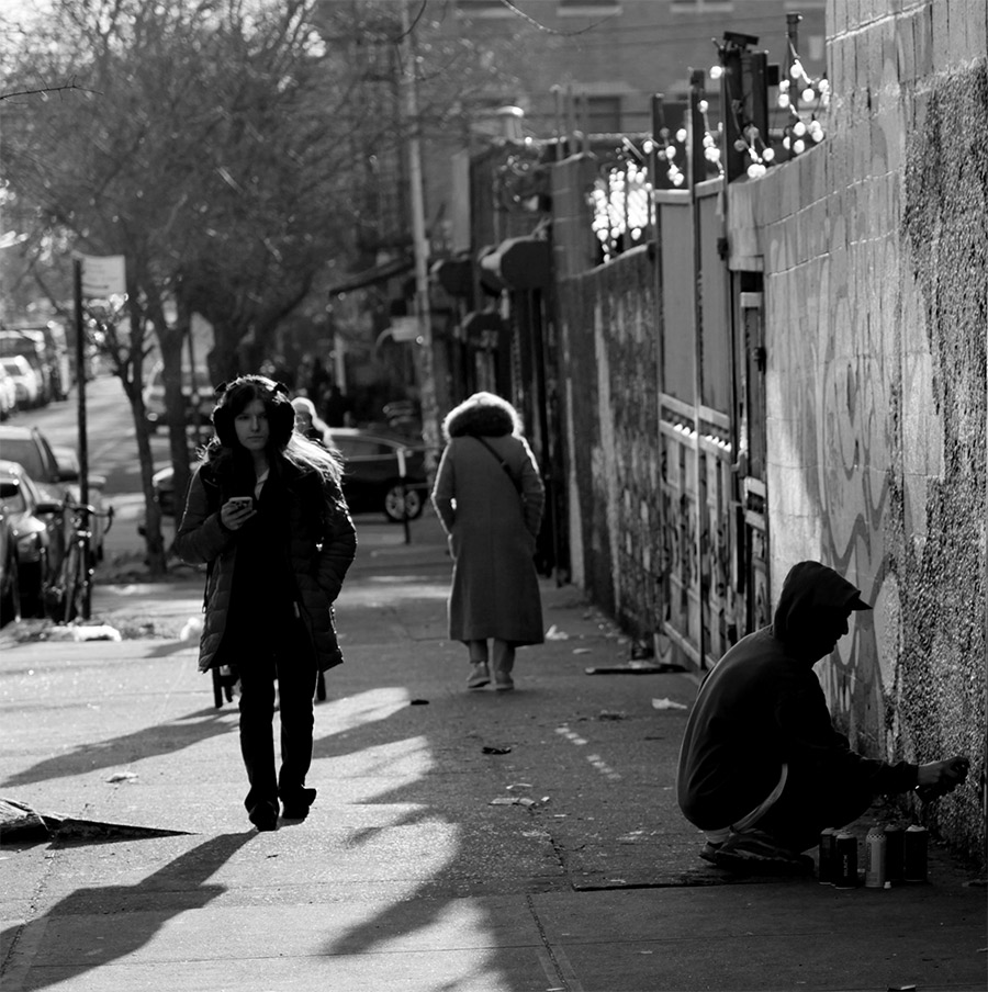
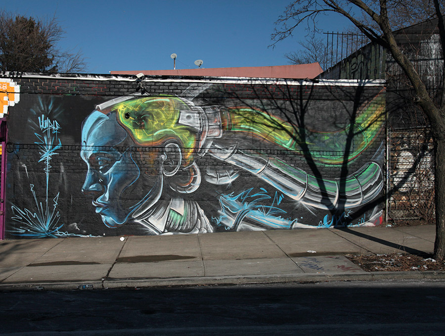
Here’s our weekly conversation with the street, this week featuring Shiro, Sticker Maul, Werds, One Rad Latina, Dzel, George Collagi, Jocelyn Tsajh, Quaker Pirate, Guadalupe Rosales, and Lokey Calderon.
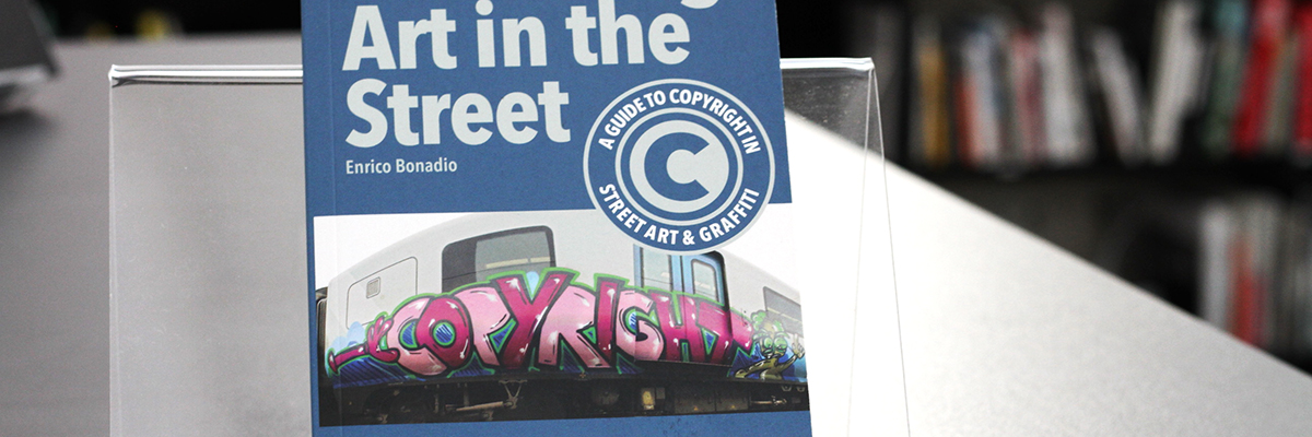
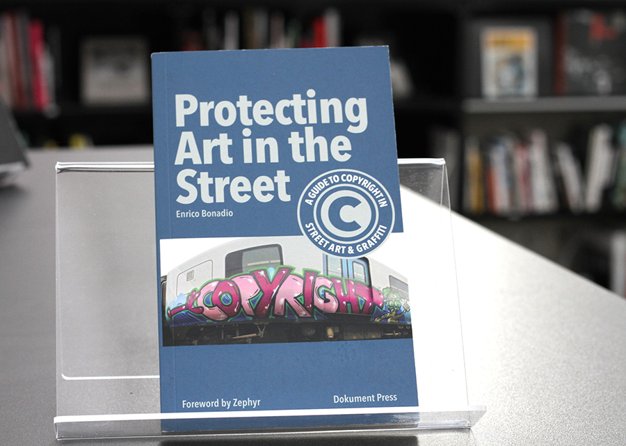
Enrico Bonadio. Protecting Art in the Street: A Guide to Copyright in Street Art and Graffiti. 2020
Reprinted from the original review.
Enrico Bonadio, a seasoned expert in copyright law, delves into the complexities of legal rights surrounding street art and graffiti in this insightful book, “Protecting Art in the Street.” Accompanied by a foreword from renowned graffiti writer, artist, and historian Zephyr, the book is a thorough and accessible guide for artists in understanding and navigating copyright laws.
Bonadio underscores the heightened vulnerability of street art and graffiti to unauthorized use and exploitation. He highlights that these art forms, often placed in public spaces, face greater risks of misappropriation and destruction compared to traditional fine art. This vulnerability, he points out, has led to an increase in legal actions against those who commercialize these works without the artists’ consent or proper compensation.
MARTHA COOPER LIBRARY: BOOK RECOMMENDATION
| Title: Protecting Art in the Street: A Guide to Copyright in Street Art and Graffiti. | Dokument Press. December 2020. Soft cover. | Author: Enrico Bonadio | Language: English
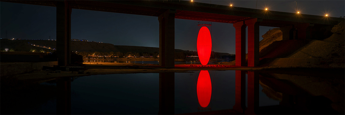
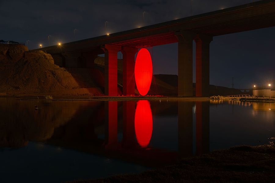
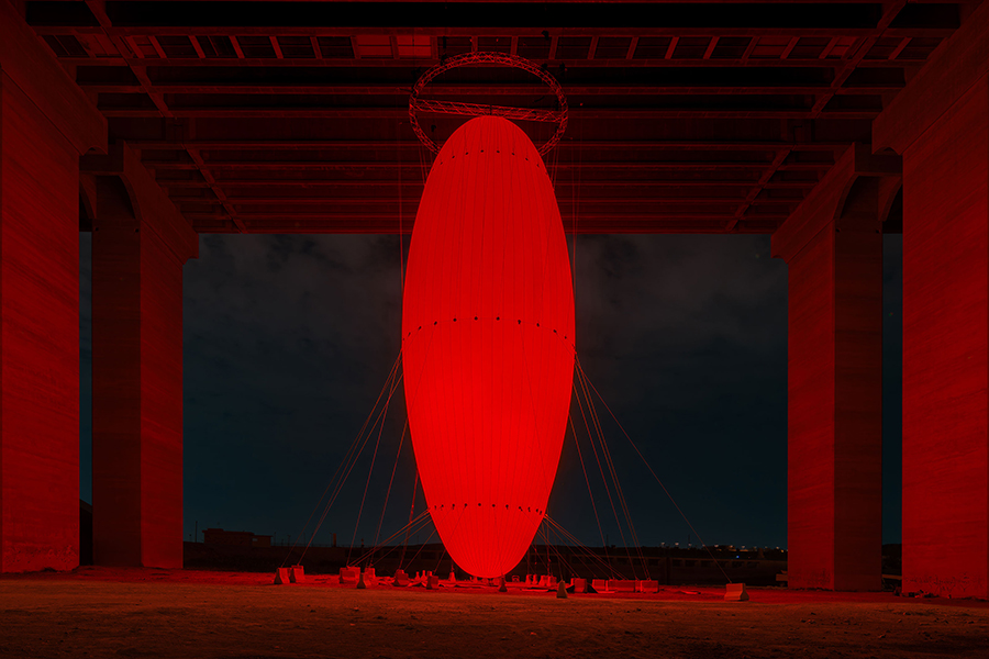
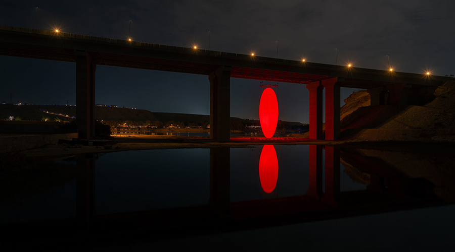
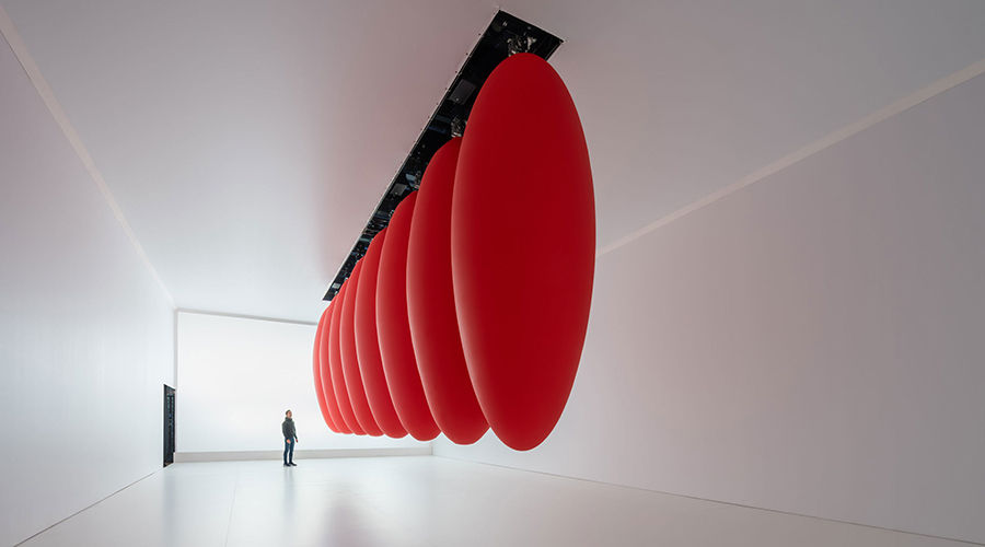
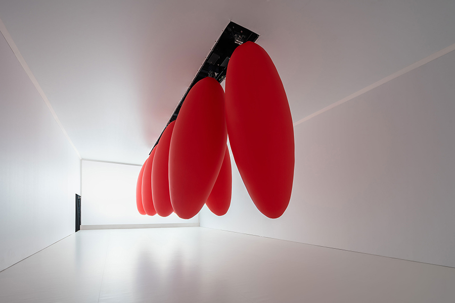
SpY’s latest projects, Ovoid and Ovoids, take two distinct approaches to spatial intervention—one in the open air of Riyadh, the other within an exhibition space in Rome. Vastly differing in scale and context, both works use form, movement, and light to challenge how we perceive and navigate the environments we often take for granted.
Public space is often shaped by necessity—by the logic of roads, bridges, and infrastructure that prioritize function over contemplation. Within these engineered landscapes, overlooked voids emerge: spaces beneath highways, gaps between buildings, and neglected urban margins. Street artists, including interventionist sculptors, have long recognized their potential, transforming them into sites of meaning. Ovoid, SpY’s latest large-scale installation, reclaims one such space beneath the Wadi Hanifah Bridge in Riyadh, inserting light, reflection, and scale into what could be considered an unremarkable void.
Suspended within this architectural remnant, Ovoid is both an assertion of presence and an activation of absence. The 35-meter-high glowing red form is not just framed by its surroundings; it forces a reconsideration of them. Bridges are built for passage, leaving their undersides as liminal, forgotten zones. By occupying this limbo with a hovering, illuminated form, SpY may compel the public to notice, challenging how we perceive and engage with the built environment.
This act of spatial transformation is deeply connected to the ethos of street art, where artists repurpose barriers and margins as arenas of possibility. Ovoid alters its setting, shifting attention from what is above to what is below, urging us to see the city differently. Reflected in the moving water beneath, it extends beyond its own materiality—both physical and ephemeral, solid and intangible. It is a reminder that cities are not only a collection of static structures but evolving spaces waiting to be redefined.
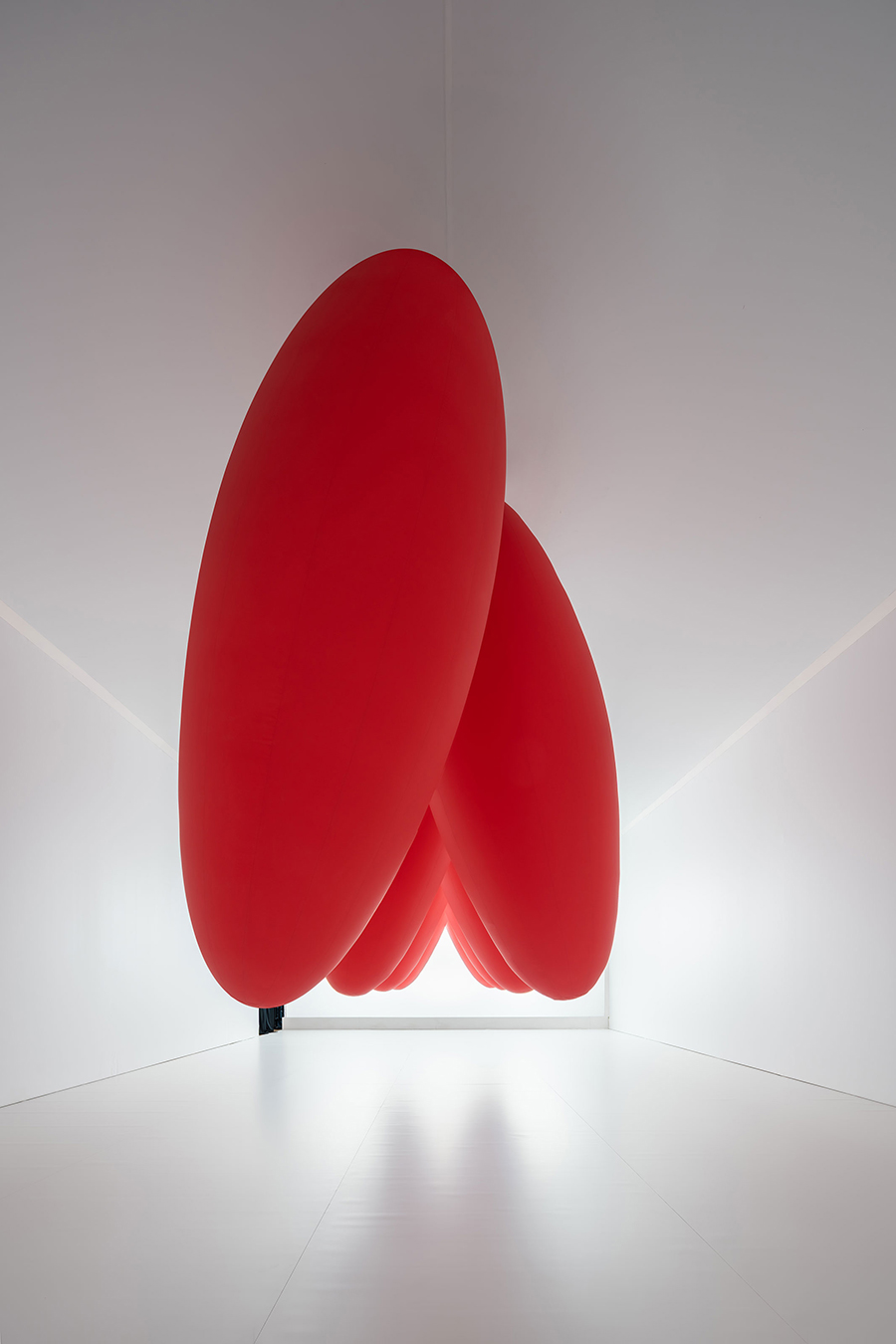
Ovoids takes the organic abstraction of SpY’s outdoor interventions inside the exhibition space and reforms it into a kinetic environment. Suspended from the ceiling, a series of elongated red forms—somewhere between paddles, seeds, and plum tomatoes—sway in slow, deliberate arcs. Their movement is rhythmic yet unpredictable, their scale imposing yet oddly humorous. As they hover and oscillate above, they create a shifting landscape of perception, inviting viewers to navigate around them.
Like its outdoor counterpart, Ovoids plays with presence and absence, stillness and motion. Here, the interplay between structure and fluidity is heightened, as the sculptures are neither fixed nor entirely free. They exist in a perpetual state of transformation, blurring the line between the mechanical and the organic. The slow pendular motion alters the spatial experience, pulling you into a hypnotic engagement where time seems to stretch and contract.
One moment, the paddles seem to loom overhead with imposing weight; the next, they glide harmlessly past, a dance both mesmerizing and slightly absurd. With the spirit of experimentation, like SpY’s interventions in public space, Ovoids reconfigures the familiar and leaves the viewer reconsidering the unseen forces that shape their surroundings.
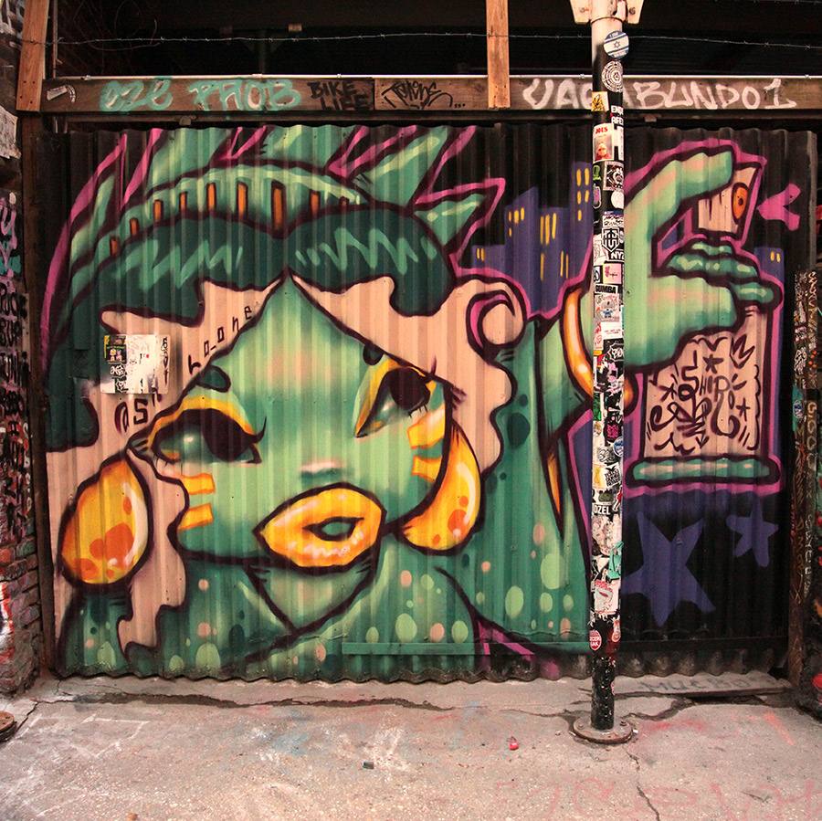
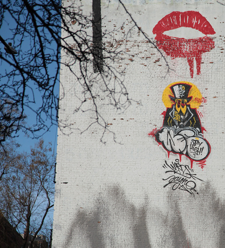
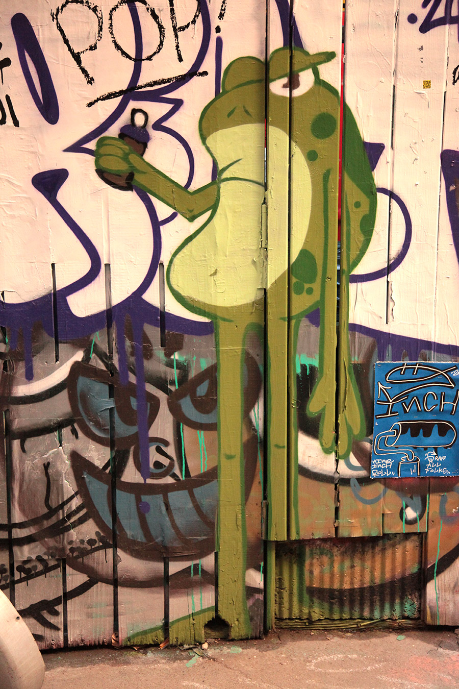
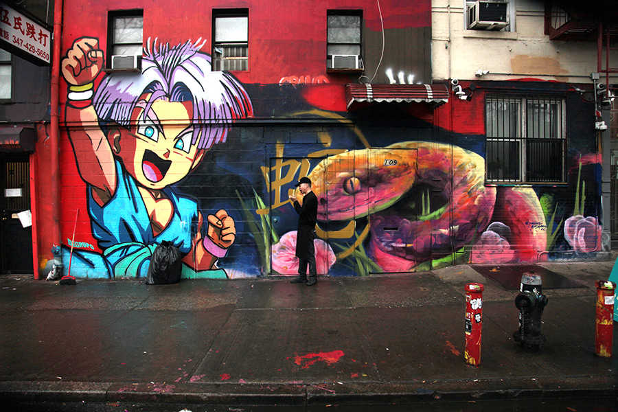
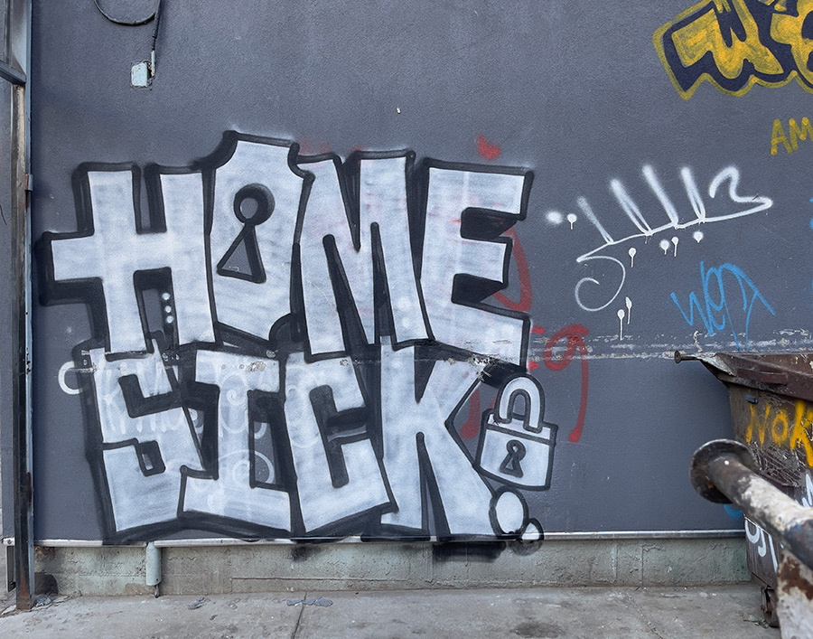
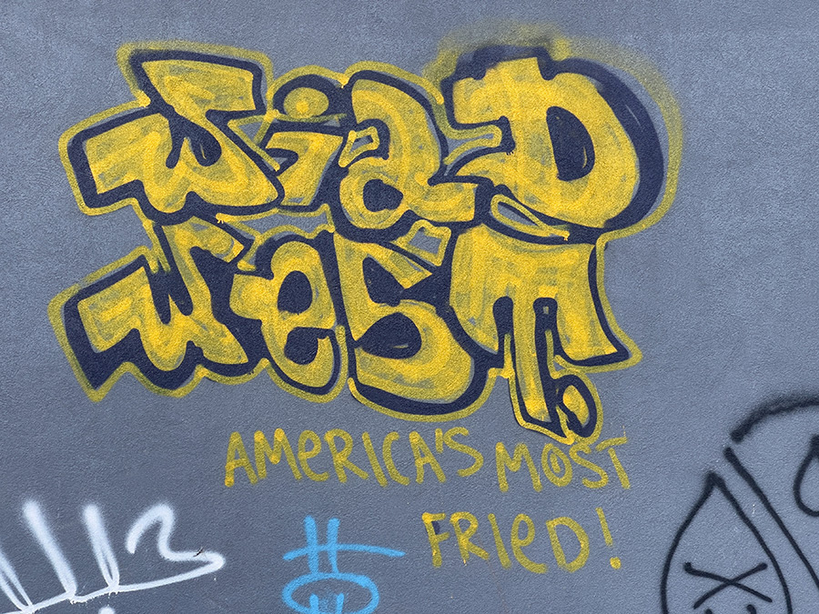
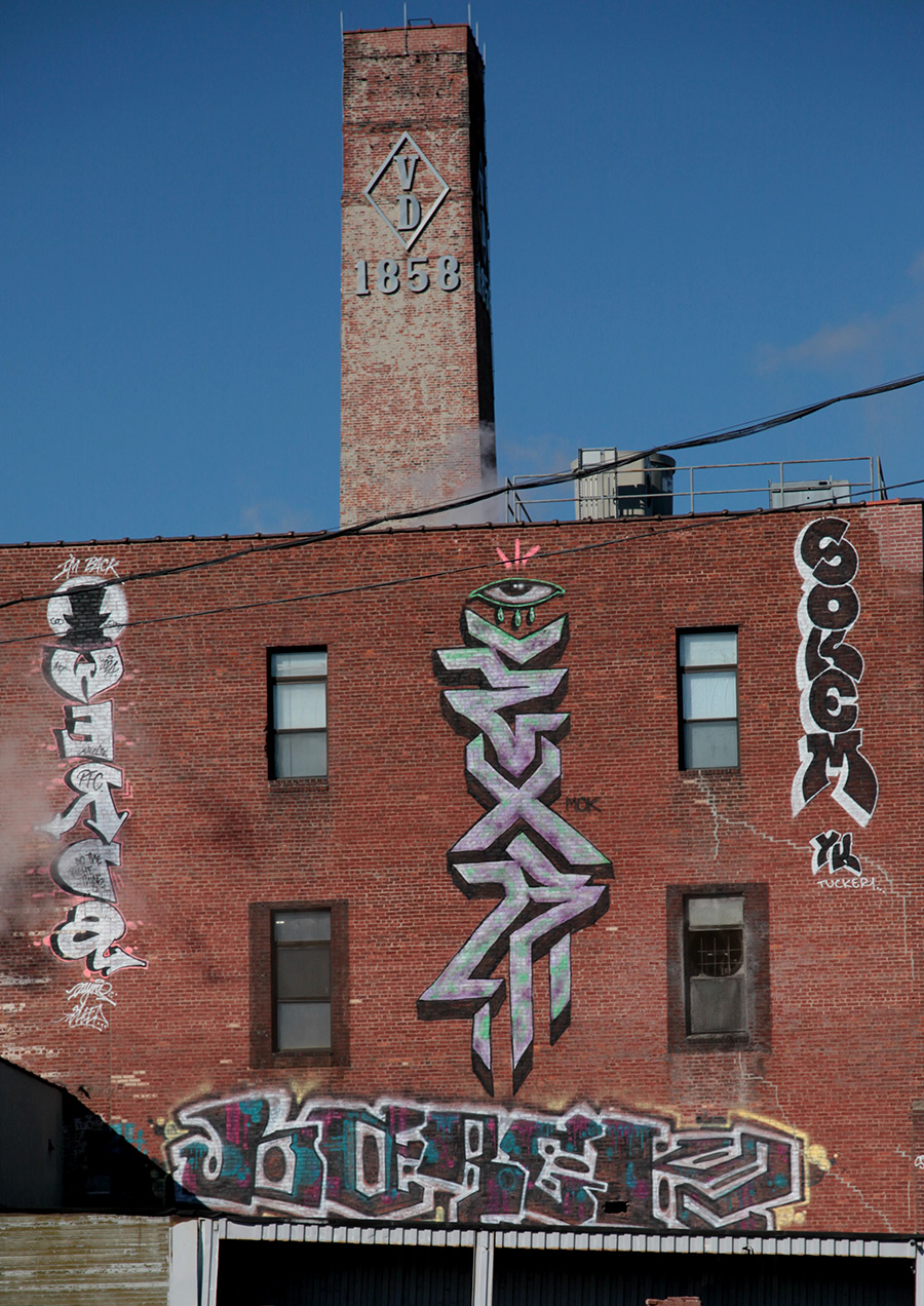
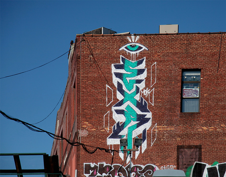
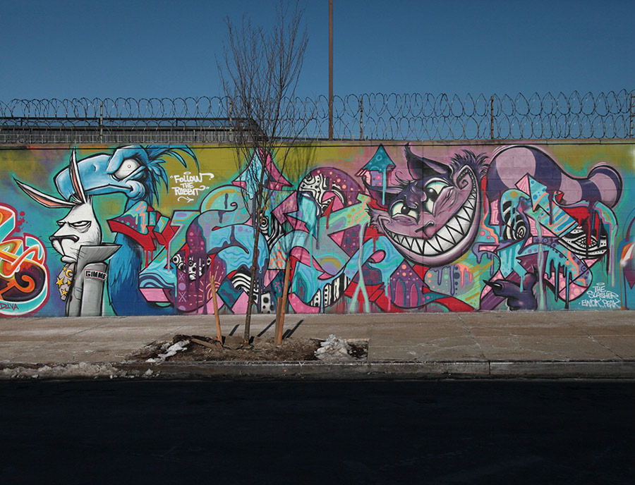
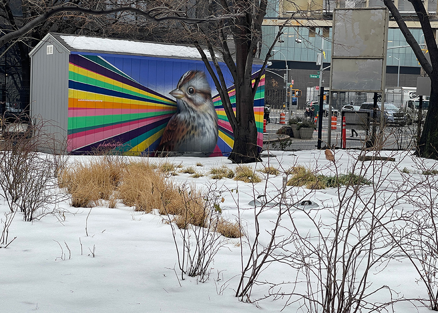
Here’s our weekly conversation with the street, this week featuring Homesick, Degrupo, BK Foxx, Werds, EXR, Manuel Alexandro, Great Boxers, Wild West, Fred Tomaselli, Mr. Mustart, Imok, and Sokem.
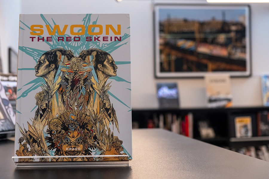
In “The Red Skein,” Swoon (Caledonia Curry) thoroughly examines her artistic work over the past decade, encompassing both her street art and studio pieces. The book, spanning 224 pages and containing over 200 color images, is a detailed account of Swoon’s contributions to street art and related fields. It includes contributions from notable writers and critics, such as Dr. Gabor Maté, RJ Rushmore, Melena Ryzik, Jerry Saltz, Pedro Alonzo, Jeffrey Deitch, and Judy Chicago, offering a multifaceted analysis of Swoon’s career.
The book is structured as a visual compilation and a narrative documenting Swoon’s artistic development. It covers her pioneering efforts in street art, studio work, animation projects, and community initiatives, providing insight into her innovative techniques and wide-ranging influence. The title, “The Red Skein,” draws on the mythological concept of Ariadne’s thread, symbolizing the complex trajectory of Swoon’s career and the interconnections within her work.
MARTHA COOPER LIBRARY: BOOK RECOMMENDATION
| Title: SWOON: THE RED SKEIN | Drago Publishers. October 25, 2022. Hardcover | Authors: SWOON | Language: English
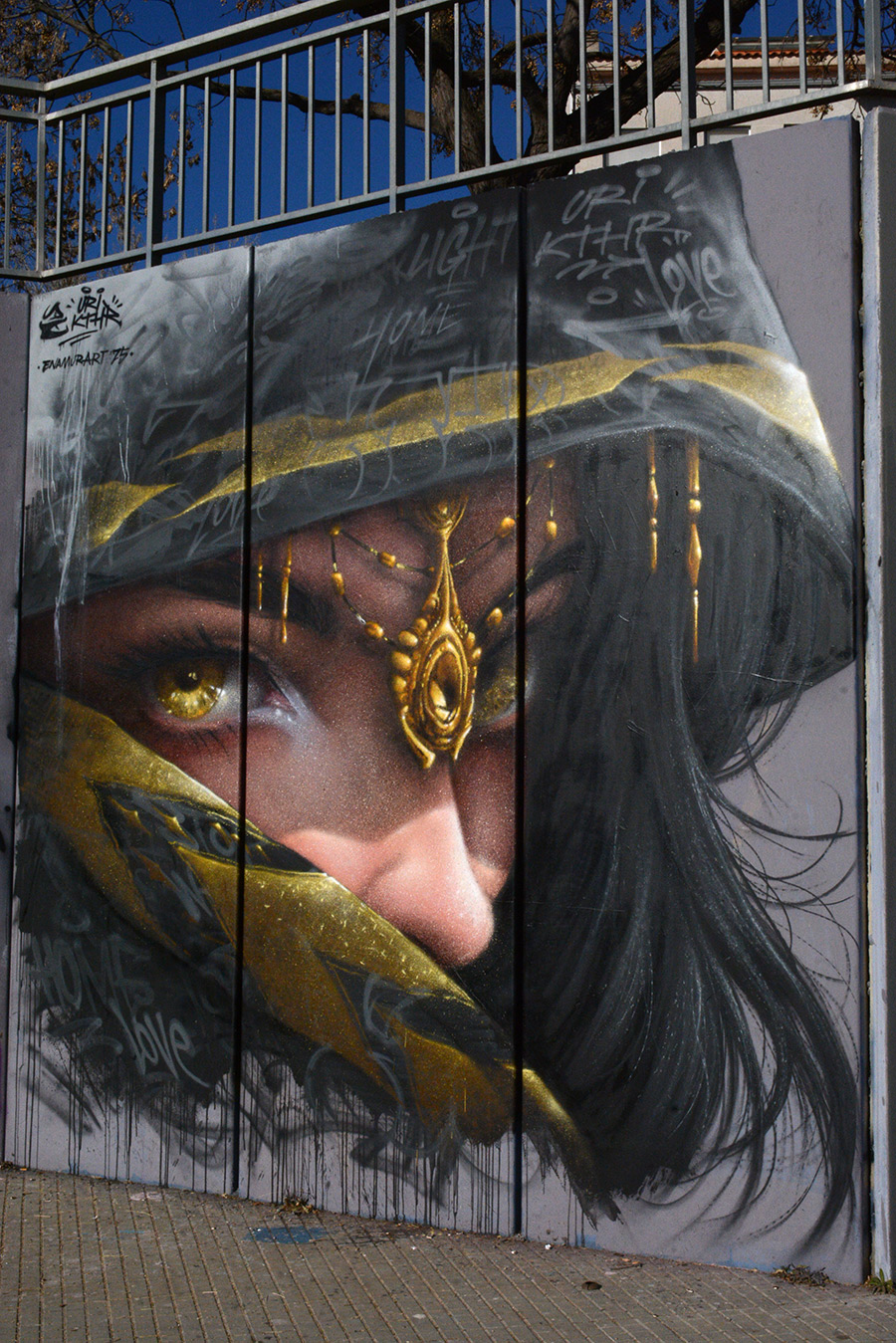
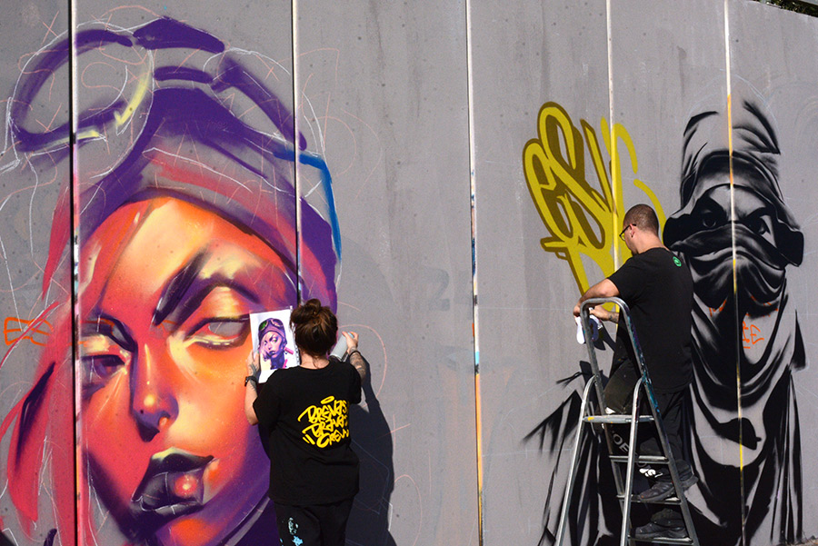
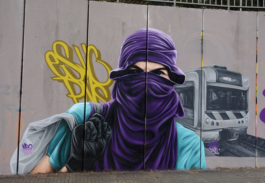
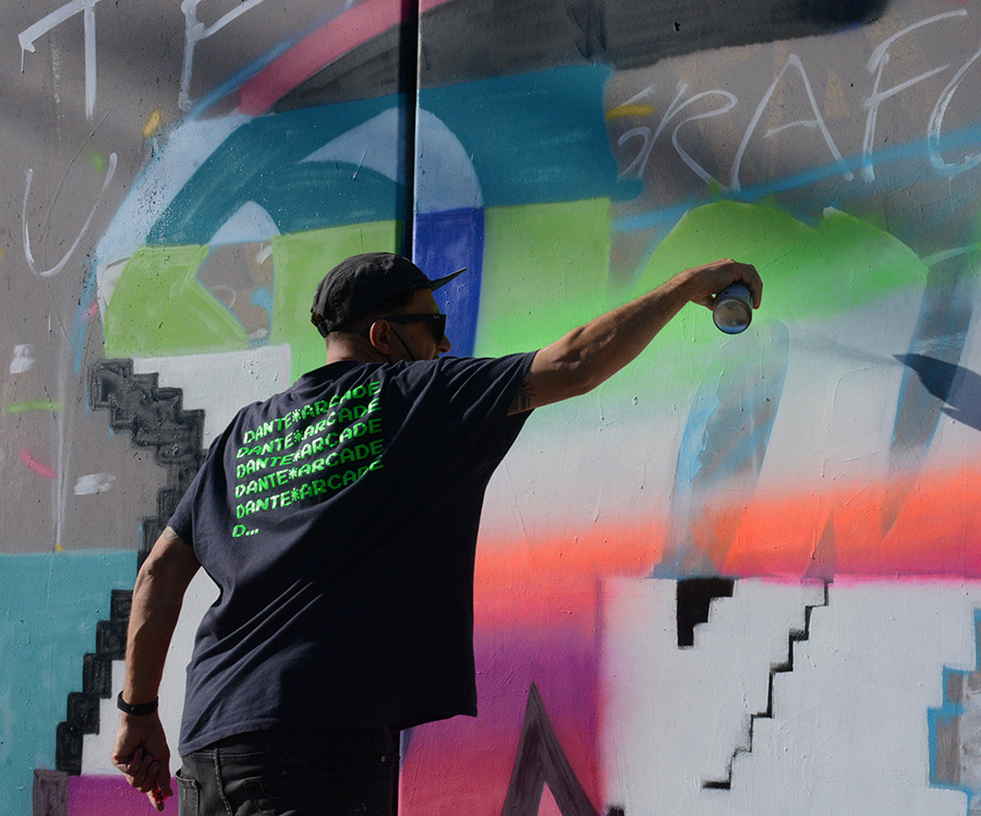
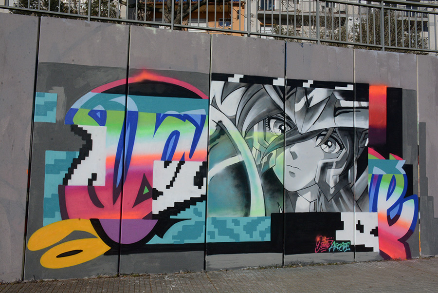
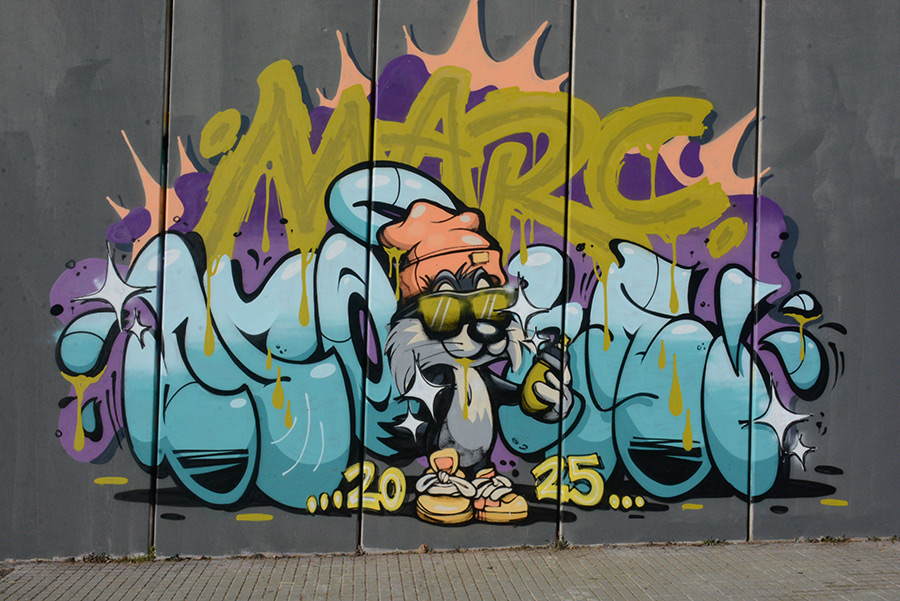
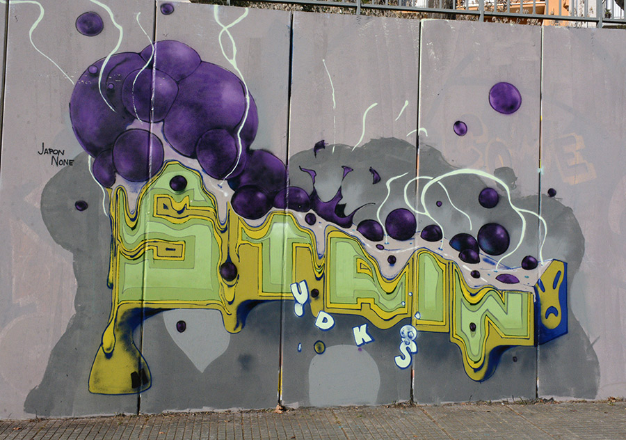
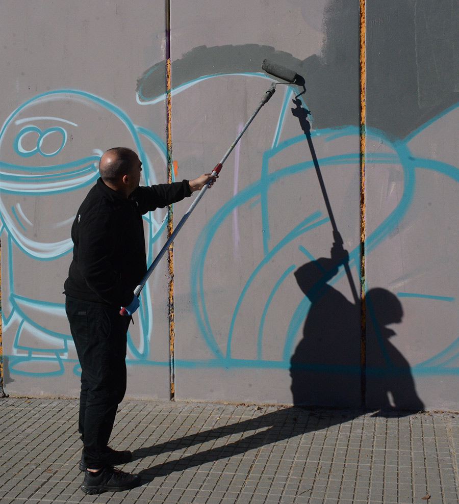
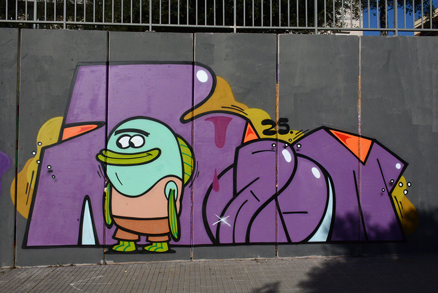
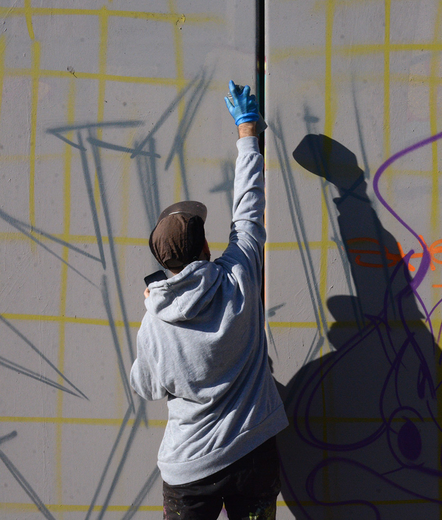
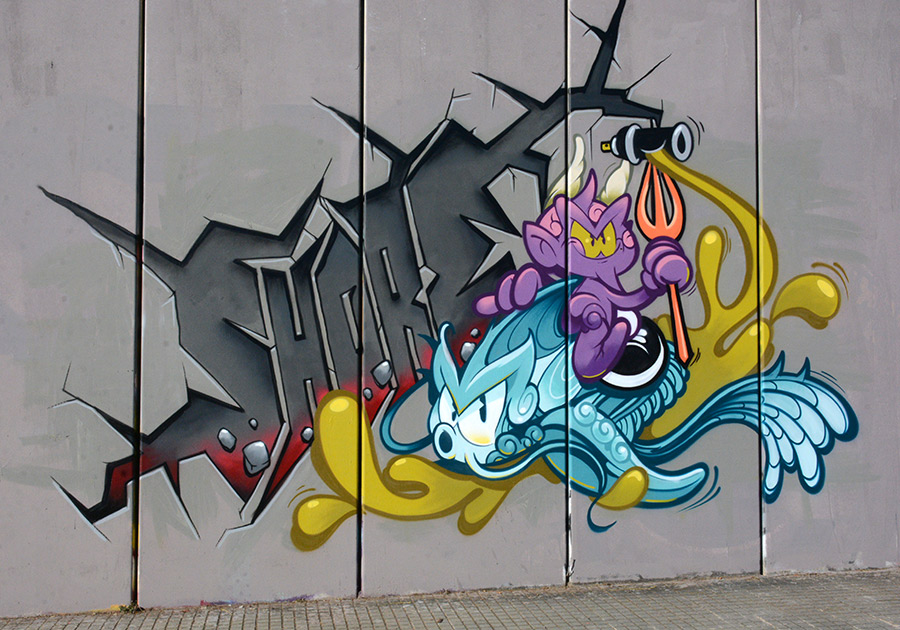
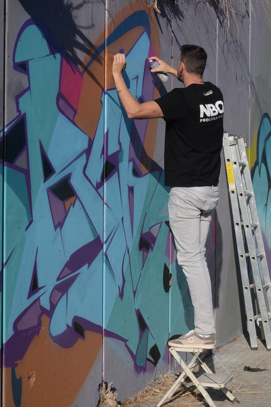
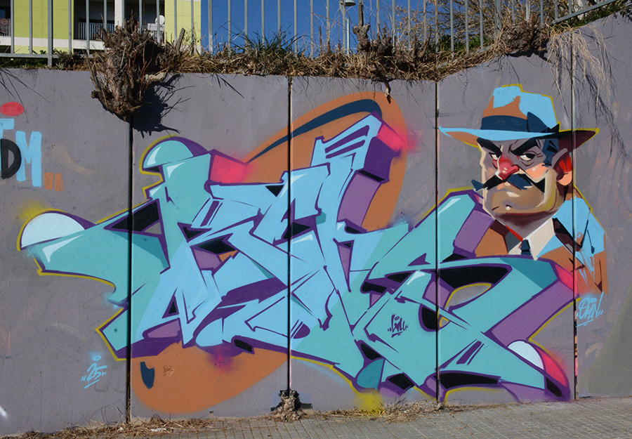
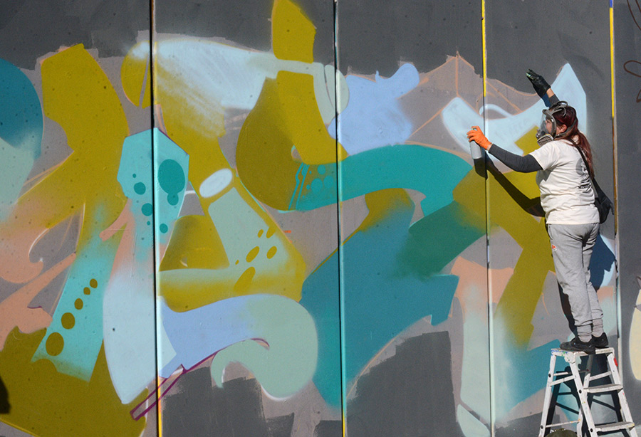
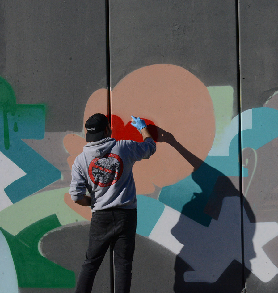
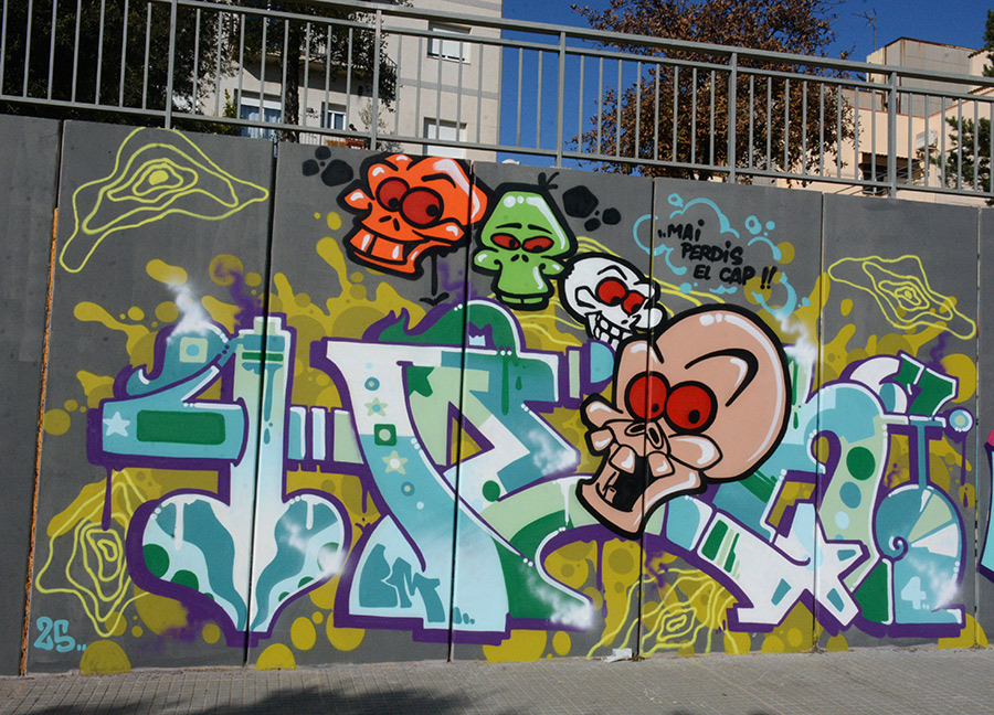
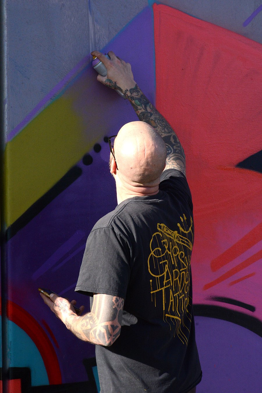
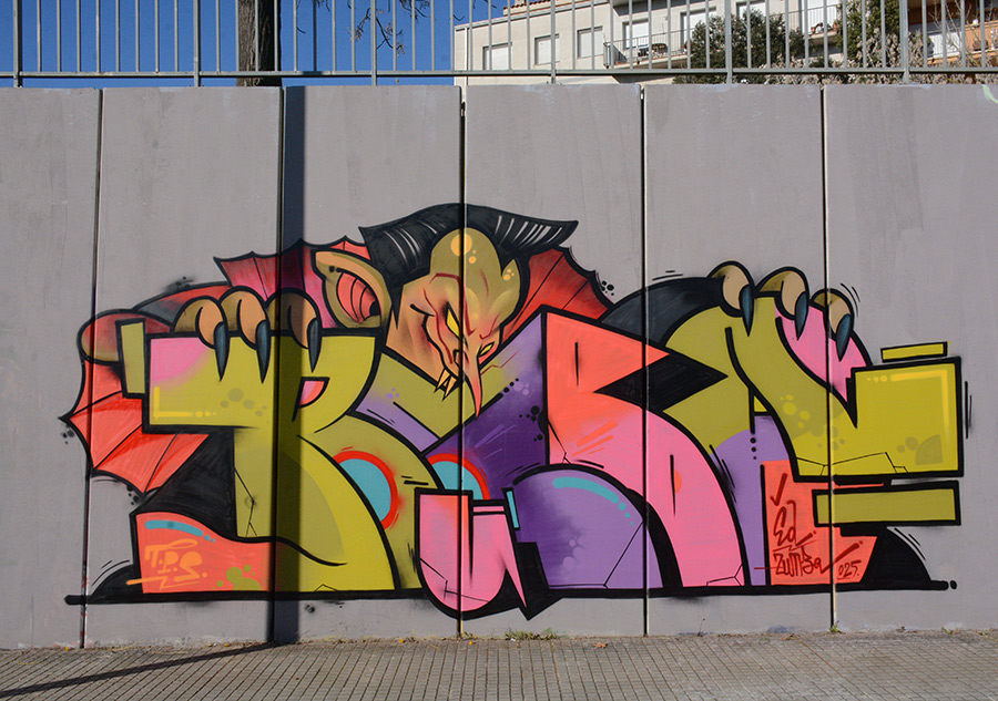
The small town of Les Franqueses del Vallès, located just 4 kilometers north of Granollers in Catalonia, Spain, hosted the third edition of the Enamurart Graffiti Jam on January 11, 2025. Nestled in a suburban setting, this town may not be on your radar, but you can imagine a reputation as a hub for urban art growing – especially with events like this graffiti jam.
Unfolding at the intersection of Carrer de la Serra and Carrer Llevant, Enamuart brought together an impressive lineup of graffiti artists and writers, including MARIA DIE, ESLICER, DANTE, MARCONE, PAKO & MAGA, STAIN, JAPON, SHORE, OKAN, MUSA, HEN, and EDZUMBA. The names represent a mix of styles, perspectives, and techniques, making the jam not just an artistic gathering but a good showcase of the breadth of contemporary graffiti.
Les Franqueses del Vallès, while quieter and more residential than its larger neighbor Granollers, is finding its footing as a cultural hotspot. The nearby Roca Umbert Fàbrica de les Arts in Granollers is a converted textile factory that’s become a cultural center and creative hub thanks to high quality works from graffiti and street artists, contributing to the region’s sense of artistic momentum. Enamurart’s graffiti jam is another layer in this evolving landscape, helping shape the community’s identity.
Thanks again to the artists and the organizers for sharing this story with us. Special thanks go to Lluis Olive Bulbena, whose sharp eye and passion for street art and graffiti have captured the day’s best moments in the photos shared with you today.
Bitter is right! The city’s temperature has been below freezing every day this week, and the sentiments coming out of the new White House appear to be bitterly subzero. We will be looking for artists to respond to the raft of new declarations, announcements, and aspirations spread across the political landscape. You can’t simply ban and deport everyone who you despise – it doesn’t work. When you see powerful people punching down with such hostility… – even a half-asleep school counselor with a coffee-stained clipboard would ask if everything is okay at home. The behavior on display this week might bring to mind something Grandma Arlene used to say when you were a mouthy teenager: ‘Maybe it’s time to take a good look in the mirror, mister!”
When it comes to graffiti and street art, we’ll keep an eye on the streets; In times of crisis and uncertainty, the artist’s voice emerges strongest, as adversity is the canvas on which creativity thrives.
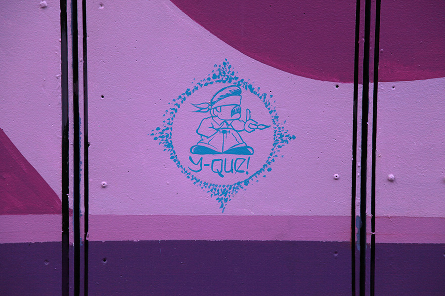
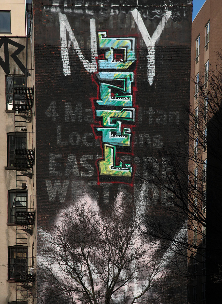
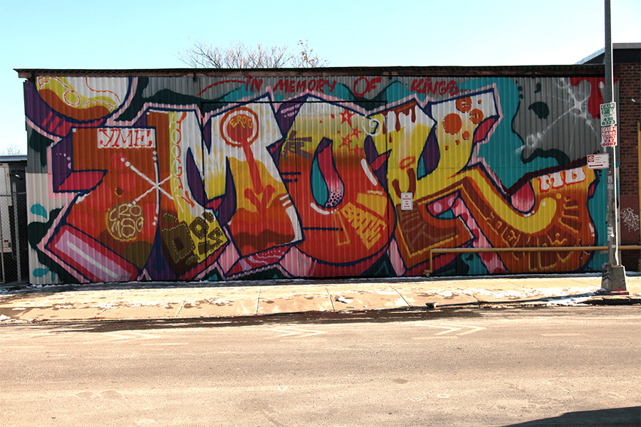
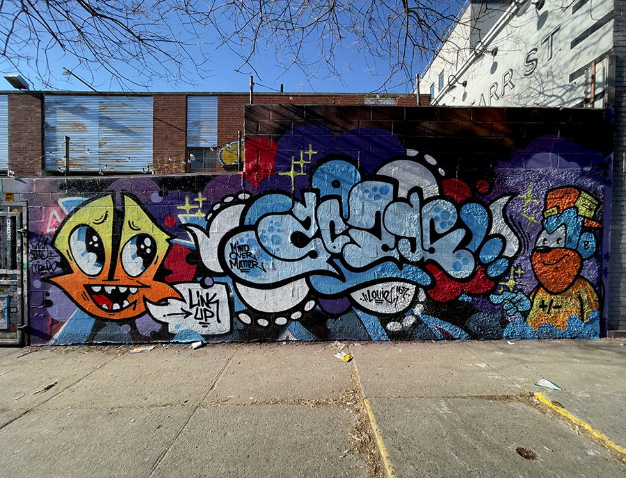
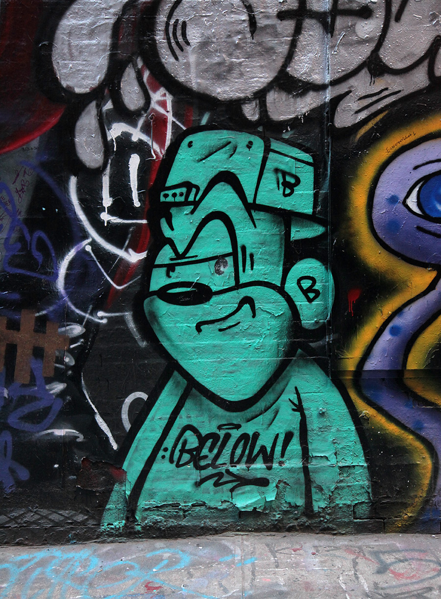
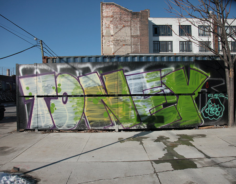
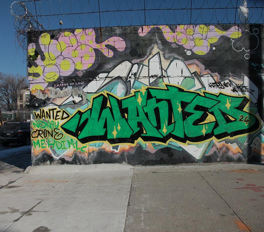
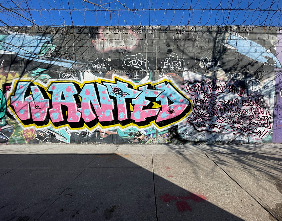
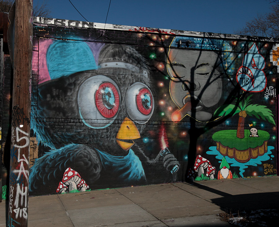
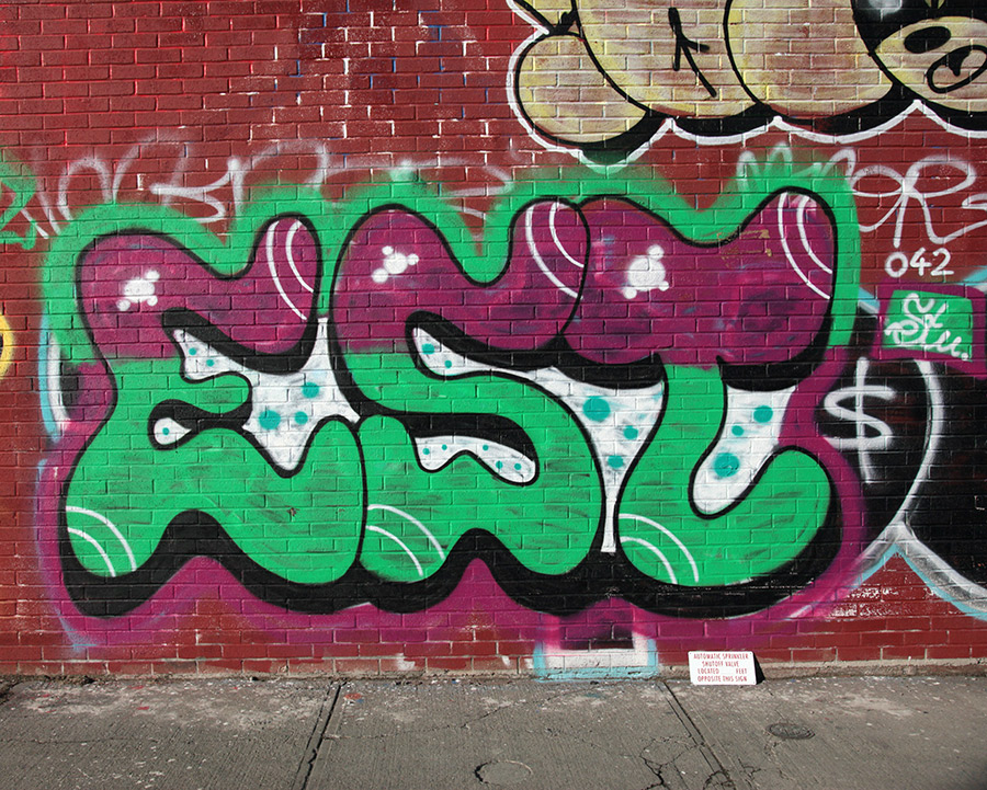
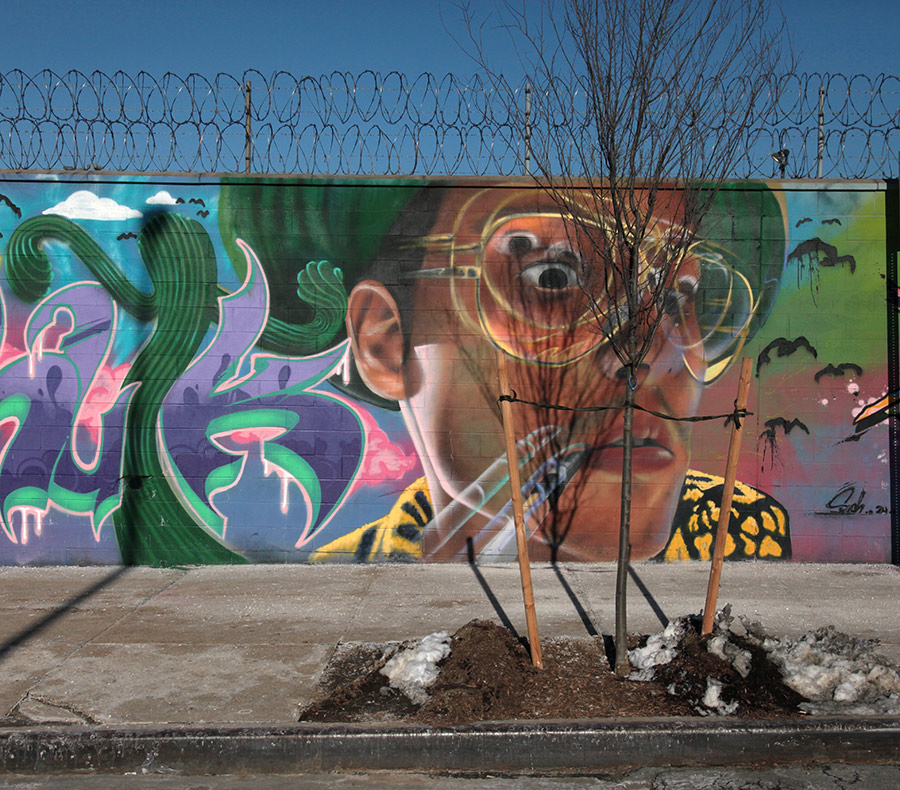
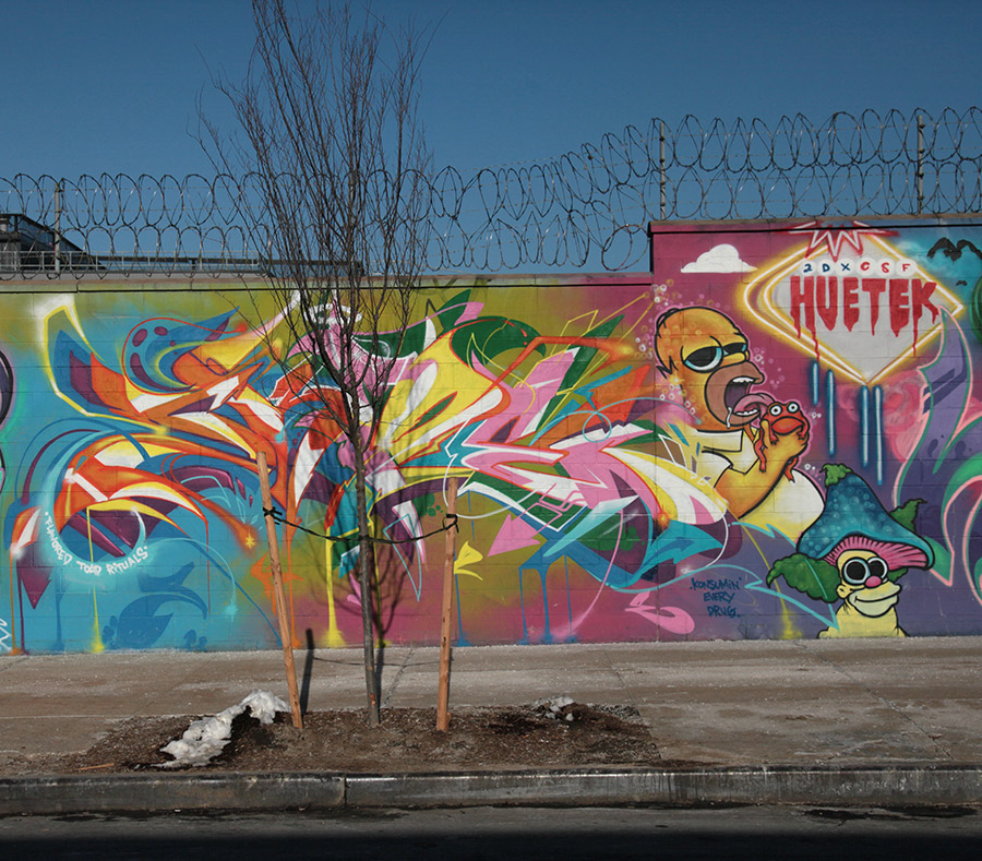
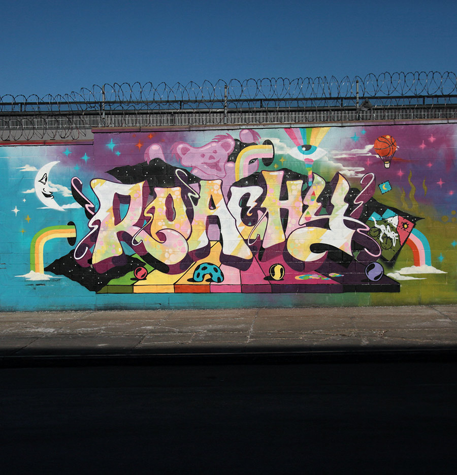
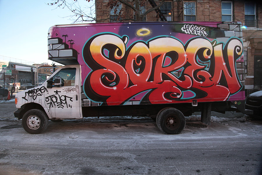
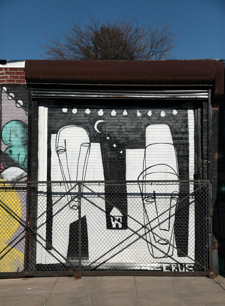
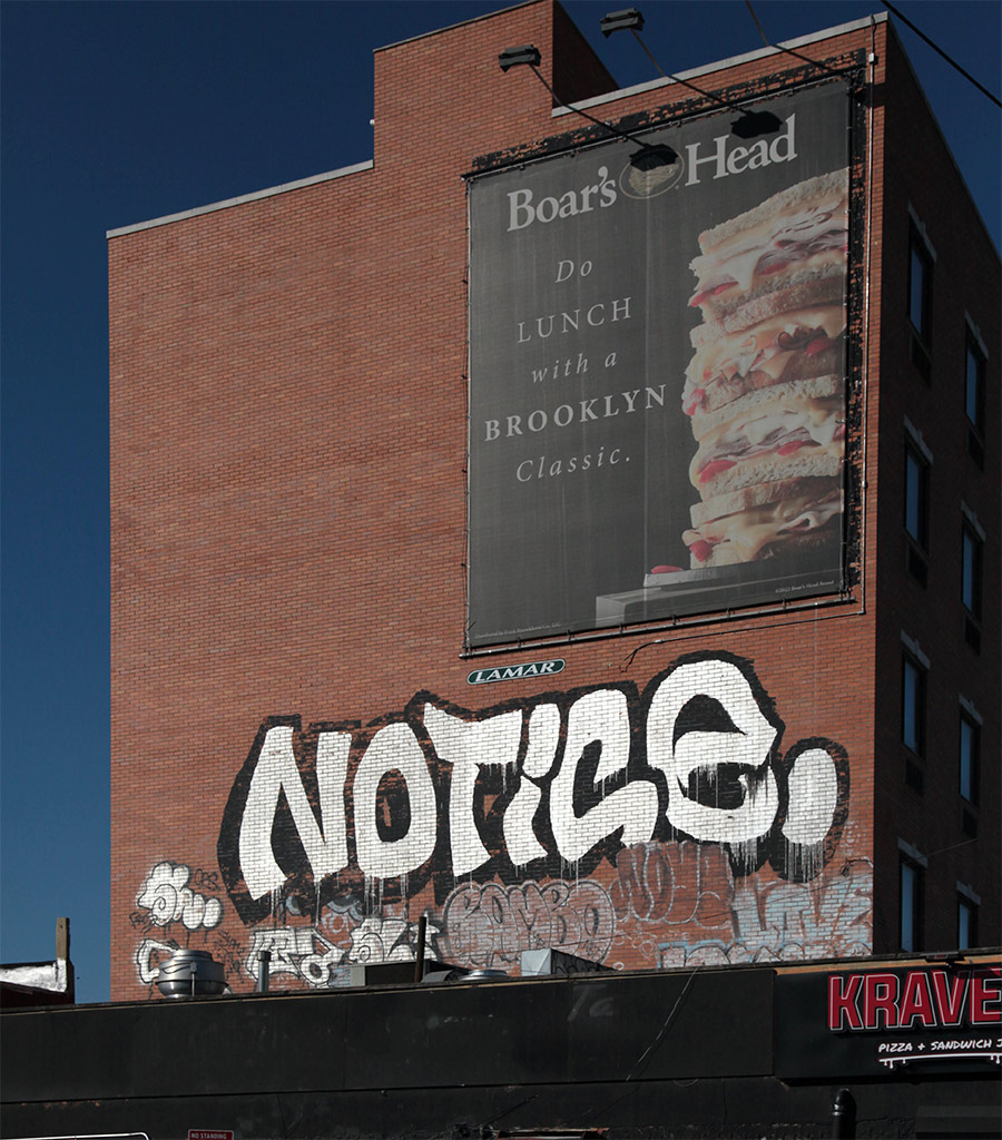
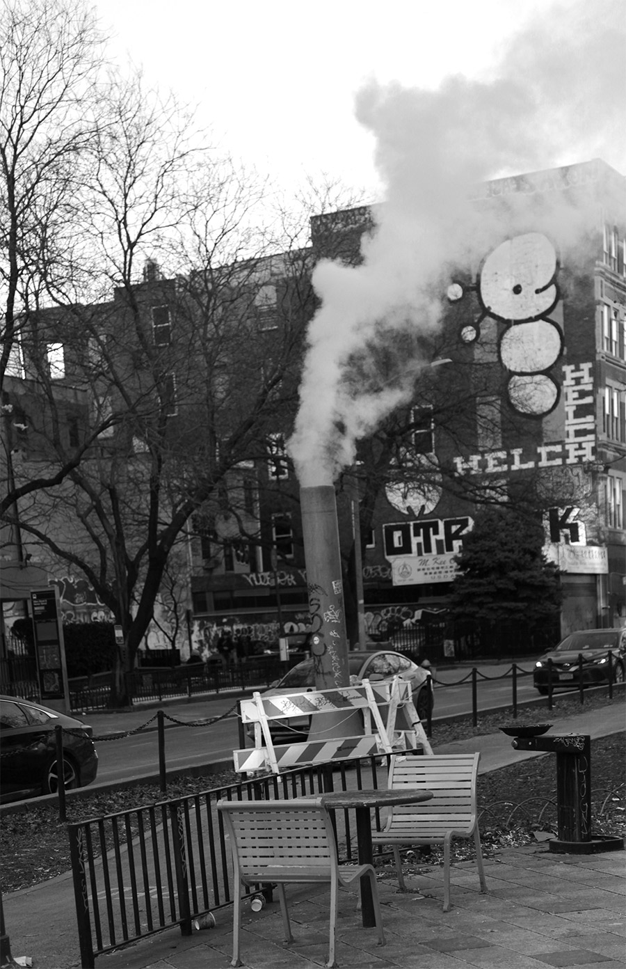
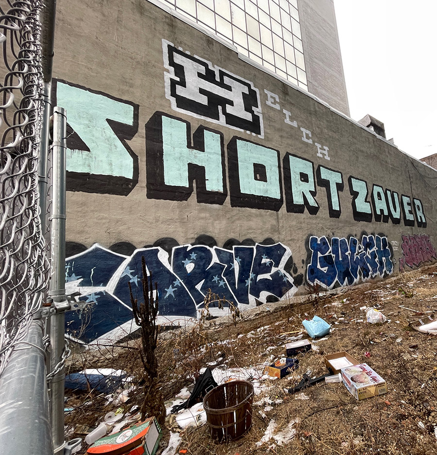
Here’s our weekly conversation with the street, this week featuring City Kitty, Below Key, Huetek, Muebon, Rheo, Roachi, Such, Humble, Le Crue, Denis Ouch, Notic, Stu, Toney, Jay Diggz, EST, The Slasher, Soren, HELCH, Louie167, and Wanted.
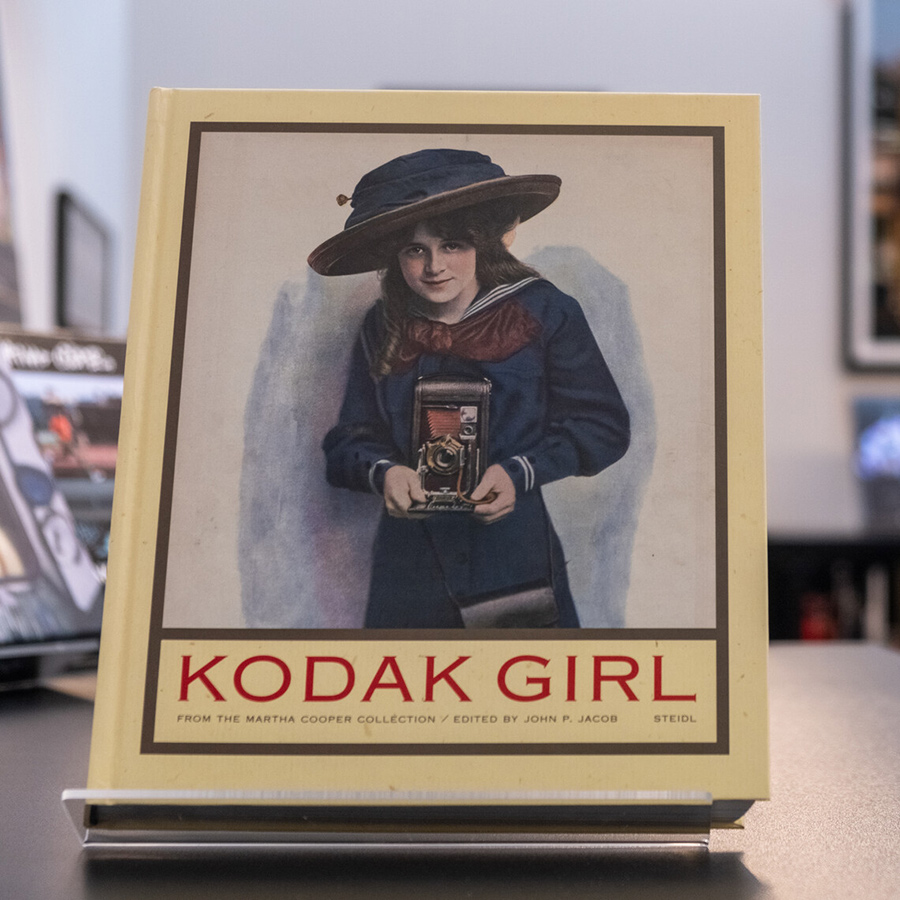
Books in the MCL: John P. Jacob (ed.). Kodak Girl: From the Martha Cooper Collection
Kodak Girl: From the Martha Cooper Collection. John P. Jacob (ed.). 2012
Reprinted from the original review.
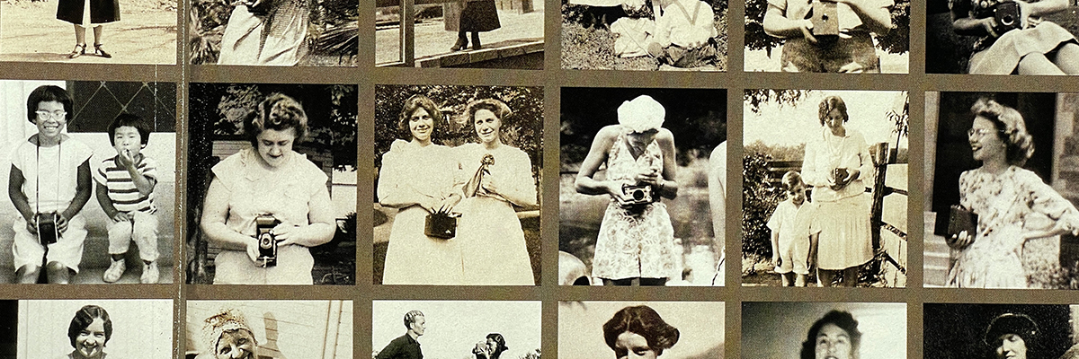
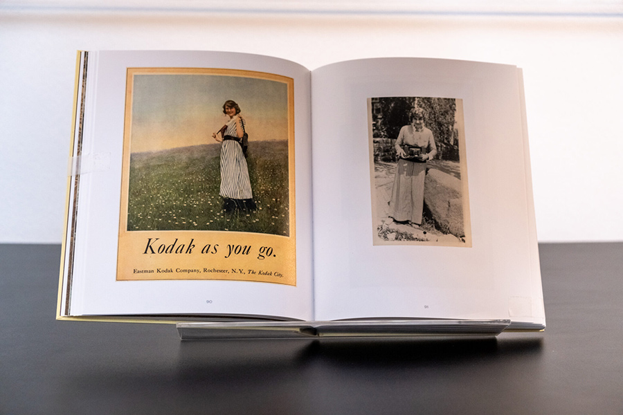
“Kodak Girl: From the Martha Cooper Collection“, edited by John P. Jacob with essays by Alison Nordström and Nancy M. West, provides an in-depth examination of Kodak’s influential marketing campaign centered around the iconic Kodak Girl. With a riveting collection of photographs and related ephemera, the book dives into the intersection of technology, culture, and the role of gender in the late 19th to the mid-20th centuries. It offers readers a comprehensive look at how Kodak not only transformed photography into a widely accessible hobby but also significantly influenced societal perceptions of women.
MARTHA COOPER LIBRARY: BOOK RECOMMENDATION
| Title: Kodak Girl. From The Martha Cooper Collection / Edited by John P. Jacob | Steidl. Germany, 2011 | Authors: John P. Jacob, Alison Nordstrom, and Nancy M. West | Language: English
Before “street art” became a globally recognized genre, Barry McGee and Margaret Kilgallen were charting their course—one rooted in graffiti, …Read More »


 | Title: The Wide World of Graffiti
 | The Monacelly Press. December 2023. Hardcover.
 | Author: Alan Ket
 | Language: English