Corporate Space, Happy Universal Shapes, and Additive Averaging
Two unusual aspects distinguish todays’ posting. One is that the featured project by the remarkable street artist MOMO is not actually on the street, rather it is in a corporate lobby – a quasi public/private place far removed from the origins and ethos of most Street Artists’ work. Secondly, the interview is conducted by our guest Kate Gilbert rather than us. An artist, curator, and creative strategist, Kate directs a Boston non-profit that curates and produces independent public art projects. We really enjoyed the conversation that she and MOMO had while he was in the midst of a two week installation – and we knew you would like it too.
~ by Kate Gilbert
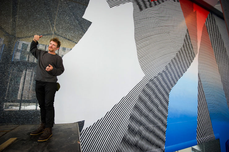
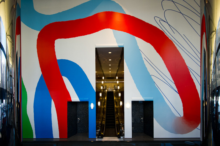
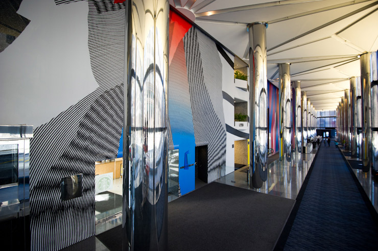
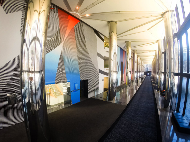
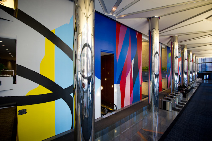
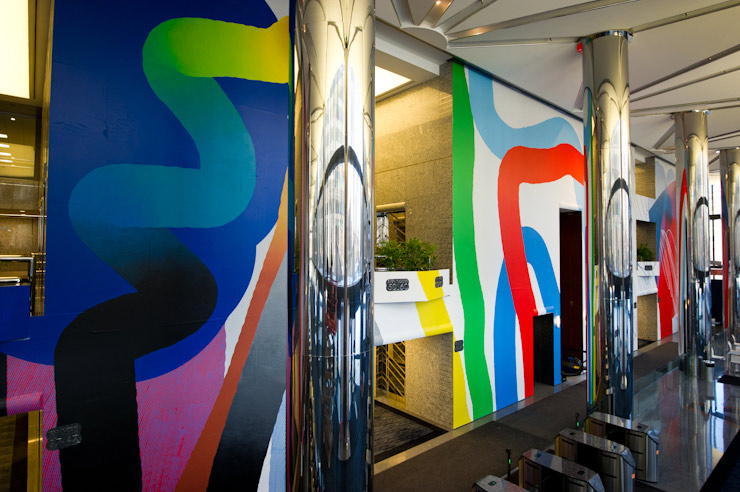
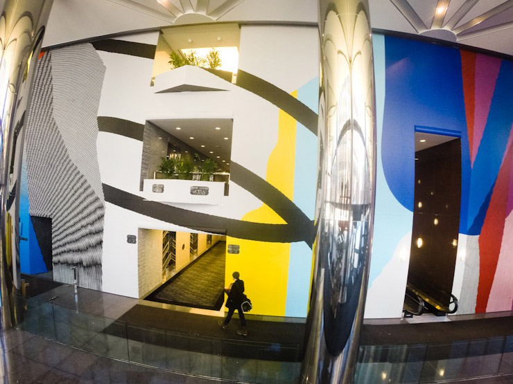
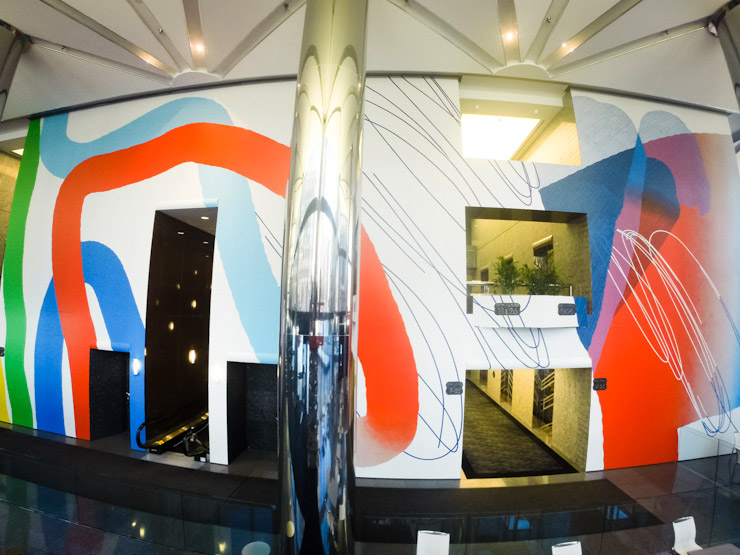
In February the Brooklyn/New Orleans street artist MOMO arrived in Boston in the midst of Snowpocalypse ‘15, an unrelenting series of snowstorms and freezing temperatures that left Boston under 93” of snow. Undaunted by it all, MOMO completed a massive 250’ x 34’ mural over eighteen nights in the lobby of Boston’s iconic John Hancock Building bringing his signature combination of blending techniques, harmonious colors and universal forms to warm up the austere lobby and its wintery surrounds.
MOMO (photo © Geoff Hargadon)
The following is an excerpt from an interview I had with MOMO on his fourteenth night of painting, which followed a brief talk he gave with project curator Pedro Alonzo.
Kate Gilbert: So it’s 20 degrees in Boston tonight and the thermometer is stuck at 20 degrees. The snow isn’t melting, and there’s ice everywhere; it’s permanent. So first of all I want to thank you for bringing this to us. It’s great color and smart design.
MOMO: Cool, I’m glad you like it.
KG: One of the things I wanted to bring back from your conversation with Pedro is this idea of universal shapes and appealing colors. That’s something we don’t usually hear coming out of the mouth of an artist who originally started in the street.
MOMO: Pedro’s first question took me off guard because I hadn’t quite heard that from anyone. He said the murals made him feel good, and why was that. I didn’t quite have an answer ready then but I’ve thought a lot about it since and it reminds me that I have this great love for David Hockney’s swimming pools. A sunny landscape has a certain key of colors and mix of shadows and this variety of things that feels like it’s at the peak spectral combination of all these formal things like shade and value, and it lets us know it’s a sunny landscape.
Something about that really appeals to me. At different moments I’ve wished my art could be associated with swimming pools, cabanas, and beach towels – those things that are, for me, a godsend in terms of mood and inspiration.
I spent a lot of time in the south and I love a tropical climate and things like that feel really alive and vital. It’s no coincidence that I take so much inspiration from Jamaica. Not just the nature there but also their culture seems to respond to this vivid set of conditions. I want to put that in the paintings and I hope that is what’s coming through in what Pedro mentioned about being happy.
MOMO (photo © Geoff Hargadon)
KG: I think so. It’s happy and, especially at this time of year in Boston, we’re all keyed in to anything that’s happy.
MOMO: Good. I realized quite late that I respond well to warm climates and it’s why I stay in the South primarily. And I do think a majority of these forms keep repeating. They’ve come up in different ways through the years.
KG: Are they forms that you’re testing on the street? When you say universal, are they universal in your artistic vocabulary, or do you think for they’re universal for all of us?
MOMO: They’re meant to be simple and universal so the audience might enjoy these as their own, being just colors and lines, spectrums and harmonies.
For instance I’m relying heavily on just the impact of red. Or the right orange-red which I feel is lit by sunlight. It’s not so much a narrative or a meaning implied on top, it’s the concrete materiality of the work that has to carry the oomph.
MOMO (photo © Geoff Hargadon)
KG: Picking up on this idea of materiality, the space has this well, let me just say, it’s pretty unique. Have you ever worked in a space like this before?
MOMO: No, this is the best architectural chance I’ve ever had to do something, indoor or outdoor.
KG: What are you responding to in this space?
MOMO: The chrome columns are undeniably weird and fun and that’s led me to make the fat lines somewhat in scale with them, or in-and-out of scale with them. There’re a lot of vertical bands. Down there [pointing to the NE side] there’re a lot of noodly ones that are just going their own way. It struck me that having a conversation with those floor-to-ceiling forms was an obvious way to respond.
MOMO (photo © Geoff Hargadon)
KG: There’s this sort of forest effect going on.
MOMO: Yeah, there’s a forest! They have a gesture. Everything in here is real straight lines and clean and feels like it’ll last for the ages. But the columns do have a gesture and it’s right in front of the painting.
Besides the columns, everything in the lobby is a super straight, flat surface. I’ve tried to play off of that with soft forms so the building can show off. I’m doing something complementary in a way.
MOMO (photo © Geoff Hargadon)
KG: You’re creating a visual conversation with the architects. I’d love to see you in a room with I.M. Pei’s office. What would you say to them?
MOMO: I’d be interesting to see how this building has grown or developed on its own because it’s probably not the way the architect left it. They’ve designed security in a way that wasn’t part of the initial pedestrian flow.
KG: There’s this great performance going on here with people entering and leaving through the security desk, even now at 6 pm.
MOMO: And cleaning crews! It takes a huge staff to keep the building up to its standards.
MOMO (photo © Geoff Hargadon)
KG: So did you consider this audience or who’d be coming and going when you were making the work?
MOMO: Yeah, of course. First thing, I tried to identify was where people would see the wall the most frequently, or where they’d spend the most time. Because the wall is framed by the columns, you get a grouping of available vignettes.
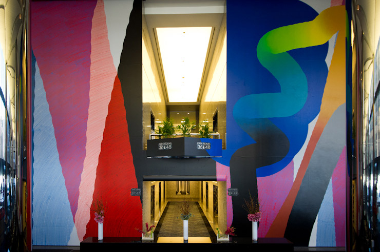
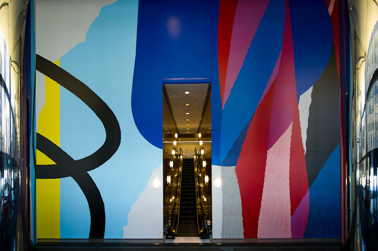
I took the ends to have special significance. At one end there are tables and chairs where you can relax in a communal café area. I thought those areas should be dressed up in a way so you could look at them for longer periods of time. Then the center, I kept things more serious and somber because it has this stately serious pretense with the check-in desk and security being there. I tried to look at the space anthropologically.
KG: So the painting in the center is more serious? Is that represented in the darker, gray pinstripes created through…what do you call it, additive averaging?
MOMO: Yes, the particular color theory we’re working with when we add these gray tones is called additive averaging. I guess they just happened in the center by chance. The center is where subtle mixes are happening and the darker colors are coming through. In general, I want the whole thing to feel light but it needed to be grounded somewhere, especially there, so it didn’t seem silly.
MOMO (photo © Geoff Hargadon)
KG: I don’t think your work could ever be interpreted as silly.
MOMO: Oh that’s good because I want to take it right to the edge like a dance performance. Certainly dance can be seen as flippant or pure whimsy. But if it is balanced and well done, somehow it can go right to the edge and still be serious.
KG: Your work is serious and I get the sense everything is very thought-out and methodical. Were there any surprises when you got here?
MOMO: We changed everything! It’s been so much work! Struggling, redesigning, you know, minutes before we go. Part of that is because we weren’t able to use the sprayers. That was my mistake in understanding how much dust they were going to dump into their surroundings. We struggled a few days trying to make it work with a spray tent and it was not possible. So without the sprayers we couldn’t do the giant sweeping color gradations.
That meant things had to be redesigned so they’d still be exciting while staying unblended. I tried to break up the backgrounds that the stripes are going over, so there’d still be a number of colors changing. It wasn’t a solution just to switch fades for single colors, because I had to break things up in a way that’d keep them interesting.
MOMO (photo © Geoff Hargadon)
KG: That sucks.
MOMO: No, it’s okay actually. Somehow the sprays that I do outdoors are a rough thing. I don’t even know if they were working that well in this refined space. It has a texture that would be a little out of step with the high-polish feeling here.
KG: As a result, have you invented any new techniques while working here?
MOMO: Oh, that’s a good question! I’m doing this thing between all of my helpers where I’m taking screenshots off of the computer where I’m designing, sending them in emails, and then we’re all following the sketches on our phones. I feel like there’s a big potential there to synch everyone up in a detailed way. I used to print everything out and keep it in a laminated pocket which is good so you don’t drop your phone in a bucket of paint, but this is kinda better.
MOMO (photo © Geoff Hargadon)
KG: So maybe there’s a MOMO app in your future?
MOMO: Or maybe I need a phablet – a phone tablet where I can do all my Photoshopping and it hangs off my neck.
KG: All right, let’s get you a sponsor! I did want to get back to that audience question. When you’re working outside doing your posters between 3 and 6 am I assume you don’t want to interact with anyone. When you’re here, are you interacting with people? Or are you just trying to get your work done?
MOMO: We’re interacting and keeping our ears open. It’s fun to just feel what the response is like. We hear a lot from the security guys because they’re here all night. It’s been really positive from those people and other people who’ve come by and have an interest in art.
MOMO (photo © Geoff Hargadon)
KG: It is really hard to take in the mural all at once. Even from the outside because of these crazy columns, multiple doors and reflections. The most similar project you’ve done might be the Living Walls project because you could only see it all from within a car. Is there a way to see this mural? A narrative?
MOMO: I think it’s a sequential piece of artwork. Because you see pieces at a time and sorta have a chance to forget the first one that you saw by the time you get to the end. There’s not a way to see the whole composition all at once. That doesn’t exist. It’s like changing panels on any other media.
The thing in Atlanta has this opportunity for foreshortening. I tried to make it interesting if you were to stand in front of it, but also it collapsed all 1,000 feet into an instant image. Here you can’t really see everything collapsed.
It’s been fun to see how much it’s reflecting on the glass inside at night. I hadn’t seen that other times I’d checked out the spot. The chrome columns cast and catch all kinds of parts in new weird ways.
KG: Yeah, it’s going to be a really fun challenge for someone to photograph! Is there anything else you’d want Boston and beyond to know about this work?
MOMO: I feel really privileged to be working here in such a great, high-level type community and given such an amazing piece of architecture to explore. I’m just extremely grateful to everyone that made this possible and extended the necessary faith. The support has been great and Pedro’s been amazing.
MOMO (photo © Geoff Hargadon)
Our special thanks to photographer Geoff Hargadon for sharing his shots of this hard-to-shoot mural for BSA readers.
<<>><<>>><<><><><><<<>><<>>>
MOMO’s mural is the first in a three-part series of temporary public projects commissioned by Boston Properties and curated by Pedro Alonzo. It is on view at the John Hancock Tower (200 Clarendon Street, Boston MA 02116) now through May 31, 2015.
<<>><<>>><<><><><><<<>><<>>>
Kate Gilbert is an artist, public art curator, and the director of Now and There, a new start up dedicated to creating impactful temporary public art projects in Greater Boston. When she’s not buried in snow she’s Tweeting as @kgilbertstudio and @now_and_there.
<<>>><><<>BSA<<>>><<<>><><BSA<<>>><><<>BSA<<>>><<<>><><
BSA Please note: All content including images and text are © BrooklynStreetArt.com, unless otherwise noted. We like sharing BSA content for non-commercial purposes as long as you credit the photographer(s) and BSA, include a link to the original article URL and do not remove the photographer’s name from the .jpg file. Otherwise, please refrain from re-posting. Thanks!
<<>>><><<>BSA<<>>><<<>><><BSA<<>>><><<>BSA<<>>><<<>><><BSA
Other Articles You May Like from BSA:
This is the third year for Northern Norway's UPN Festival and this year it's on an Island called Røst and includes a collection of artists eager to do site-specific and environmental works - o...
Ah, the feckless, sebaceous, inward-turned man; Bumbling through the world unaware and uncaring how his actions may impact the lives of others. Little does he know that the fire he starts will burn h...
Was Leonora Carrington revealing to us a world of creatures that once existed in our world which we evolved from, or was she following the natural indicators that she sensed to predict the world and ...
Welcome to BSA Images of the Week! Abortion. Ukraine. Bitcoin. Guns. NFTs. These are topics/themes that street artists are addressing this week in New York - pretty much wherever you go. I...
“This historical character is a clear example of how a human being in search of better life, new experiences and knowledge, can become corrupted by power and greed, causing death - and even attract ow...
 BROOKLYN STREET ART LOVES YOU MORE EVERY DAY